PSet 2
Welcome back! In this problem set you’ll flex your data-wrangling muscles. You will import, clean, join, and transform real ecological data — then visualize the results in publication-quality figures.
- Your Mission: Replicate (and improve!) a key figure from a recent biology paper, plus create one original figure of your own.
- You’ll submit:
- Deadline: May 10th, 2026 — 11:59 PM
How You’ll Be Graded
| Criterion | Weight | What we’re looking for |
|---|---|---|
| Required elements | 50% | Does each step include every bullet-pointed requirement listed below? |
| Readability | 20% | Are axis labels, titles, and annotations large enough to read comfortably? (Recall the Claus Wilke quote from Chapter 6!) |
| Aesthetics & creativity | 20% | Did you go beyond the minimum? Custom theme, smart color palette, clean layout, etc. |
| Reproducibility | 10% | Does your script run top-to-bottom inside the RStudio project and produce the submitted figures via ggsave() with explicit width and height? |
The data come from a recent paper studying land-snail diversity across the Galápagos Islands. You can read the original paper here. Let’s get started!
Step 1 — Project Setup
- Create a new RStudio project for this assignment.
-
Download the data from here. The archive contains two CSV files:
-
PSet2_snail.csv— snail community data (species diversity, functional diversity, habitat type, per island). -
PSet2_vegzonetotals.csv— total species counts per vegetation zone for each island.
-
-
Organize your files — place both CSV files in a subfolder named
data/within your project directory.
Helpful tools — project structure
Your project folder should look like this:
PSet2_project/
├── PSet2_project.Rproj
├── data/
│   ├── PSet2_snail.csv
│   └── PSet2_vegzonetotals.csv
└── analysis.R
Using here::here() inside your script ensures file paths work on any machine (see Chapter 9):
Step 2 — Data Import
-
Load both CSV files into R using
read_csv()(from thereadr/tidyversepackage). -
Clean the column names with
janitor::clean_names()for consistency.
Helpful tools — step by step
Step 1 — Import with read_csv(). Use the RStudio import shortcut (File → Import Dataset → From Text (readr)) to preview the data, then copy-paste the generated read_csv() code into your script:
library(tidyverse)

data_snail <- read_csv(here("data", "PSet2_snail.csv"))
data_veg   <- read_csv(here("data", "PSet2_vegzonetotals.csv"))
Step 2 — Clean column names. The janitor package standardizes column names to snake_case:
library(janitor)

data_snail <- data_snail |> clean_names()
data_veg   <- data_veg   |> clean_names()
Step 3 — Data Cleaning: Filter Out Specific Islands
-
Remove rows from
data_snailwhere theislandcolumn is"CH","ED", or"GA". -
Use
filter()— think about whyfilter()is the right verb here instead ofselect()(see Chapter 7).
Helpful tools — step by step
Filtering rows with %in%. The %in% operator checks whether each value appears in a vector. Negate it with ! to exclude matches:
Why filter() and not select()? Because filter() removes rows based on a condition, while select() removes columns. Here we want to drop specific islands (rows), not variables (columns).
Step 4 — Join Data
-
Join
data_snailwithdata_vegusing the common columnisland. -
Choose the right join — consider whether a
left_join(),inner_join(), orfull_join()is most appropriate (see Chapter 9).
Helpful tools — step by step
left_join() keeps all snail rows. Since we want to keep every row in data_snail and attach the vegetation totals where available:
data_joined <- data_snail |>
  left_join(data_veg, by = "island")
If an island in data_snail has no match in data_veg, its arid_total and humid_total columns will be NA. That’s fine — it means the vegetation data wasn’t collected for that island.
Step 5 — Data Transformation: Normalize Species Diversity
-
Create a new variable
normalized_spdivthat normalizesspdiv(species diversity) based on habitat type:- If
habitatis"arid"→normalized_spdiv = spdiv / arid_total - If
habitatis"humid"→normalized_spdiv = spdiv / humid_total
- If
-
Use
mutate()together withcase_when()orif_else()(see Chapter 7).
Helpful tools — step by step
case_when() for conditional logic inside mutate(). This is cleaner than nested if_else() when you have more than two cases:
data_final <- data_joined |>
  mutate(
    normalized_spdiv = case_when(
      habitat == "arid"  ~ spdiv / arid_total,
      habitat == "humid" ~ spdiv / humid_total
    )
  )
case_when() evaluates conditions top to bottom and returns the right-hand value for the first match. Any row that doesn’t match either condition gets NA.
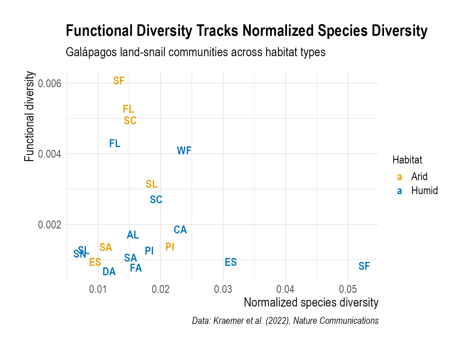
Step 6 — Data Visualization: Replicate Figure 5
Create a scatter plot that shows the relationship between normalized species diversity (normalized_spdiv) and functional diversity (funcdiv). Your plot must include:
-
geom_text()instead ofgeom_point()— label each point with the island code. - Color by habitat type — distinguish arid vs. humid points.
-
A descriptive title that communicates the main message (use
labs(title = ...)). - Readable text sizes — axis labels, titles, and point labels should be big enough to read comfortably. The defaults are almost always too small (Chapter 6).
-
A non-default theme — pick one from
jtools,hrbrthemes,ggthemr, etc. (Chapter 6). -
Export with
ggsave()— specify explicitwidthandheight(Chapter 6).
Helpful tools — step by step
Step 1 — Labeled scatter plot. Use geom_text() to display island codes instead of dots:
ggplot(data_final, aes(x = normalized_spdiv, y = funcdiv)) +
  geom_text(aes(label = island, color = habitat), size = 4)
Step 2 — Custom color palette. Use scale_color_manual() with colors you like:
scale_color_manual(
  values = c("arid" = "#E69F00", "humid" = "#56B4E9")
)
Step 3 — Informative labels. A good title tells the reader the takeaway:
labs(
  title = "Functional diversity tracks normalized species diversity",
  x = "Normalized species diversity",
  y = "Functional diversity",
  color = "Habitat",
  caption = "Data: Kraemer et al. (2022), Nature Communications"
)
Step 4 — Export. Save with explicit dimensions:
My example plot
As one example, below is a figure I created. This is just a reference to help you navigate — I’m looking forward to seeing your more creative versions!
Step 7 — Create One More Publication-Quality Figure
-
Explore another interesting relationship in the dataset — for example, how species richness (
s) varies across islands, the distribution of functional diversity by habitat, or any other pattern you find compelling. - Apply what you’ve learned — use appropriate plot types (amounts, distributions, trends, associations — see Chapters 10–13) and make the figure informative and aesthetically pleasing.
- A non-default theme (Chapter 6).
-
Export with
ggsave()— specify explicitwidthandheight.