pak::pak(c("ggplot2", "palmerpenguins", "jtools"))4 Welcome to the World of ggplot2
Packages for this chapter
If you haven’t installed the following packages, run this code:
Class Objectives
- Learn the basic ideas behind the “grammar of graphics”
- Make scatter plots using the
ggplot2package
4.1 Why so much focus on Graphs?
As you can see from the syllabus, we will spend a lot of time on making graphs. Why? Because humans are visual beings. There’s a reason why The New York Times invests in top-tier graphic designers to craft their visuals. A well-designed graph can illuminate complex data in a way that words alone often can’t.
Now, don’t get me wrong. Graphs aren’t a replacement for text. We still need words to convey intricate ideas and the necessary nuances that come with any scientific discourse. But the sad truth is that most people won’t read your entire paper, they will likely skim it. So if you want your work to resonate, you need to make your key findings as clear as possible. In a world overflowing with information, effective visuals are becoming more and more important.
The realm of data visualization has exploded with new tools and frameworks. Among them, ggplot2 stands out. Why focus on ggplot2? Because it encapsulates the right approach to thinking about graphics. Much like learning the grammar of a new language, understanding the “grammar of graphics” will make your visualizations more structured and easier. Additionally, it boasts a large community and a wide array of extension libraries that enable the creation of virtually any plot imaginable.
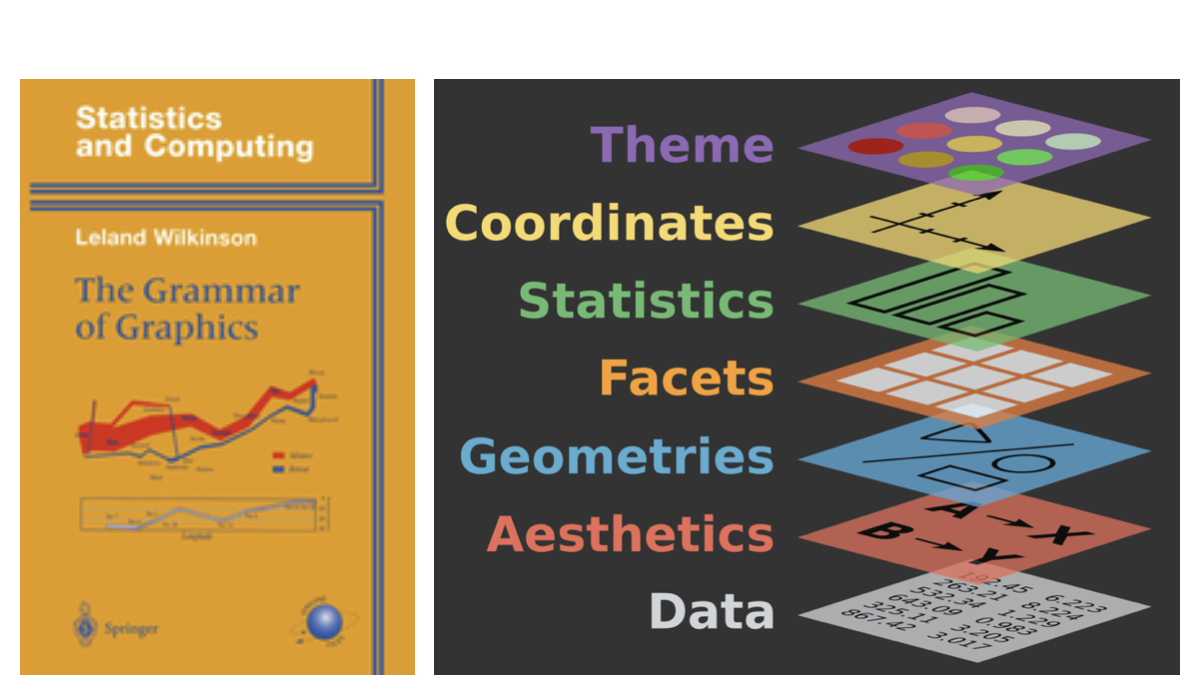
History of Grammar of Graphics
Leland Wilkinson, a statistician, published a book The Grammar of Graphics that laid the foundation for the ggplot2 package. The book introduced a systematic way to think about graphics, breaking them down into components that could be combined in different ways. This approach has since been adopted by many other visualization libraries.
4.2 Crafting Our First Graph with ggplot2
Let us load the penguins dataset from the palmerpenguins package, as we learnt in the previous chapter.
library(palmerpenguins) Suppose we’re curious about the relationship between bill length and bill depth in penguins. In the palmerpenguins dataset, these are represented by bill_length_mm and bill_depth_mm, respectively. Let’s visualize this relationship using ggplot2:
library(ggplot2)
ggplot(
data = penguins,
aes(x = bill_length_mm,
y = bill_depth_mm)
) +
geom_point()- 1
-
Load the
ggplot2package. - 2
-
Start a new plot with the function
ggplot(). - 3
- Specify the dataset used in the plot.
- 4
-
Define the x-axis variable as
bill_length_mm. - 5
-
Define the y-axis variable as
bill_depth_mm. - 6
- Add a layer to the plot.
- 7
- A layer of points to the plot.
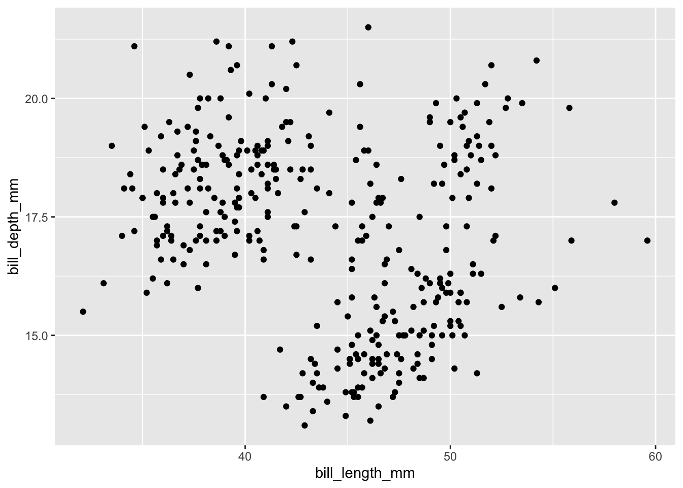
When you run this code, you should see a scatter plot of flipper length against body mass. Congratulations! You’ve just made your first ggplot2 graph.
Let’s dissect this enchanting code piece by piece:
- The
+operator is your magical wand, allowing you to add layers to your plot. Each layer is a graphical element that enhances your masterpiece. Any professional graphical sofware (e.g., Photoshop, Illustrator) works in a similar way. aes()is used to define the aesthetics of the plot. Here, we map the flipper length to the x-axis and body mass to the y-axis.geom_point()is part of a vast family ofgeom_*functions that define what you add on top of your graph—points, lines, bars, you name it.
Once you grasp these concepts, ggplot2 becomes as intuitive as pie (and just as satisfying). When creating scatter plots, you need data, define your axes, and decide what magical elements to add (like points). To abstract it a bit, here’s the fundamental grammar of ggplot2:
ggplot(
data = <DATA>,
aes(x = <X>, y = <Y>)
) +
<GEOM_FUNCTION>(aes(...))- 1
- Specify the dataset.
- 2
- Define the x- and y-axis variable.
- 3
- Add a layer to the plot.
- 4
- Specify the type of layer to add.
4.3 Tuning our Plot
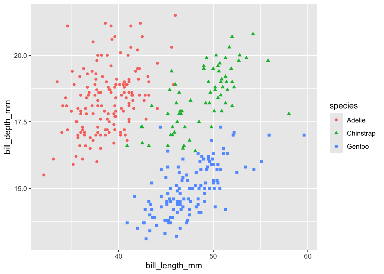
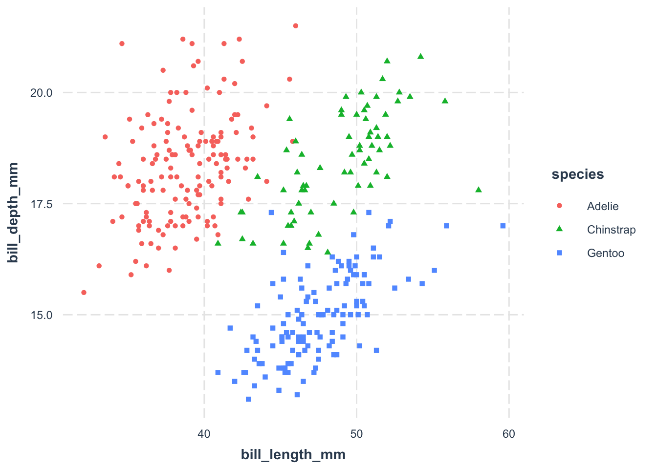
Our plot is functional but not entirely useful. What about different species? To do this, we can use different colors to distinguish them:
ggplot(
data = penguins,
aes(
x = bill_length_mm,
y = bill_depth_mm
)) +
geom_point(aes(color = species))- 1
-
We map the
speciesvariable to the color aesthetic.
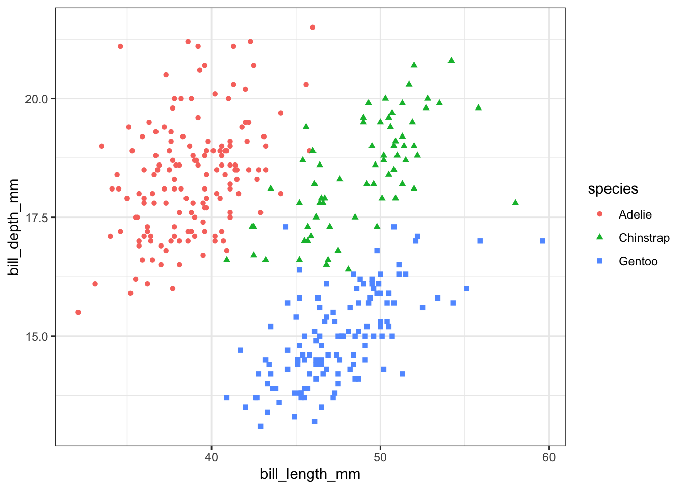
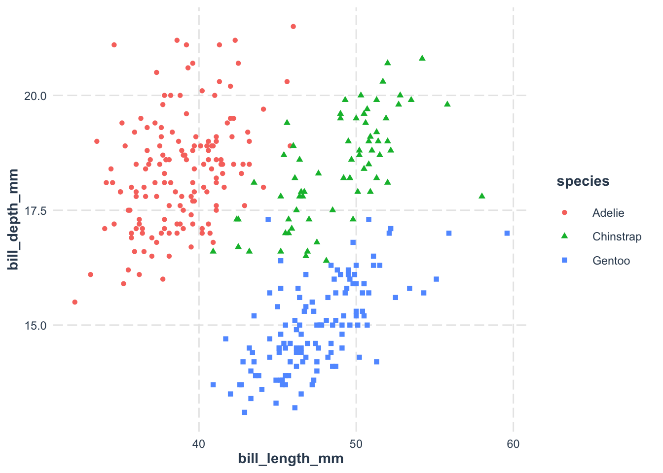
But why stop at color? Let’s add another layer of distinction by incorporating shapes:
ggplot(
data = penguins,
aes(
x = bill_length_mm,
y = bill_depth_mm
)) +
geom_point(aes(color = species, shape = species))- 1
- Differentiate the species by both the color and the shape of the points.
4.4 Do not use the default theme
The default theme is not good. Besides being aesthetically bland, the grey background guzzles a ton of ink when you print. We can change it by adding a theme to the plot. Themes control the non-data elements of your plot—think of them as the outfit your graph wears to impress. Here’s how you can do it:
ggplot(
data = penguins,
aes(
x = bill_length_mm,
y = bill_depth_mm
)) +
geom_point(aes(color = species, shape = species)) +
theme_bw()- 1
-
Apply the
theme_bw()theme to the plot.
The theme_bw() is a great starting point—it removes the background gridlines and opts for a clean white backdrop, making your plot easier on the eyes and more printer-friendly. ggplot2 comes with a plethora of themes (check them out here). We’ll dive deeper into theme_*() functions in future classes, but for now, remember that you can transform your plot’s appearance by simply adding a theme_*() function.
Personally, I rarely stick to themes provided in the ggplot2 library. I prefer the flair of themes from other packages. My personal favorite? theme_nice() from the jtools package:
# install.packages("jtools")
ggplot(
data = penguins,
aes(
x = bill_length_mm,
y = bill_depth_mm,
color = species,
shape = species
)) +
geom_point() +
jtools::theme_nice()- 1
-
Install the
jtoolspackage if you haven’t already. - 2
-
Apply the
theme_nice()from the packagejtoolstheme to the plot.
Of course, this isn’t yet a publication-ready figure, but it’s a fantastic start. We’ll explore more customization options in future classes.
Exercise
- Try to plot the relationship between Body mass (
body_mass_g) and Bill depth (bill_depth_mm) for thepenguinsdataset. Use thespeciesvariable to color the points.
- Explore themes. Try to change the theme of the plot to
theme_minimal()ortheme_classic(). What do you observe?