pak::pak(c("tidylog", "gghighlight", "ggridges", "patchwork", "geomtextpath"))11 Visualizing Distribution
Class Objectives:
- Distribution of a single variable
- Distribution of multiple variables
- Distribution of a variable across multiple groups
Packages for this chapter
If you haven’t installed the following packages, run this code:
Data distributions are central to data analysis. We’ll explore several methods for visualizing distributions in R using ggplot2 and related packages.
Let us begin by loading the necessary packages and setting the theme.
library(tidyverse)
library(tidylog)
library(palmerpenguins)
theme_set(theme_minimal())- 1
-
Set all plots to use
theme_minimal()
11.1 Single Variable
11.1.1 Histograms
Histograms are a common way to visualize the distribution of a single variable. In this example, we plot the distribution of flipper_length_mm from the penguins dataset:
penguins |>
    ggplot(aes(x = flipper_length_mm)) +
    geom_histogram(color = "white")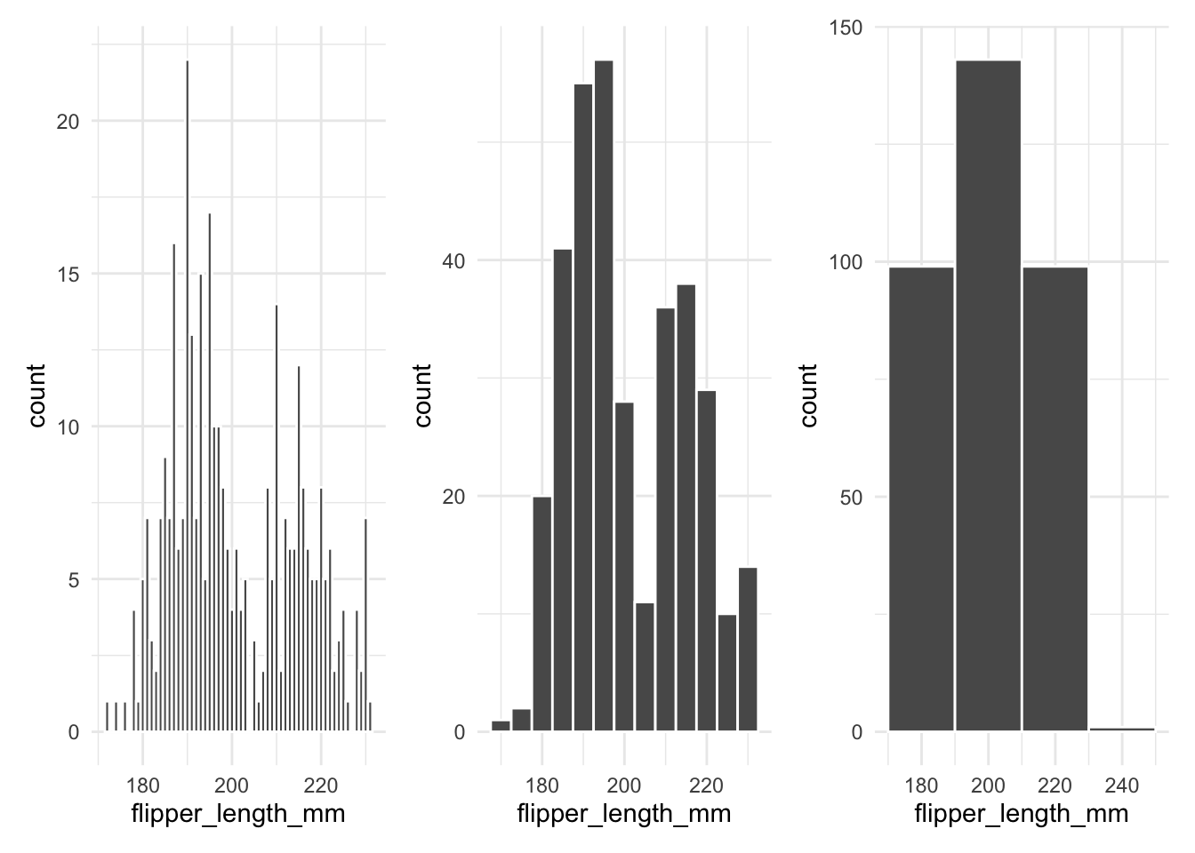
A frequent mistake is to call geom_histogram() without specifying the binwidth. When you don’t set the bin width, ggplot2 uses a default value that may not reveal important details in your data. The example below shows how changing the bin width affects the histogram:
11.1.2 Density Plots
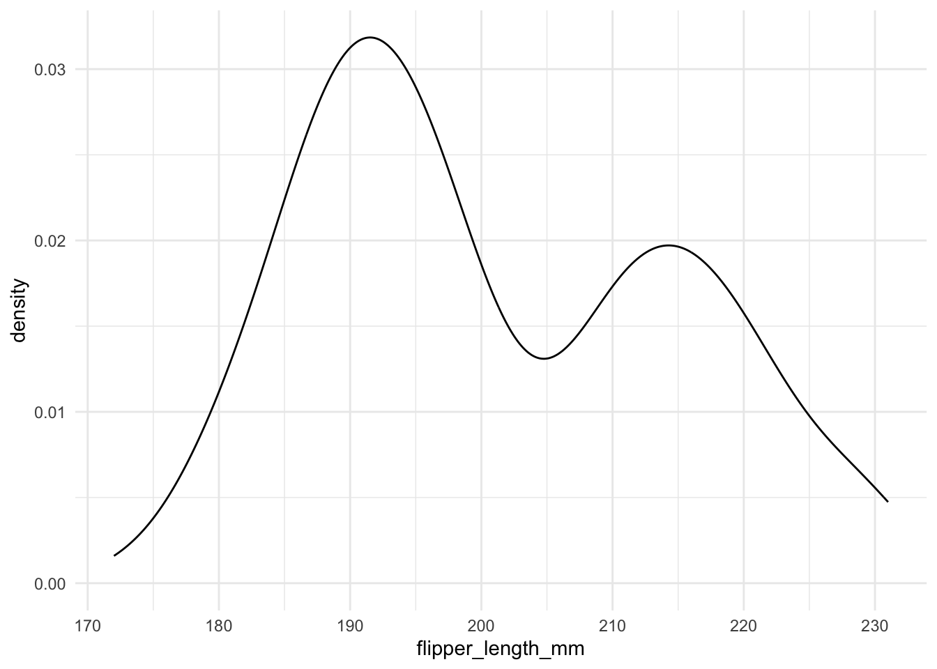
Density plots provide a smooth estimate of the distribution. For example, the following code creates a density plot for flipper_length_mm:
It is very easy to draw a density plot.
penguins |>
    ggplot(aes(x = flipper_length_mm)) +
    geom_density()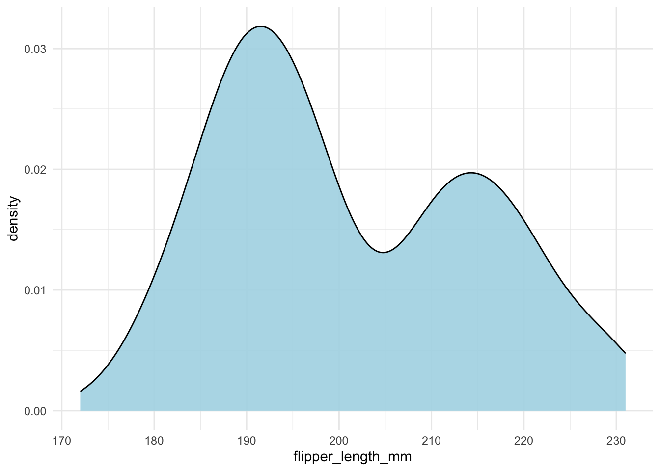
In general, line drawing itself is not a good idea. It is better to fill the area under the curve (geom_density() with fill = "what color you like").
penguins |>
    ggplot(aes(x = flipper_length_mm)) +
    geom_density(fill = "lightblue", alpha = .9)
It is also a good idea to show the actual data points. You can use geom_rug() to do this.
penguins |>
    ggplot(aes(x = flipper_length_mm)) +
    geom_density(fill = "lightblue") +
    geom_rug()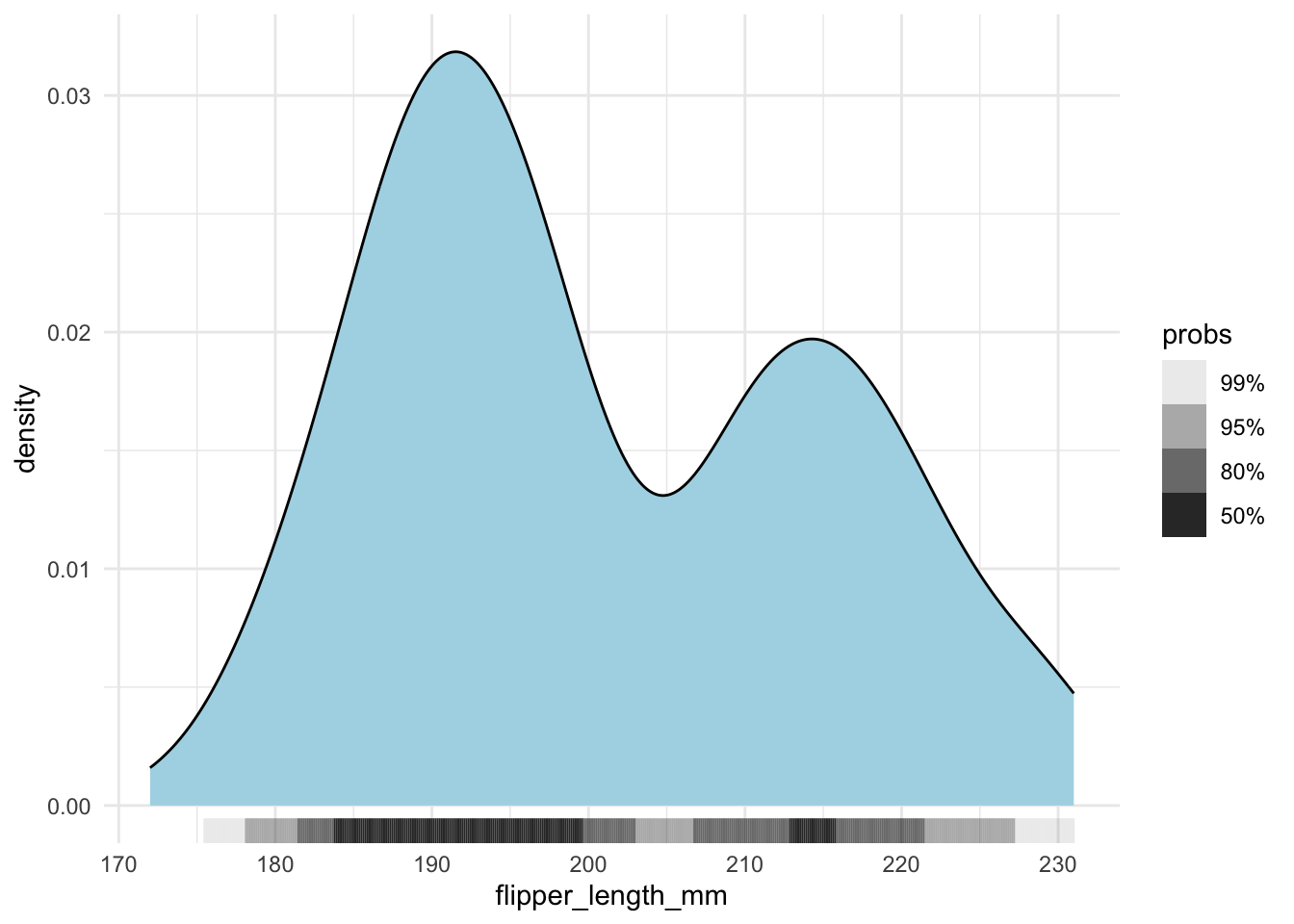
However, when you have a lot of data points, it is better to use geom_hdr_rug() from the ggdensity package.
penguins |>
    ggplot(aes(x = flipper_length_mm)) +
    geom_density(fill = "lightblue") +
    ggdensity::geom_hdr_rug()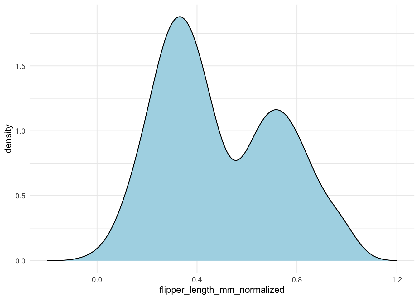
A common pitfall is that the density curve may extend beyond the actual data range. To illustrate, if you normalize your data to range from 0 to 1, the density estimate might still spill outside these bounds. Consider the following example where we normalize the flipper lengths and then set explicit x-axis limits:
penguins |>
drop_na(flipper_length_mm) |>
mutate(flipper_length_mm_normalized = (flipper_length_mm - min(flipper_length_mm)) / (max(flipper_length_mm) - min(flipper_length_mm))) |>
ggplot(aes(x = flipper_length_mm_normalized)) +
geom_density(fill = "lightblue") +
xlim(-.2, 1.2)- 1
- We set the x-axis limits to [-0.2, 1.2] to illustrate the issue.
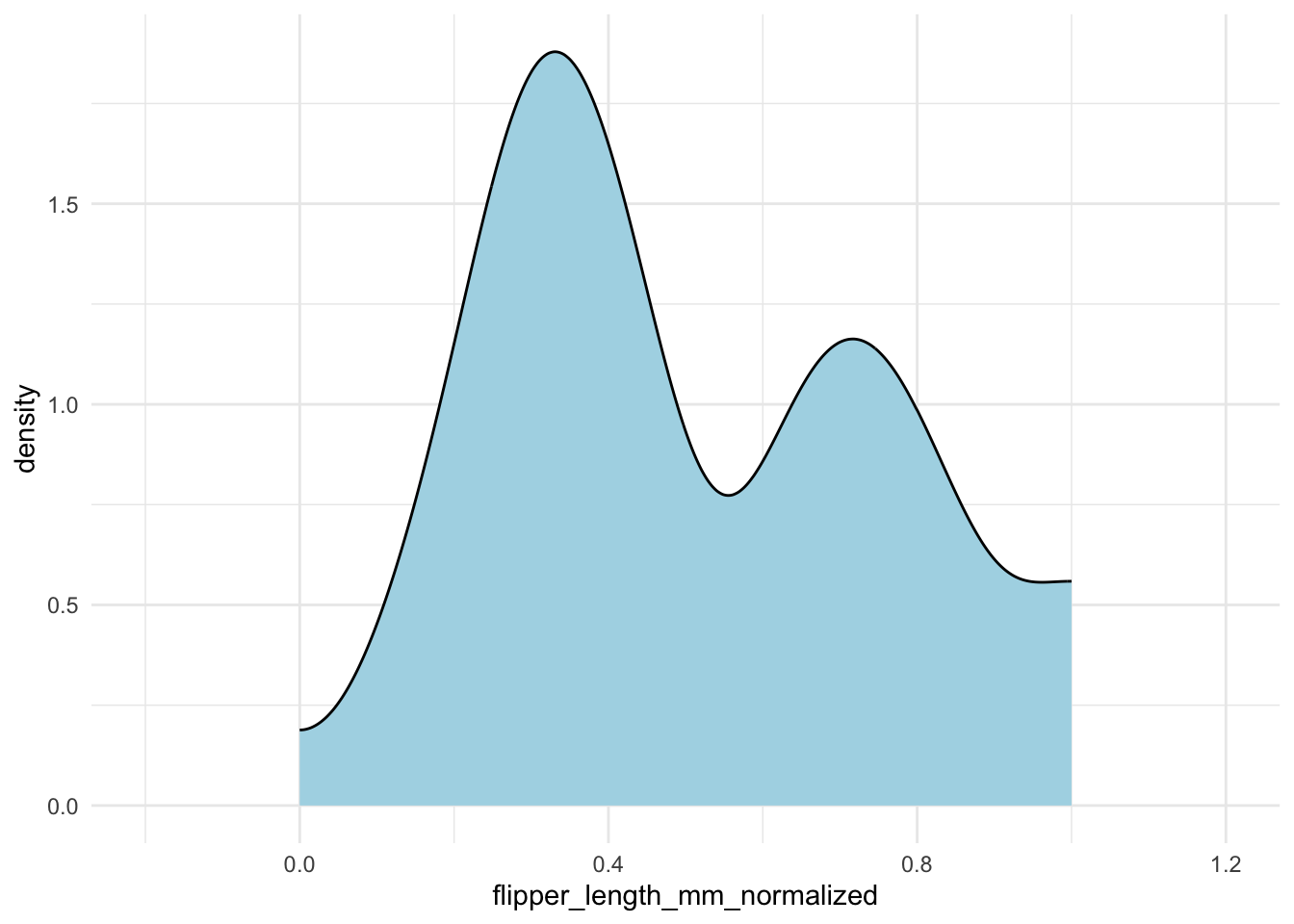
Without careful inspection, you might not notice that the density extends outside the [0, 1] interval. To fix this, you can specify the bounds in geom_density():
penguins |>
drop_na(flipper_length_mm) |>
mutate(flipper_length_mm_normalized = (flipper_length_mm - min(flipper_length_mm)) / (max(flipper_length_mm) - min(flipper_length_mm))) |>
ggplot(aes(x = flipper_length_mm_normalized)) +
geom_density(fill = "lightblue",
bounds = c(0, 1)) +
xlim(-.2, 1.2)- 1
-
We specify the bounds in
geom_density()to ensure the density curve stays within the [0, 1] interval.
Alternative density estimate
The ggalt package’s geom_bkde() function can sometimes provide a better density estimate.
11.2 Comparing More Than One Variable
11.2.1 Histograms vs Density
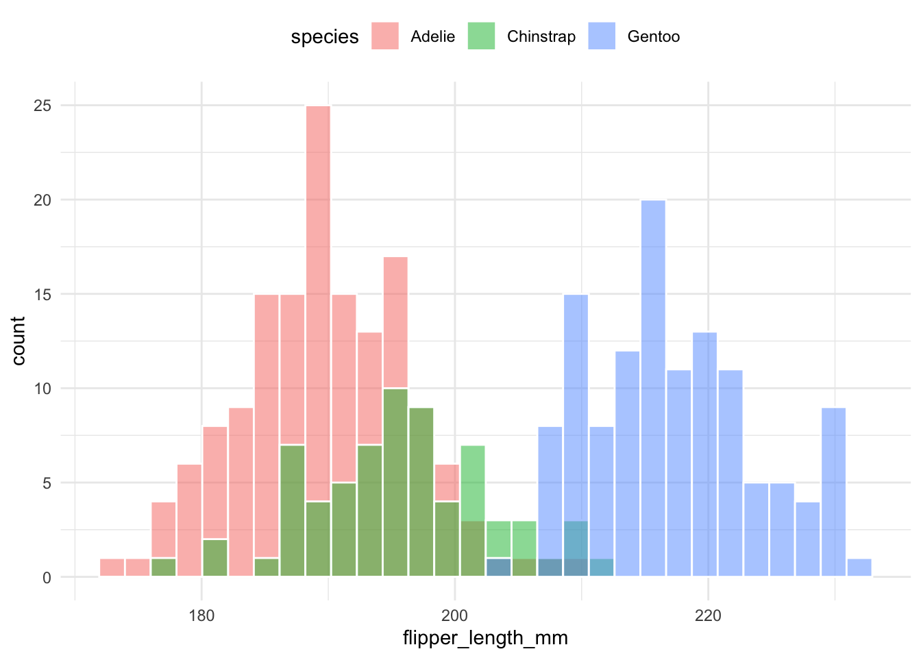
As a general rule, DON’T use Histograms naively when dealing with multiple variables. For example, all three examples below are difficult to efficiently compare the distribution of flipper length across different species.
Each group is plotted in the same space with transparency:
penguins |>
    ggplot(aes(x = flipper_length_mm, group = species, fill = species)) +
    geom_histogram(color = "white", alpha = .5,position = "identity") +
    theme(legend.position = "top")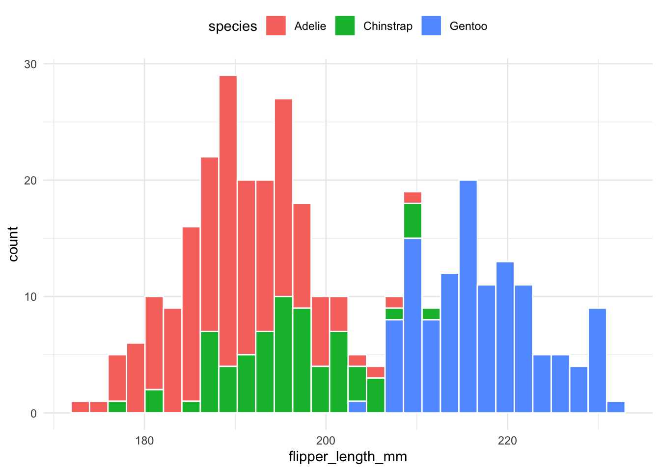
Histograms are stacked on top of each other to compare proportions:
penguins |>
    ggplot(aes(x = flipper_length_mm, group = species, fill = species)) +
    geom_histogram(color = "white", position = "stack") +
    theme(legend.position = "top")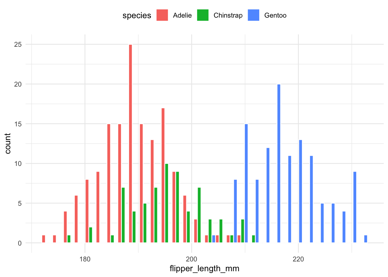
Histograms for each group are placed next to one another for easier comparison:
penguins |>
    ggplot(aes(x = flipper_length_mm, group = species, fill = species)) +
    geom_histogram(color = "white", position = "dodge") +
    theme(legend.position = "top")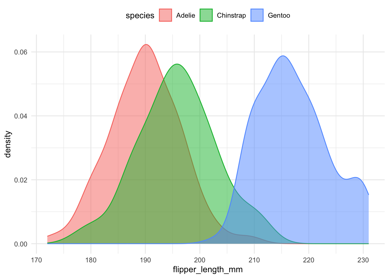
Density plots are generally easier to compare when multiple groups are involved. The following code overlays density curves for each species:
penguins |>
    ggplot(aes(
        x = flipper_length_mm,
        group = species,
        fill = species,
        color = species)) +
    geom_density(alpha = .5) +
    theme(legend.position = "top")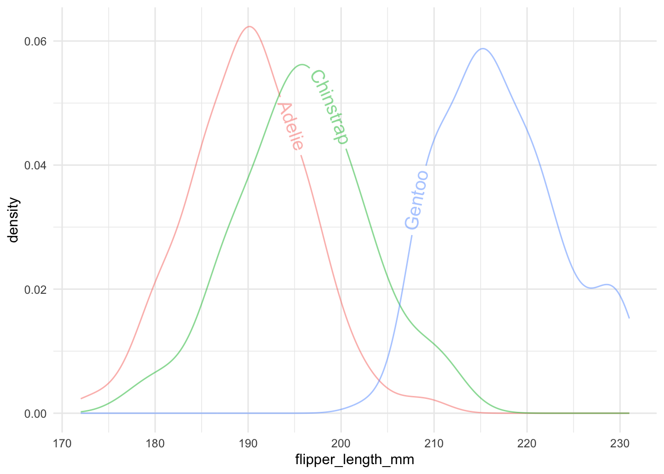
As we mentioned before, it is generally a good idea to avoid using legends. The library geomtextpath provides a way to add text to the density plot.
library(geomtextpath)

penguins |>
    ggplot(aes(x = flipper_length_mm, group = species, color = species)) +
    geom_textdensity(alpha = .5, aes(label = species), size = 5) +
    theme(legend.position = "none")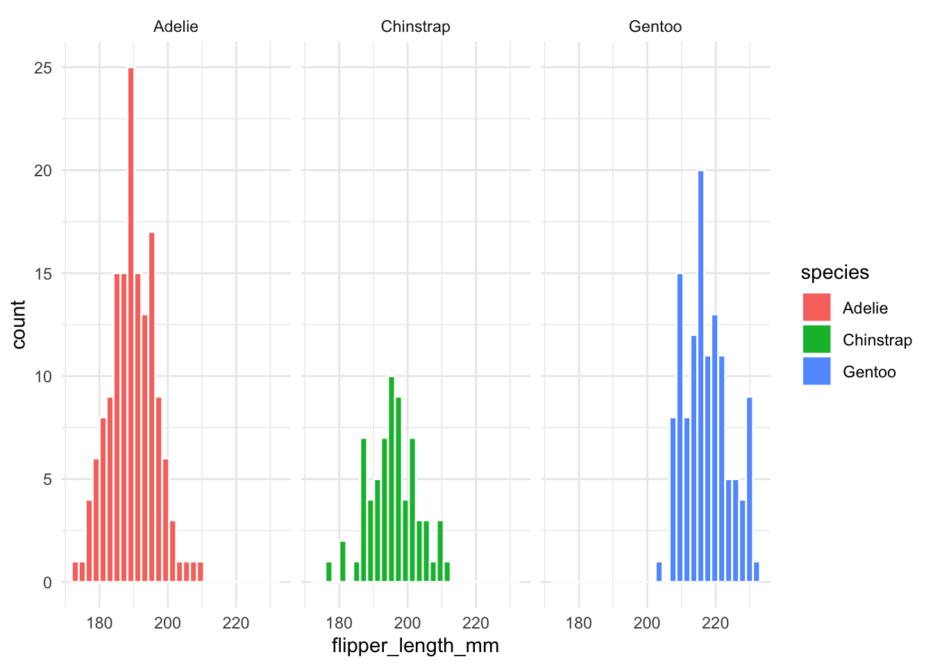
11.2.2 Better Variations for Group Comparisons
There are many variations of density/histogram plots that are more informative and aesthetically pleasing. I particularly like two of them.
The most simple way is to just plot each group in a separate plot.
penguins |>
ggplot(aes(x = flipper_length_mm,
fill = species)) +
geom_histogram(color = "white") +
facet_wrap(~species)- 1
- create a separate plot for each species.
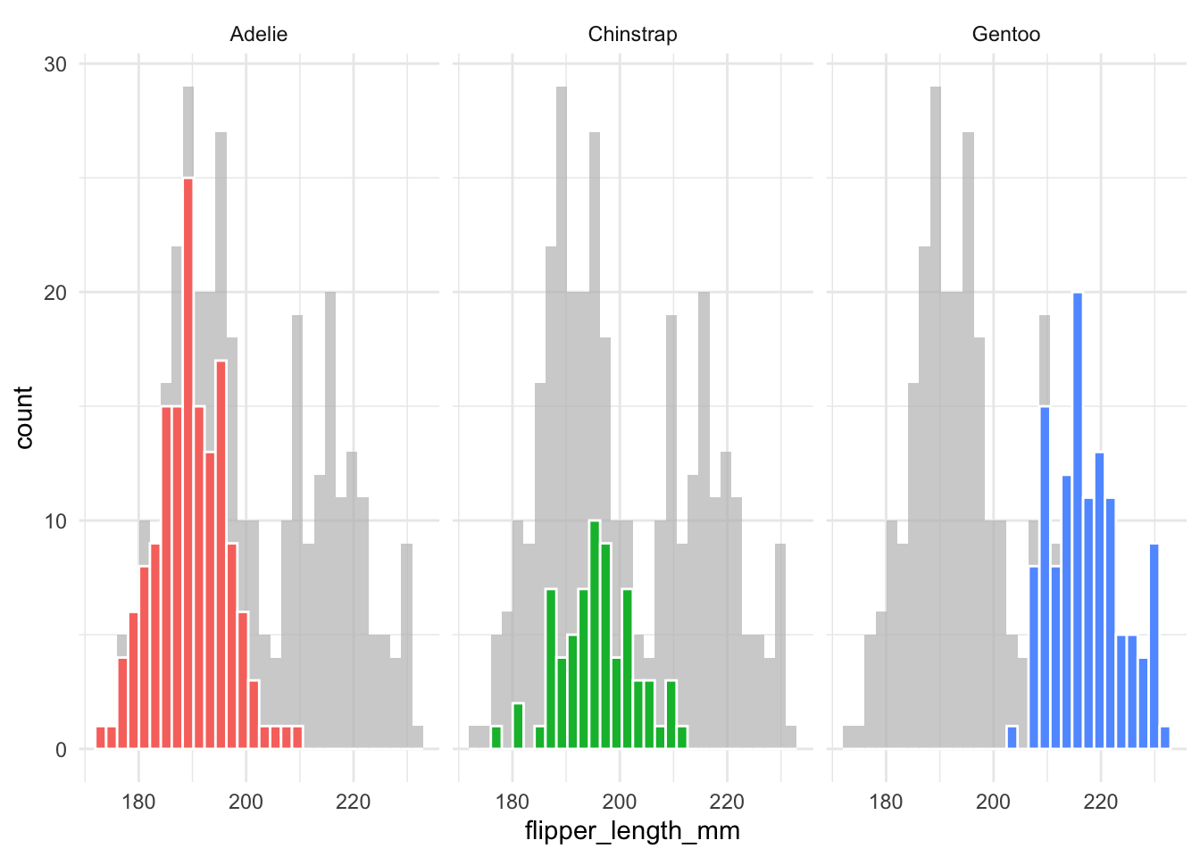
However, this is not very informative as it lacks the information about how one group compares to the others. To solve this, faceting and highlighting each group can be very effective. We can easily do this with the gghighlight package:
library(gghighlight)
penguins |>
ggplot(aes(x = flipper_length_mm,
fill = species)) +
geom_histogram(color = "white") +
gghighlight() +
facet_wrap(~species)- 1
-
gghighlight()is used to highlight the data points for each species. - 2
-
facet_wrap(~species)is used to create a separate plot for each species.

It is more complicated to do this with density plots. The issue is that density plots are scaled so the total area under the curve is 1.
When comparing two groups, a mirror density plot places one density curve above and one below the horizontal axis. This example compares male and female penguins:
penguins |>
    ggplot(aes(x = flipper_length_mm)) +
    geom_density(
        data = filter(penguins, sex == "male"),
        aes(y = after_stat(density)),
        alpha = .5, fill = "#69b3a2", color = "black") +
    geom_label( aes(x=180, y=0.02, label="male"), color="#69b3a2", size = 5) +
    geom_density(
        data = filter(penguins, sex == "female"),
        aes(y = -after_stat(density)),
        alpha = .5, fill = "#404080", color = "black") +
    geom_label( aes(x=228, y=-0.01, label="female"), color="#404080", size = 5)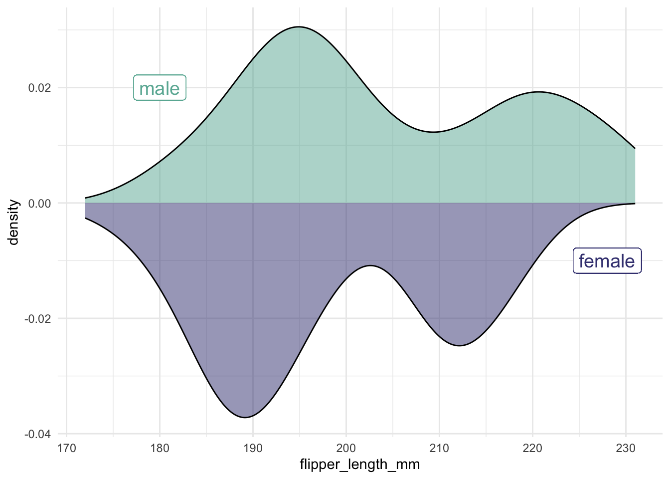
11.3 Many distributions at once
Sometimes, you need to display distributions for many groups simultaneously. For example, we use the lincoln_weather dataset (from the ggridges package) to demonstrate different approaches.
We first clean the data by selecting relevant columns and extracting the month from the date:
library(ggridges)
lincoln_weather_clean <- lincoln_weather |>
    select(CST, `Mean Temperature [F]`) |>
    mutate(CST = ymd(CST)) |>
    mutate(month = month(CST, label = TRUE))
11.3.1 Summarizing with Points and Error Bars
One approach is to show the mean along with an error bar. Always be explicit about how you compute the error bar!
lincoln_weather_clean |>
    group_by(month) |>
    summarise(mean = mean(`Mean Temperature [F]`),
              lower = quantile(`Mean Temperature [F]`, 0.025),
              upper = quantile(`Mean Temperature [F]`, 0.975)) |>
    ggplot(aes(x = month, y = mean, ymin = lower, ymax = upper)) +
    geom_pointrange()
group_by: one grouping variable (month)
summarise: now 12 rows and 4 columns, ungrouped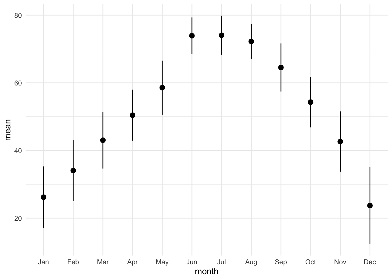
lincoln_weather_clean |>
    group_by(month) |>
    summarise(mean = mean(`Mean Temperature [F]`),
              sd = sd(`Mean Temperature [F]`)) |>
    ggplot(aes(x = month, y = mean)) +
    geom_pointrange(aes(ymin = mean - sd, ymax = mean + sd))
group_by: one grouping variable (month)
summarise: now 12 rows and 3 columns, ungrouped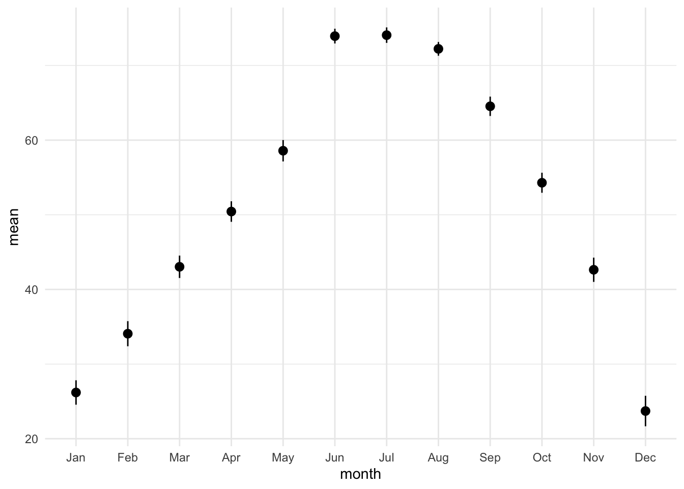
lincoln_weather_clean |>
    group_by(month) |>
    summarise(mean = mean(`Mean Temperature [F]`),
              se = sd(`Mean Temperature [F]`) / sqrt(n())) |>
    ggplot(aes(x = month, y = mean)) +
    geom_pointrange(aes(ymin = mean - se, ymax = mean + se))
group_by: one grouping variable (month)
summarise: now 12 rows and 3 columns, ungrouped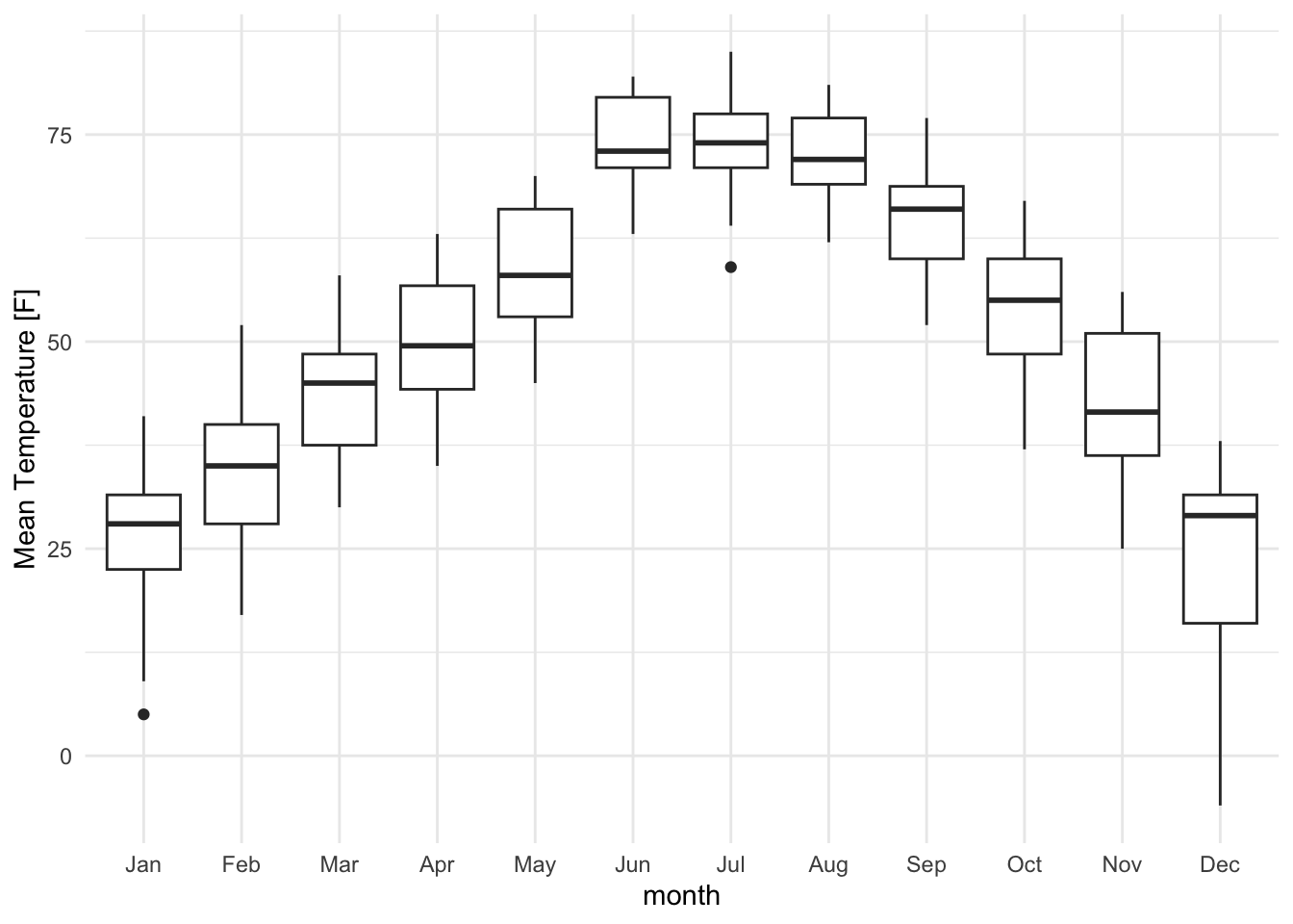
11.3.2 Showing the Full Distribution
Whenever possible, display the full distribution rather than just summary statistics.
lincoln_weather_clean |>
    ggplot(aes(x = month, y = `Mean Temperature [F]`)) +
geom_boxplot() 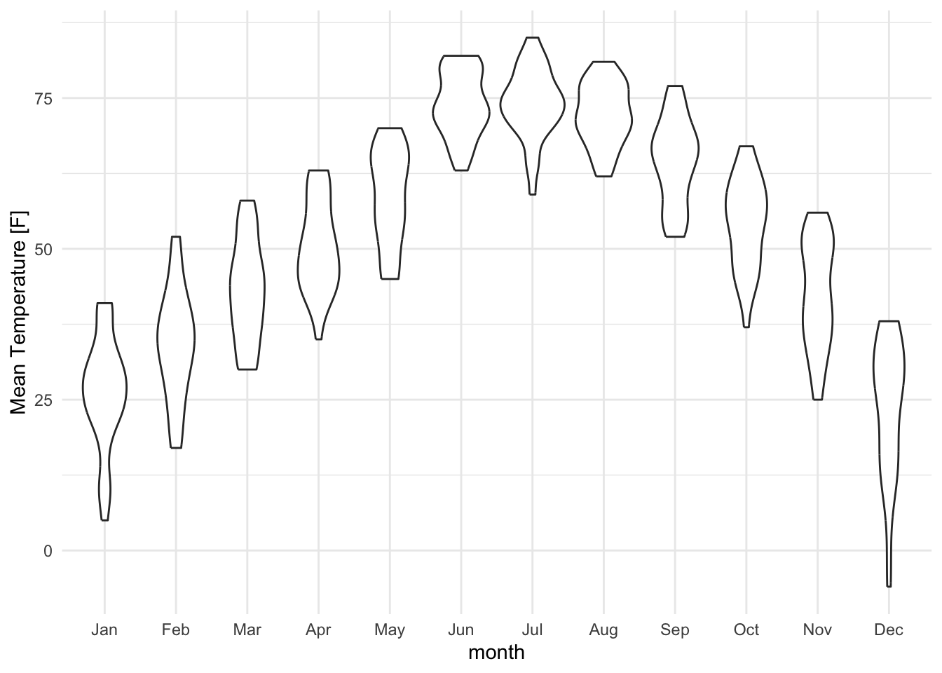
lincoln_weather_clean |>
    ggplot(aes(x = month, y = `Mean Temperature [F]`)) +
geom_violin() 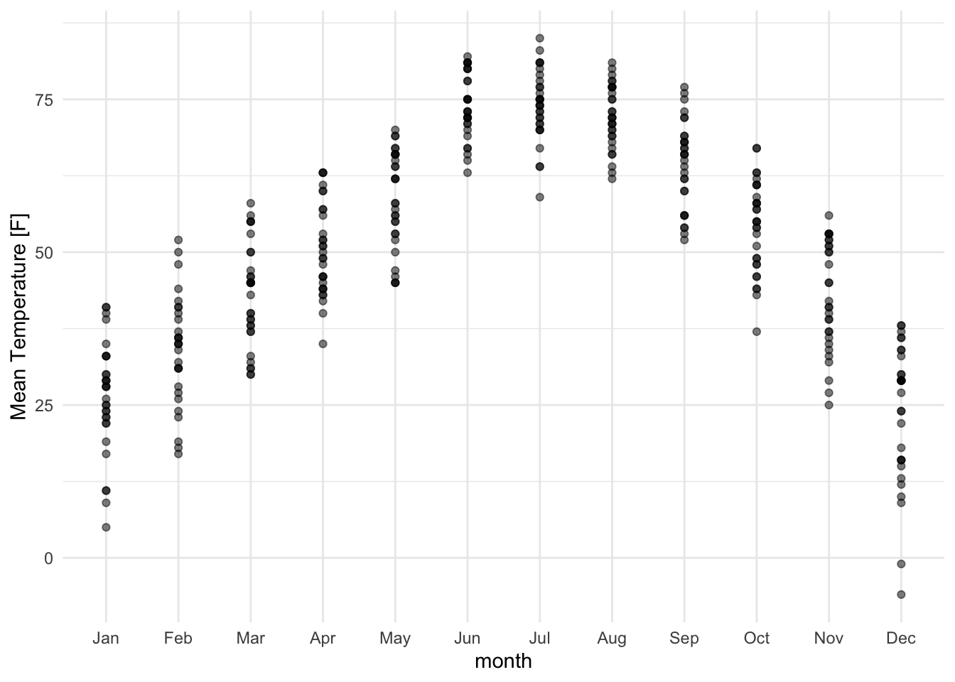
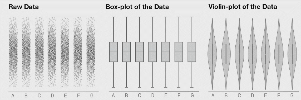
It is generally advised to use violin plots instead of boxplots, especially when the data is not normally distributed (which is often the case). The animated comparison below illustrates why violin plots often convey more information than boxplots.
11.3.3 Plotting the Actual Data Points
It’s a good idea to show the raw data along with any summaries. This is especially true for real data, where we often have to work with limited samples. It is less useful, or sometimes even advised against, for synthetic data.
lincoln_weather_clean |>
    ggplot(aes(x = month, y = `Mean Temperature [F]`)) +
    geom_point(alpha = .5)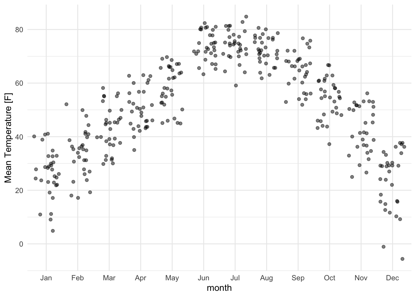
Jittering helps avoid overlapping points:
lincoln_weather_clean |>
    ggplot(aes(x = month, y = `Mean Temperature [F]`)) +
    geom_jitter(alpha = .5)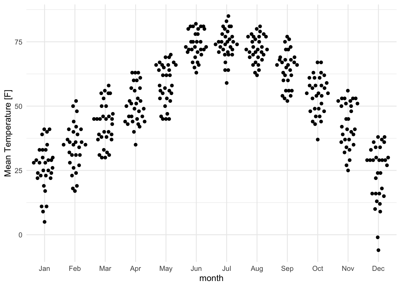
For more controlled jittering, use the ggbeeswarm package:
lincoln_weather_clean |>
    ggplot(aes(x = month, y = `Mean Temperature [F]`)) +
ggbeeswarm::geom_quasirandom(varwidth = TRUE) 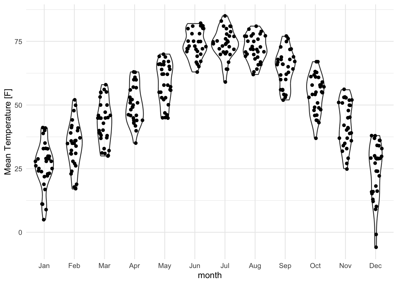
Even better, why not show both the data and the distribution?
lincoln_weather_clean |>
    ggplot(aes(x = month, y = `Mean Temperature [F]`)) +
    geom_violin(alpha = .5) +
    ggforce::geom_sina()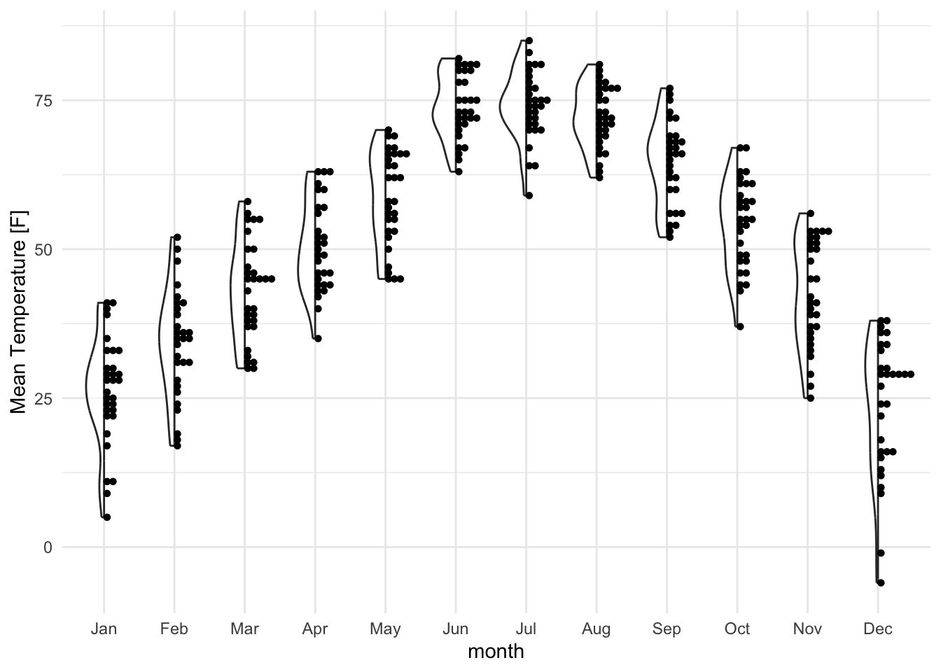
lincoln_weather_clean |>
    ggplot(aes(x = month, y = `Mean Temperature [F]`)) +
    gghalves::geom_half_violin(alpha = .5) +
    gghalves::geom_half_dotplot(method="histodot", stackdir="up", binwidth = 1)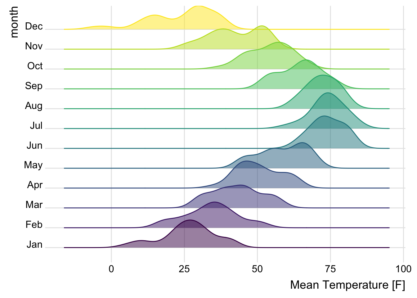
11.3.4 Ridge plot
Ridge plots (also known as joy plots) are great for comparing the distribution of a variable across many groups in a compact format. It provides a horizontal axis and a vertical density plot for each group.
library(ggridges)
lincoln_weather_clean |>
    ggplot(aes(
        x = `Mean Temperature [F]`,
        y = month,
        fill = month,
        color = month
    )) +
    geom_density_ridges(alpha = .5) +
    theme_ridges() +
theme(legend.position = "none") 
Alternative: Horizontal Plots
An issue with ridge plots is that, when the number of groups is large, distributions can be too crowded to be useful. Horizon plots are a great alternative. It uses a very smart trick to avoid overplotting:
You can use the ggHoriPlot package to create them easily. Check out the documentation here for stunning examples.
However, the risk is that the horizontal plot is not a standard plot type that most people are familiar with. Be cautious that other people might have trouble interpreting it.