15 Choosing Colors
If you haven’t installed the following packages, run this code:
Effective use of color in data visualization is crucial for communicating your message clearly. However, color is inherently subjective—it varies by person, culture, and even across generations. While no single “perfect” color scheme exists, following some general guidelines can help you create more readable, appealing, and accessible graphics.
15.1 What to consider?
As mentioned in Chapter 6, you can have a lot of fun with choosing color palettes (e.g., MetBrewer). However, there are caveats you need to be aware of.
15.1.1 Think about the nature of the variable
First thing, before selecting a color palette, determine the nature of the variable you want to display. In general, there are four categories:
Use distinct colors for each category. For example, we just want to use the color to distinguish the species of penguins.
Show the code
library(tidyverse)
library(palmerpenguins)
library(colorspace)
ggplot(penguins, aes(x = bill_length_mm, y = bill_depth_mm, fill = species)) +
    geom_point(shape = 21, color = "white", alpha = 0.5, size = 3) +
    scale_fill_discrete_qualitative() +
    labs(x = "Bill Length (mm)", y = "Bill Depth (mm)") +
    jtools::theme_nice() +
    theme(legend.position = "top")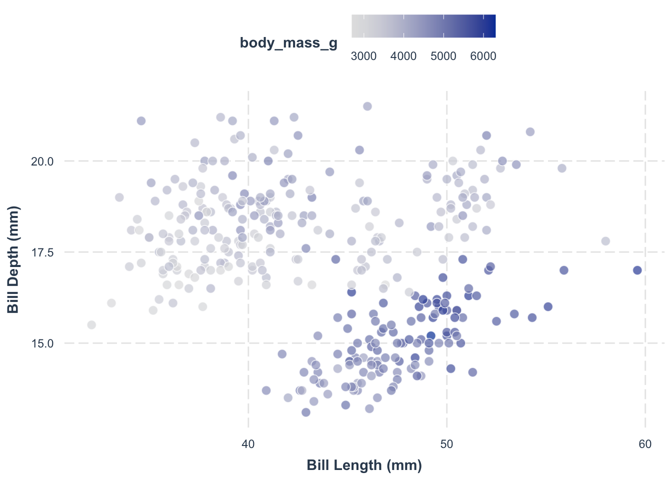
For variables with an inherent order, choose a palette that represents a gradual change. For example, we want to use the color to indicate the body mass of penguins.
Show the code
library(tidyverse)
library(palmerpenguins)
library(colorspace)
ggplot(penguins, aes(x = bill_length_mm, y = bill_depth_mm, fill = body_mass_g)) +
    geom_point(shape = 21, color = "white", alpha = 0.7, size = 3) +
    scale_fill_continuous_sequential() +
    labs(x = "Bill Length (mm)", y = "Bill Depth (mm)") +
    jtools::theme_nice() +
    theme(legend.position = "top")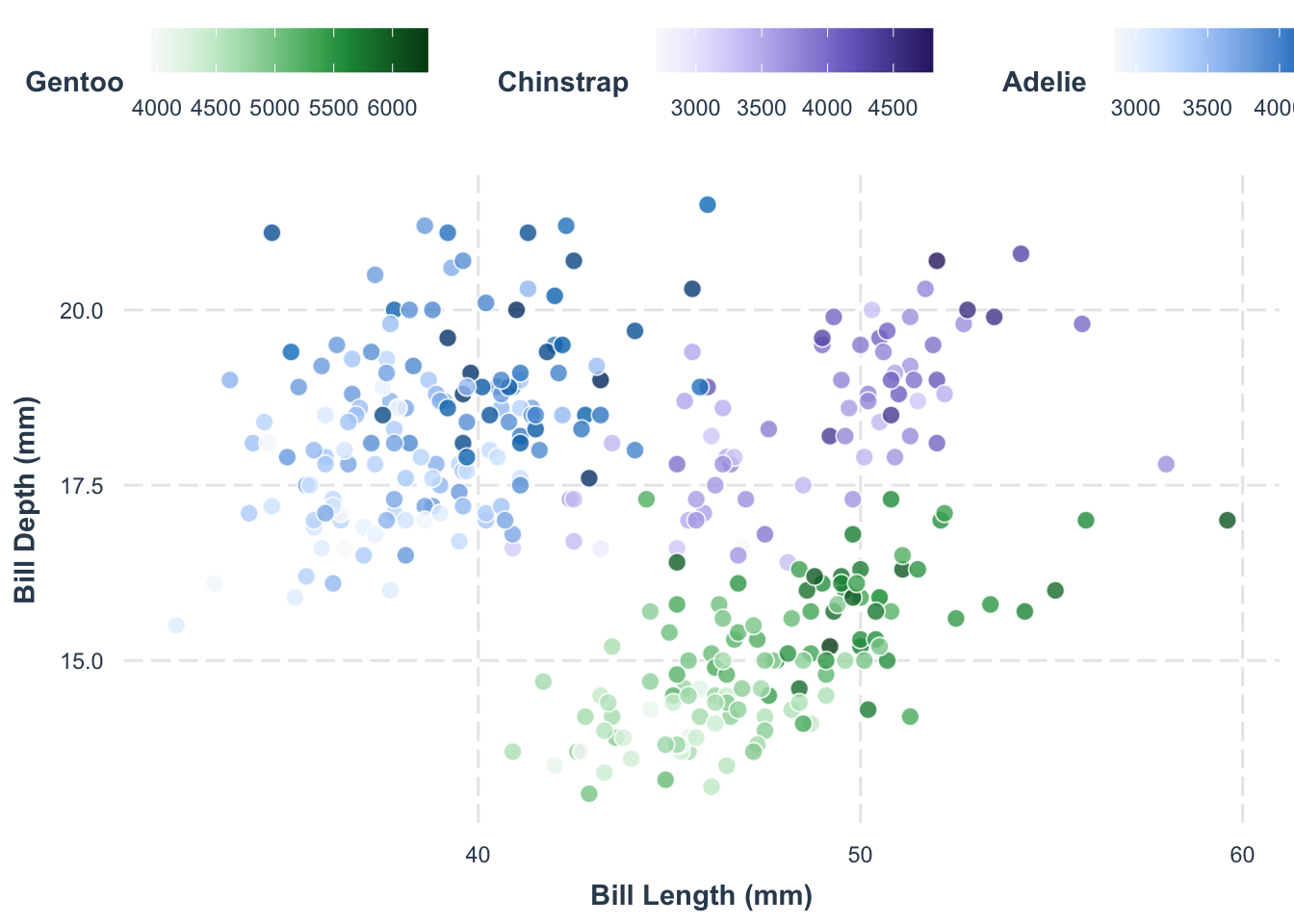
Check more about this topic here.
Transitioning between hues to indicate progression. For example, we want to use the color class to show the species, and then the color varariton within the same class to show the body mass.
Show the code
library(tidyverse)
library(palmerpenguins)
library(colorspace)
library(ggnewscale)
ggplot(penguins, aes(x = bill_length_mm, y = bill_depth_mm)) +
    geom_point(
        data = filter(penguins, species == "Chinstrap"),
        aes(fill = body_mass_g),
        shape = 21, color = "white", alpha = 0.8, size = 3
    ) +
    scale_fill_continuous_sequential(palette = "Purples 3", name = "Chinstrap") +
    ggnewscale::new_scale_fill() +
    geom_point(
        data = filter(penguins, species == "Adelie"),
        aes(fill = body_mass_g),
        shape = 21, color = "white", alpha = 0.8, size = 3
    ) +
    scale_fill_continuous_sequential(palette = "Blues 3", name = "Adelie") +
    ggnewscale::new_scale_fill() +
    geom_point(
        data = filter(penguins, species == "Gentoo"),
        aes(fill = body_mass_g),
        shape = 21, color = "white", alpha = 0.8, size = 3
    ) +
    scale_fill_continuous_sequential(palette = "Greens 3", name = "Gentoo") +
    labs(x = "Bill Length (mm)", y = "Bill Depth (mm)") +
    jtools::theme_nice() +
    theme(legend.position = "top")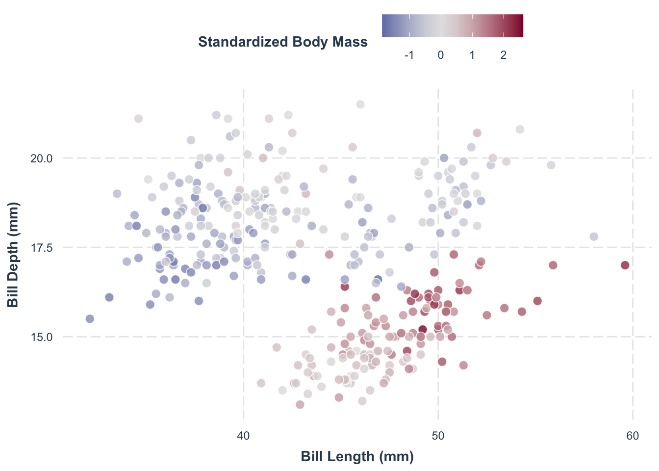
Use two contrasting hues that meet in a neutral middle value. This is ideal when your data diverges around a critical midpoint (e.g., zero).
For example, we want to show if the penguins are above or below the average body mass.
Show the code
library(tidyverse)
library(palmerpenguins)
library(colorspace)

penguins |>
    mutate(body_mass_g = (body_mass_g - mean(body_mass_g, na.rm = TRUE))/sd(body_mass_g, na.rm = TRUE)) |>
    ggplot(aes(x = bill_length_mm, y = bill_depth_mm, fill = body_mass_g)) +
    geom_point(alpha = 0.8, size = 3, shape = 21, color = "white") +
    scale_fill_continuous_diverging(name = "Standardized Body Mass") +
    labs(x = "Bill Length (mm)", y = "Bill Depth (mm)") +
    jtools::theme_nice() +
    theme(legend.position = "top")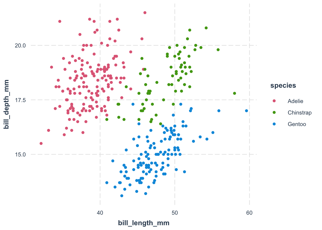
15.1.2 Reduce Chroma
15.1.3 Be aware of color-vision deficiency
Additionally, whenever possible, always verify that your plot is color-blind friendly. Many modern palettes are designed to be distinguishable for viewers with common forms of color vision deficiency. If you are interested, you can read more here.
15.2 My Go-To Solution: The colorspace Package
Based on these considerations, my preferred tool is the colorspace package. It provides a unified and flexible interface to generate color palettes tailored to the type of data you are visualizing.
For example, consider the following code that uses colorspace to create a scatterplot of penguins data:
library(tidyverse)
library(colorspace)
library(palmerpenguins)

penguins |>
    ggplot(aes(x = bill_length_mm, y = bill_depth_mm, color = species)) +
    geom_point() +
    scale_color_discrete_qualitative() +
    jtools::theme_nice()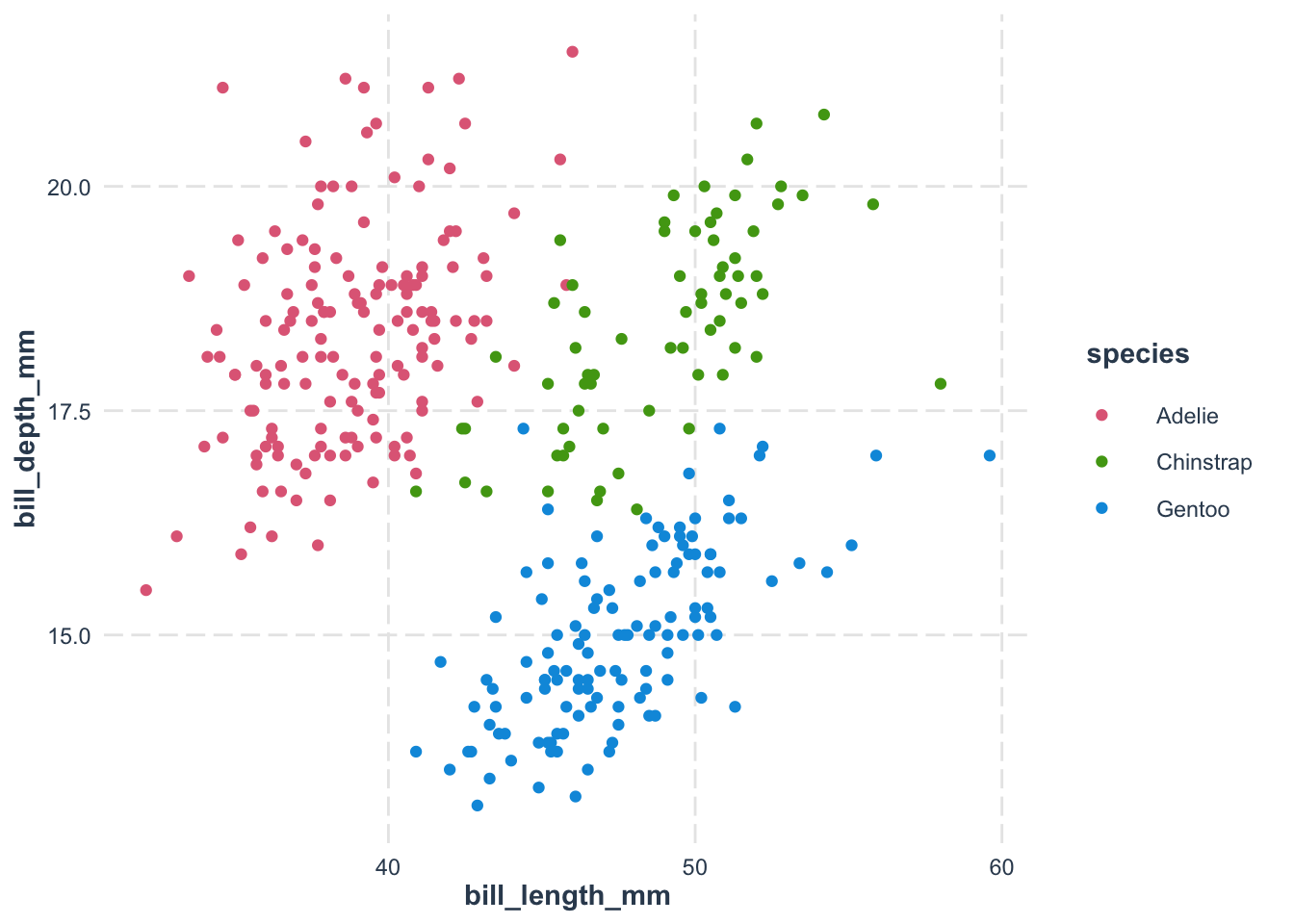
The color scale function–scale_color_discrete_qualitative()–is part of the colorspace package. Its naming convention follows the structure:
scale_<aesthetic>_<datatype>_<colorscale>()-
<aesthetic>: The visual attribute (e.g., color or fill). -
<datatype>: The type of data (e.g., discrete for qualitative data). -
<colorscale>: The palette type (e.g., qualitative, sequential, diverging).
Although visually striking, rainbow palettes can distort data interpretation because the perception of colors is non-linear and may mislead the viewer.
viridis package for continuous sequential variables.
Another popular package is viridis package, which offers excellent color palettes. As an example,
However, it is mainly optimized for continuous sequential variables and might not be as flexible as colorspace for all types of data.
15.3 Additional Useful Resources
- color-palette-finder: An interactive tool to help you choose the right color palette for your visualization.
- 配色事典: A visually rich resource with a wide range of palettes. I like having a physical copy when choosing colors.
- Traditional colors: A collection of traditional colors used in China and Japan. There are many other color palettes avaiable online from different cultures. Try to explore them!
- ColorPick Eye Dropper: A tool in Chrome that allows you to pick colors from any image and convert them to HEX code.