library(ggplot2)
library(palmerpenguins)
ggplot(
data = penguins,
aes(
x = bill_length_mm,
y = bill_depth_mm
)
) +
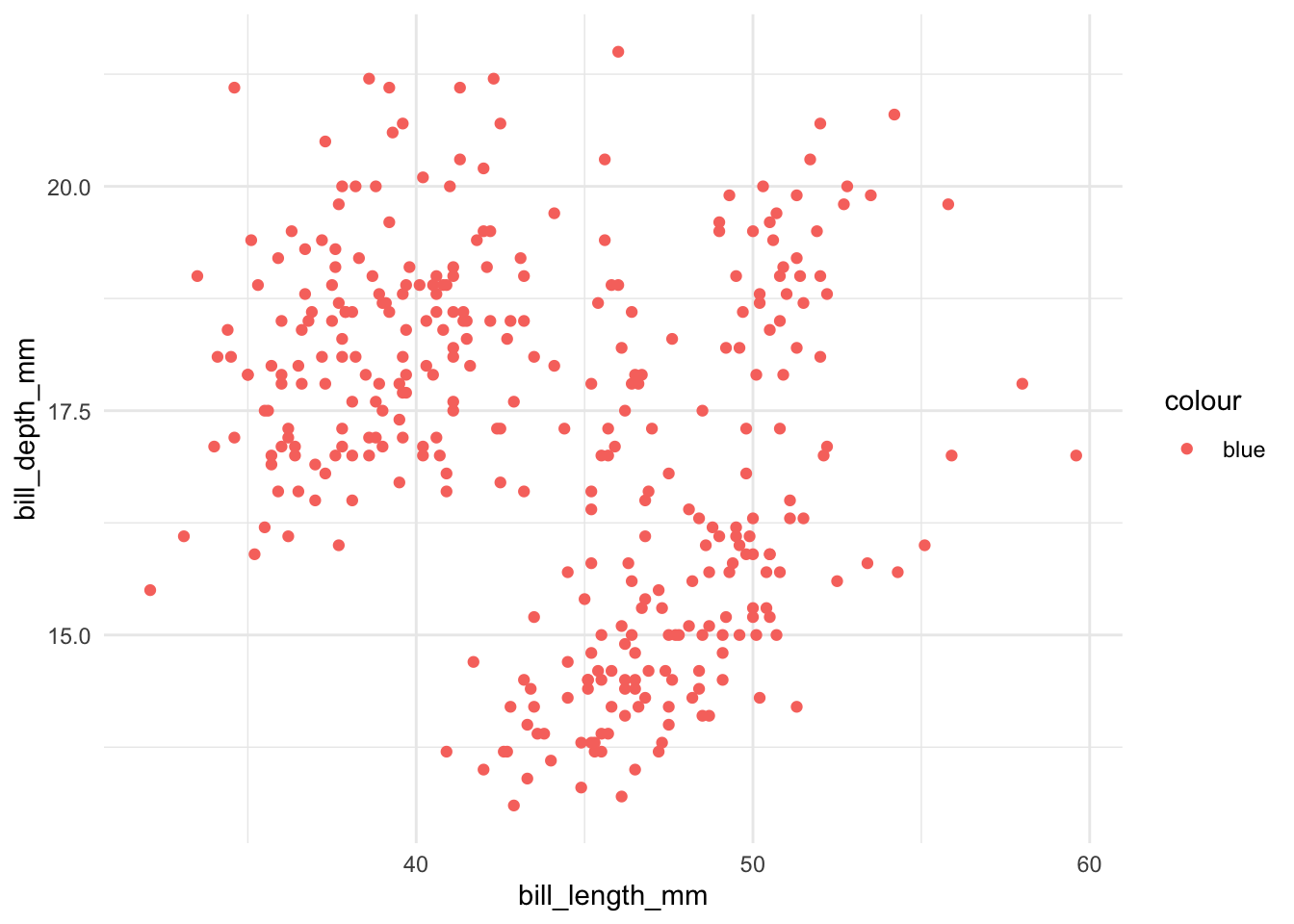
geom_point(aes(color = "blue")) +
theme_minimal()- 1
-
The
coloraesthetic is set to “blue”.
ggplot2ggplot2ggplot2Most plotting libraries, let’s be honest, are a bit of a black box. One command, bang, you’ve got a chart. It’s convenient, sure—a quick fix for the data visualization problem. But peek under the hood? Forget about it. And try tweaking things to get exactly what you want? Good luck with that. They’re built for simplicity, which all too often means a crippling lack of flexibility. And let’s face it, when you’re trying to create truly effective visualizations, customization isn’t a luxury—it’s a necessity.
ggplot2 takes a different tack. It’s built on the idea of a “grammar of graphics”—think of it as a set of Lego bricks for data visualization. Simple, modular pieces that, combined thoughtfully, can construct virtually anything you can imagine. This means you’re not trapped by pre-packaged, cookie-cutter solutions. You can actually design your charts, assembling them piece by piece, crafting them to tell precisely the story your data has to tell.
Now, there’s a trade-off, of course. You do have to invest some time to grasp its (admittedly elegant) design principles. But trust me, the payoff is well worth the effort. Below, I’ll walk you through some of the fundamental ideas that make this approach so powerful.
In ggplot2, aesthetics are the magical connections between your data and how it looks on the plot. The aes() function is like the matchmaker that sets up these relationships. It maps variables in your data to visual properties in your plot. Thus, everything inside the aes() function should correspond to a column in your dataset.
To see this, let us again consider plotting the body_mass_g against the bill_depth_mm of the penguins dataset. Suppose we want to color all points blue:
library(ggplot2)
library(palmerpenguins)
ggplot(
data = penguins,
aes(
x = bill_length_mm,
y = bill_depth_mm
)
) +
geom_point(aes(color = "blue")) +
theme_minimal()color aesthetic is set to “blue”.
library(ggplot2)
library(palmerpenguins)
ggplot(
data = penguins,
aes(
x = bill_length_mm,
y = bill_depth_mm
)
) +
geom_point(color = "blue") +
theme_minimal()color is not within aes() function.
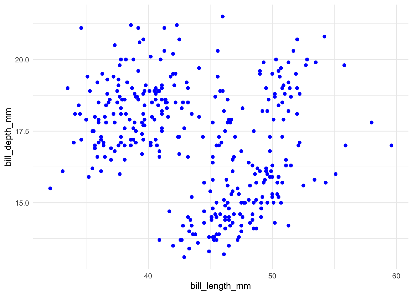
As we can see, the second option is correct. Because "blue" is not a variable in the penguins dataset, it is not a valid aesthetic mapping. Thus, the correct way to do it is to take the color as a non-aesthetic mapping.
You can map many aesthetics in ggplot2. We have already seen that:
x and y for the x- and y-axiscolor for the color of the points. This is a big and very important topic. We will discuss it in more detail in the next section.shape for the shape of the points. There are 25 different shapes you can choose from (link). I admit that I google them every time I need to use them.There are some other common aesthetics you can map to points in ggplot2:
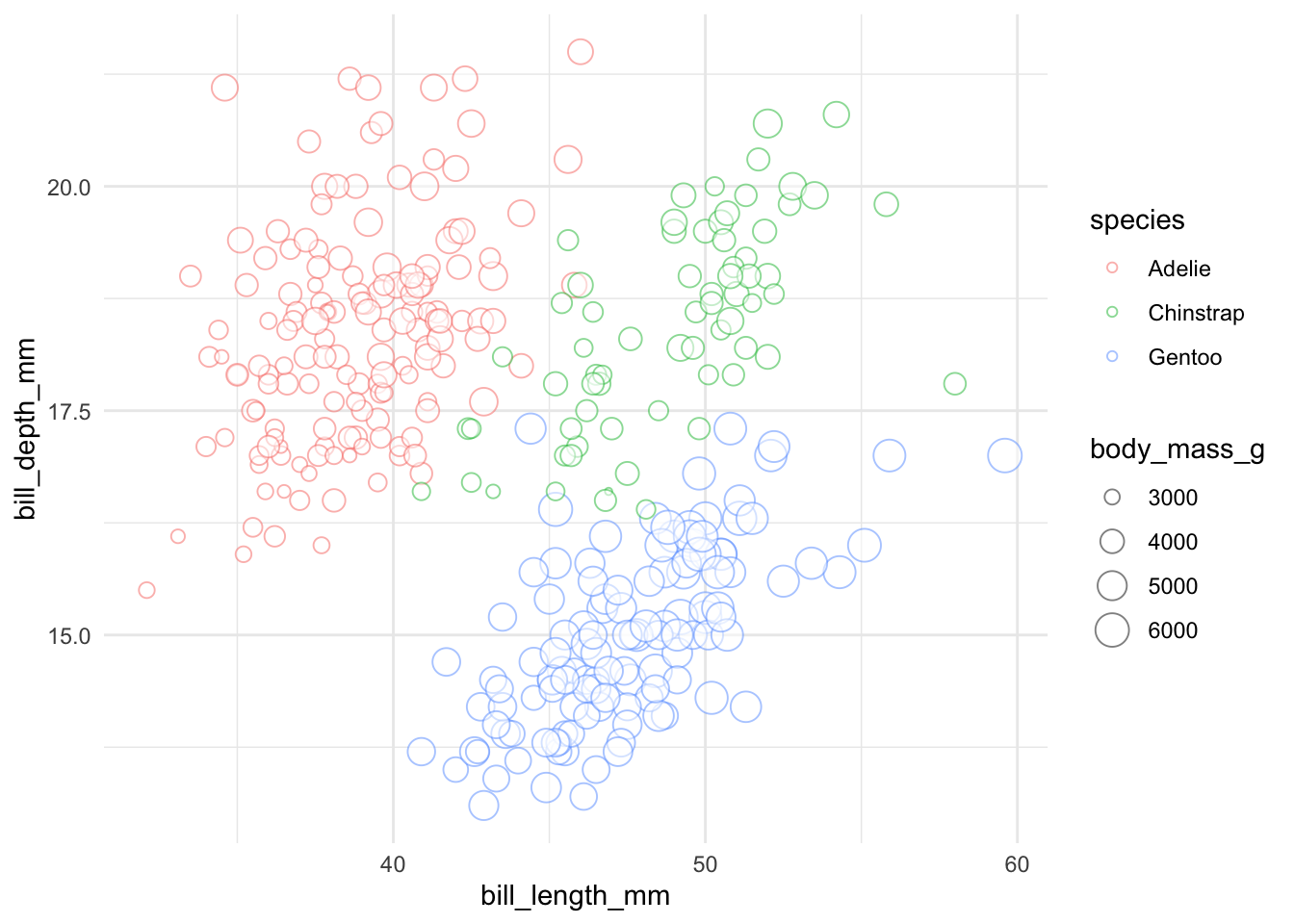
size for the size of the pointsalpha for the transparency of the points. It ranges from 0 (completely transparent) to 1 (completely opaque)library(ggplot2)
library(palmerpenguins)
ggplot(data = penguins,
aes(x = bill_length_mm, y = bill_depth_mm)
) +
geom_point(
aes(
color = species,
size = body_mass_g
),
alpha = 0.5,
shape = 21,
fill = "white"
) +
theme_minimal()species variable is mapped to the color aesthetic. Different species will have different colors.
body_mass_g variable is mapped to the size aesthetic. Different body masses will have different sizes.
alpha is the same for all. 0.5 makes the points semi-transparent.
shape is the same for all. This makes the points filled circles.
fill is the same for all. This makes the points white.
If you understand the above code, you would have a solid working knowledge of aesthetic mapping in ggplot2:
color and size aesthetics. This means that different species will have different colors and different body masses will have different sizes. Thus, you can map different variables to different aesthetics. This gives us great flexibility in how we can visualize our data.alpha, shape, and fill are set outside the aes() function, all points will have the same transparency, shape, and fill.alpha is incorrectly placed inside aes() because it is fixed, and size should be inside aes() as body_mass_g is a variable in the data.
alpha) based on body_mass_g, change the shape based on island, and set all points to purple.Geometric objects (geoms) are the visual representations of your data. Think of them as the artists painting your data onto the canvas. For example, we have already used geom_point() to create a scatter plot. ggplot2 offers a variety of geoms (geom_*()) to create different types of plots. As an example, we can use a different geometric object for the same data above:
library(ggplot2)
library(palmerpenguins)
ggplot(
data = penguins,
aes(
x = bill_length_mm,
y = bill_depth_mm
)
) +
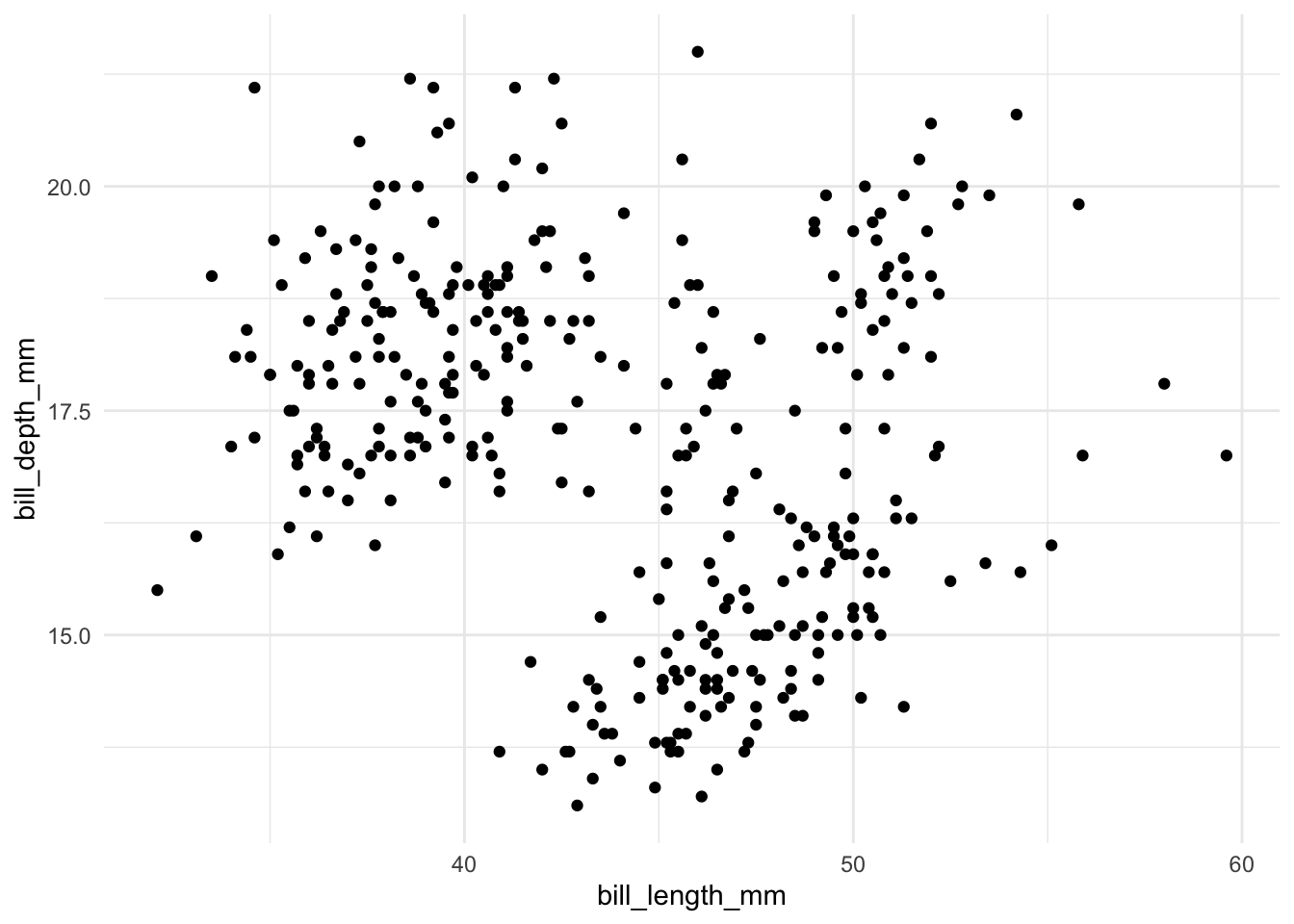
geom_point() +
theme_minimal()geom_point() function is used to create a scatter plot.
library(ggplot2)
library(palmerpenguins)
ggplot(
data = penguins,
aes(
x = bill_length_mm,
y = bill_depth_mm
)
) +
geom_smooth() +
theme_minimal()geom_smooth() function is used to create a smooth line that fits the trend of the data.
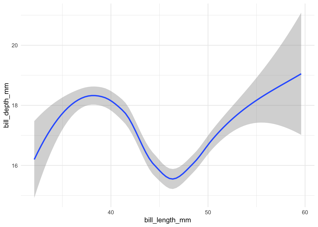
For the two plots above, left and right have the same data, same axis, but different geometric objects. The left plot uses geom_point() to create a scatter plot, while the right plot uses geom_smooth() to create a smooth line that fits the trend of the data.
You can use more than one geometric object in a plot. For example, you can add a smooth line and points on the plot. Notice that the orders of adding layers matter. The last layer will be on top of the previous layers. To see this,
library(ggplot2)
library(palmerpenguins)
ggplot(
data = penguins,
aes(
x = bill_length_mm,
y = bill_depth_mm
)
) +
geom_point() +
geom_smooth() +
theme_minimal()geom_point() function is used to create a scatter plot.
geom_smooth() function is used to create a smooth line that fits the trend of the data.
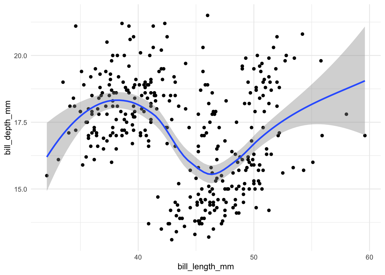
The smmoth line is on top of the points.
library(ggplot2)
library(palmerpenguins)
ggplot(
data = penguins,
aes(
x = bill_length_mm,
y = bill_depth_mm
)
) +
geom_smooth() +
geom_point() +
theme_minimal()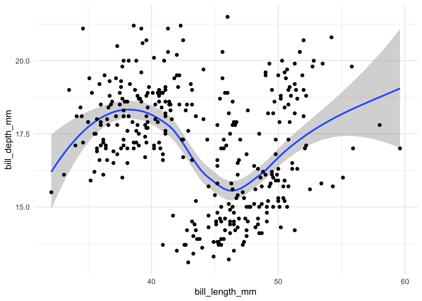
Now the black points are on top of the smooth line.
We want to explore the relationship between body_mass_g and flipper_length_mm. Please plot the data with both the points and a smooth trend line. What preliminary conclusions can you draw from the plot?
This is not something typiucally taught in length in the typical ggplot2 tutorial. I kindly learnt it from experience, through many scratching many heads with mysterious codes.
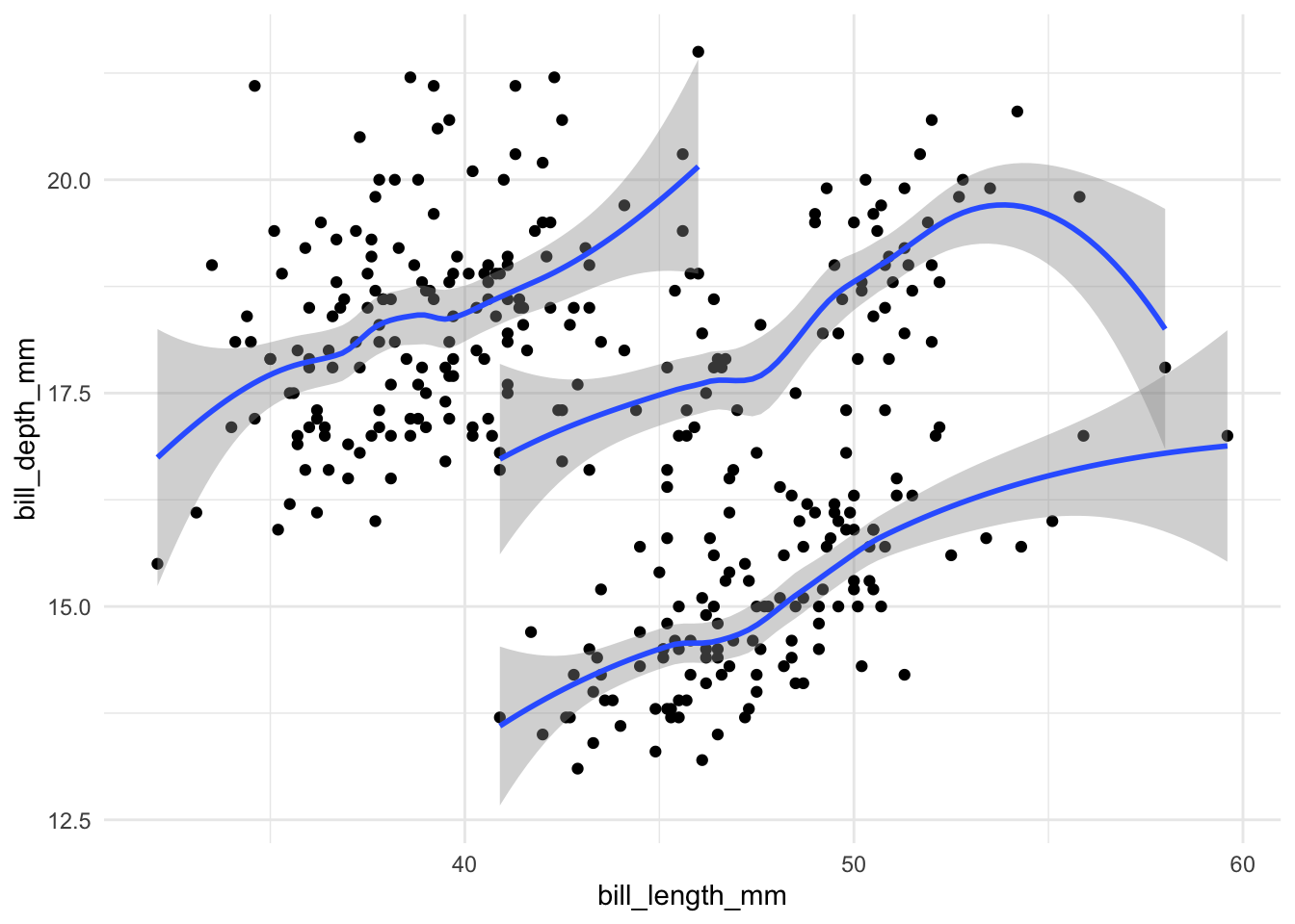
To show this, we introduce another aesthetic mapping: group. It is a central aes that is used to group data. For example, in the figure above, it is quite annoying that the smooth line desciebes the average trend across species, but we are often only intrested within species. We can group the data by species so that the smooth line is fitted to each species separately.
library(ggplot2)
library(palmerpenguins)
ggplot(
data = penguins,
aes(
x = bill_length_mm,
y = bill_depth_mm
)
) +
geom_point() +
geom_smooth(aes(group = species)) +
theme_minimal()species variable is mapped to the group aesthetic. This means that the smooth line will be fitted to each species separately.
But the figure itself is still not very informative as it is diffcult to tell which species is which. We can add a color aesthetic
library(ggplot2)
library(palmerpenguins)
ggplot(
    data = penguins,
    aes(
        x = bill_length_mm,
        y = bill_depth_mm
    )
) +
    geom_point(aes(color = species)) +
    geom_smooth(aes(group = species)) +
    theme_minimal()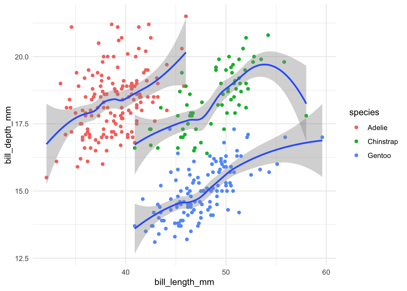
However, it is annoying that the color only applies to the points, but not the smooth line. There are two ways to fix this.
library(ggplot2)
library(palmerpenguins)
ggplot(
data = penguins,
aes(
x = bill_length_mm,
y = bill_depth_mm
)
) +
geom_point(aes(color = species)) +
geom_smooth(aes(group = species, color = species)) +
theme_minimal()species variable is mapped to the color aesthetic for the points.
species variable is mapped to the color aesthetic for the smooth line.

library(ggplot2)
library(palmerpenguins)
ggplot(
data = penguins,
aes(
x = bill_length_mm,
y = bill_depth_mm,
group = species,
color = species
)
) +
geom_point() +
geom_smooth() +
theme_minimal()species variable is mapped to the color aesthetic in the beginning but not in the geom_point() or geom_smooth() functions.
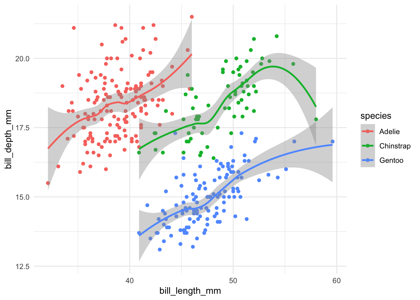
These two approaches produce the same results! In brief, what is included within the ggplot() function is applied to all geometric objects, while what is included within the geom_*() functions is only applied to that specific geometric object. A best practice is, whenver you are unsure, to include the aesthetic mapping in the geom_*() function.
To help you better understand, we can write quite cumbersome codes to achieve the same results :
library(ggplot2)
library(palmerpenguins)
ggplot(
    data = penguins
) +
    geom_point(
        aes(
            x = bill_length_mm,
            y = bill_depth_mm,
            group = species,
            color = species
        )
    ) +
    geom_smooth(
        aes(
            x = bill_length_mm,
            y = bill_depth_mm,
            group = species,
            color = species
        )
    ) +
    theme_minimal()
As we can see, even for x and y, they do not have to be included in the ggplot() function. They can be included in the geom_*() functions.
This exercise aims to show you a common pitall in using ggplot2 with global vs local assignment.
island, and the points are colored by species. Run the following code and see what are the warnings.library(ggplot2)
library(palmerpenguins)
ggplot(
data = penguins,
aes(
x = bill_length_mm,
y = bill_depth_mm
)
) +
geom_point(aes(color = species)) +
geom_smooth(aes(group = island)) +
theme_minimal()`geom_smooth()` using method = 'loess' and formula = 'y ~ x'Warning: Removed 2 rows containing non-finite outside the scale range
(`stat_smooth()`).Warning: Removed 2 rows containing missing values or values outside the scale range
(`geom_point()`).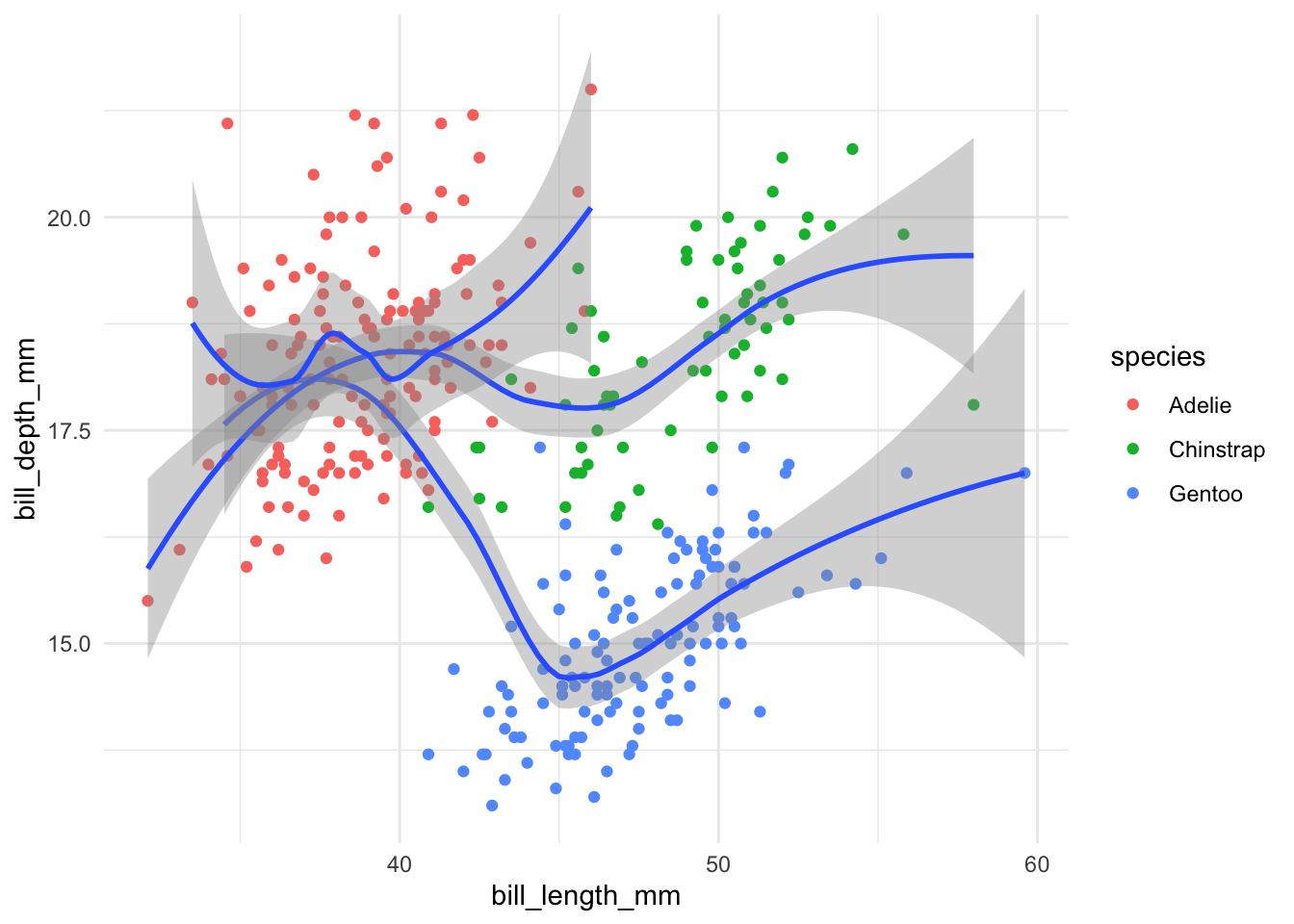
This is slightly more advanced, but it is good to know that the data = * argument can be set globally or locally. For example, I want to have the points for all species, but only the trend line for the Gentoo species.
library(tidyverse)
library(palmerpenguins)
ggplot(
    data = penguins,
    aes(
        x = bill_length_mm,
        y = bill_depth_mm
    )
) +
    geom_point(aes(color = species)) +
    geom_smooth(data = filter(penguins, species == "Gentoo")) +
    theme_minimal()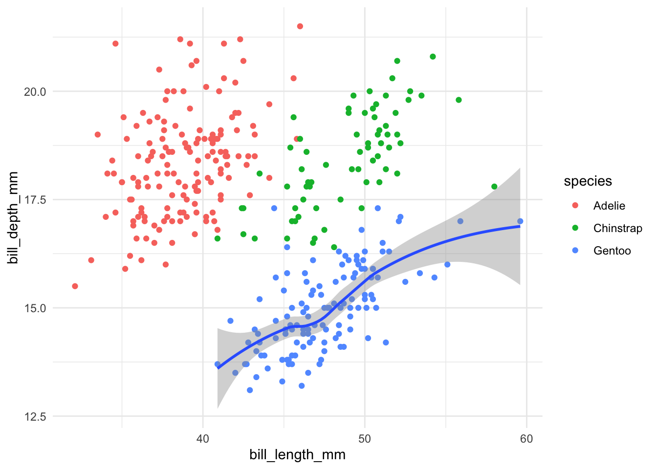
We will explain what the filter() function does when we go to data wrangling. For now, just know that it is used to get the subset of data on species .