pak::pak(c("tidylog", "ggside", "ggpca"))13 Visualizing Association
Packages for this chapter
If you haven’t installed the following packages, run this code:
Understanding how variables are associated is one of the most important aspects of data analysis. We have already seen some examples of association in the previous chapters. But given its importance, we will greatly expand on this topic. In this chapter, we will explore a variety of techniques to visualize these associations.
library(tidyverse)
library(tidylog)
library(palmerpenguins)
theme_set(cowplot::theme_cowplot())
13.1 Marginal distributions
Marginal distributions show the distribution of each variable along the axes of a scatter plot. They provide additional context to understand the spread and density of the data.
A simple way to add marginal information is by using geom_rug(), which adds tick marks along the axes:
penguins |>
    ggplot(aes(x = bill_length_mm, y = bill_depth_mm)) +
    geom_point() +
    geom_rug()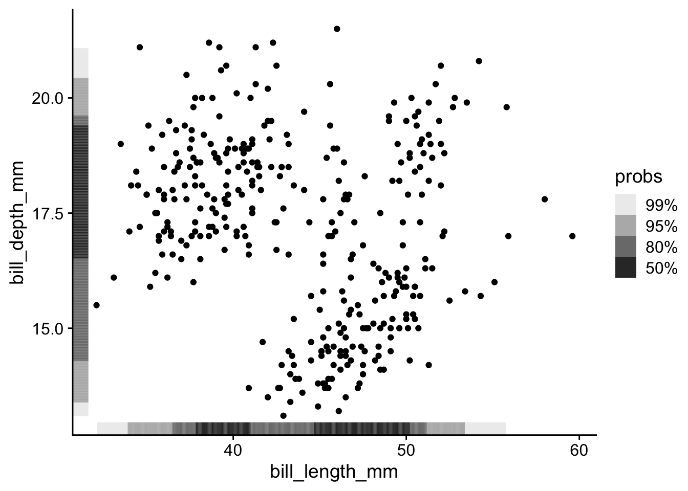
With many points, it becomes difficult to see the marginal distributions. I prefer to use geom_hdr_rug() from ggdensity package:
penguins |>
    ggplot(aes(x = bill_length_mm, y = bill_depth_mm)) +
    geom_point() +
    ggdensity::geom_hdr_rug()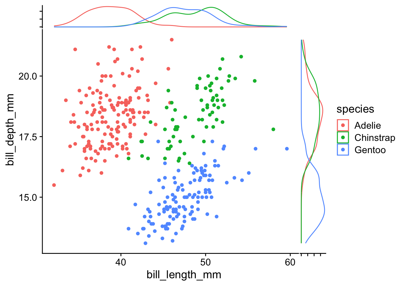
Despite its usefulness, when we have multiple groups, it would be difficult to differentiate the marginal distributions among groups.
For a clearer separation of marginal distributions by group, the ggside package provides density plots along each axis:
library(ggside)
penguins |>
ggplot(aes(x = bill_length_mm, y = bill_depth_mm, color = species)) +
geom_point() +
geom_xsidedensity(aes(y = after_stat(density))) +
geom_ysidedensity(aes(x = after_stat(density))) +
theme(
ggside.axis.text = element_blank()
)- 1
- Add density plot along the x-axis
- 2
- Add density plot along the y-axis
- 3
- Remove side axis text
13.2 Addressing Overplotting
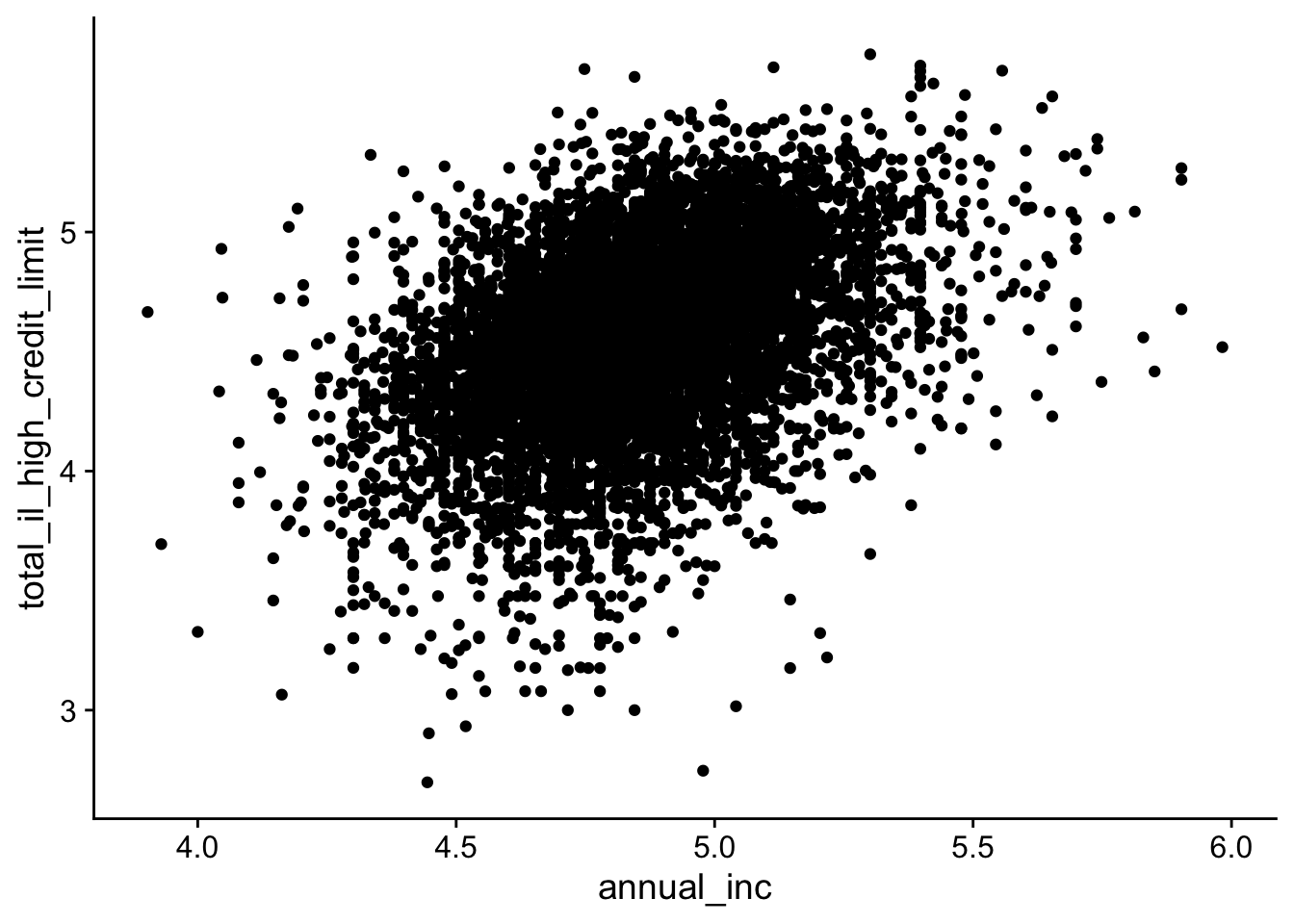
When there are too many points in a scatter plot, overplotting can obscure patterns and lead to misinterpretation (a related real science story here).
We will use the lending_club dataset from the modeldata package to illustrate several strategies for managing overplotting. We fist load and transform the data so that variables spanning several orders of magnitude are easier to visualize (using a log10() transformation):
data(lending_club, package = "modeldata")

lending_club_log10 <- lending_club |>
    mutate(annual_inc = log10(annual_inc)) |>
    mutate(total_il_high_credit_limit = log10(total_il_high_credit_limit)) |>
    filter(is.finite(annual_inc), is.finite(total_il_high_credit_limit))

lending_club_log10 |>
    ggplot(aes(x = annual_inc, y = total_il_high_credit_limit)) +
    geom_point()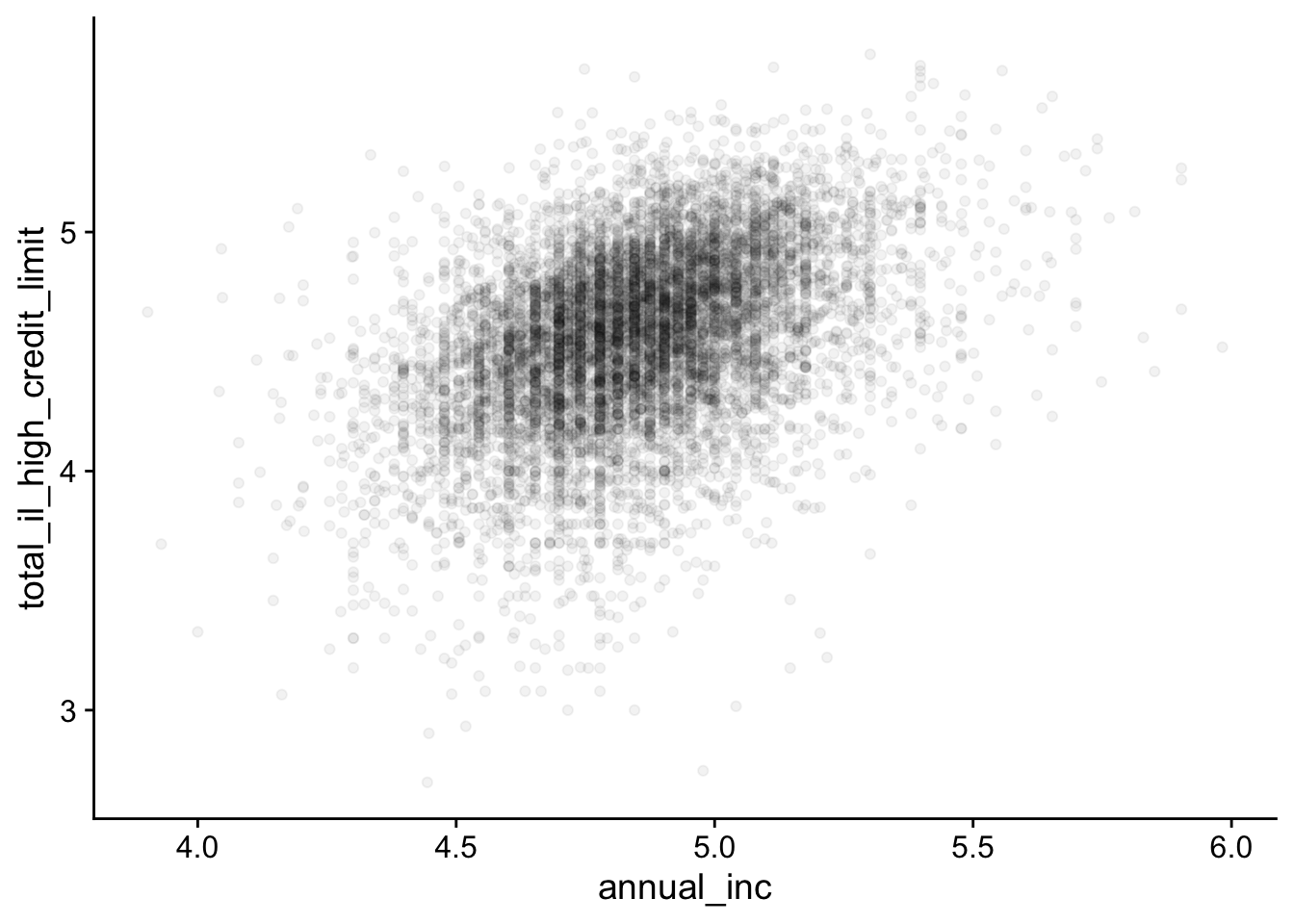
By reducing the transparency (alpha) of points, overlapping points become less dominant:
lending_club_log10 |>
ggplot(aes(x = annual_inc, y = total_il_high_credit_limit)) +
geom_point(alpha = 0.05)- 1
- Tune the transparency
For example, alpha = 0.05 means that 20 overlapping points are equivalent to 1 opaque point.
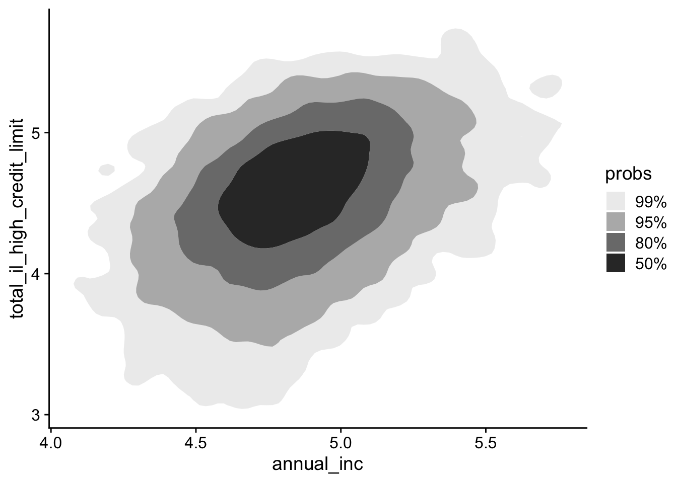
Instead of plotting every individual point, you can visualize the density of points using counter plots. We will use the ggdensity package to help with this.
lending_club_log10 |>
ggplot(aes(x = annual_inc, y = total_il_high_credit_limit)) +
ggdensity::geom_hdr()- 1
- Add a 2D counter plot
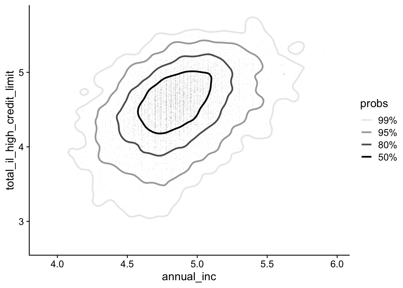
Alternatively, you can overlay density contours on top of a scatter plot:
lending_club_log10 |>
ggplot(aes(x = annual_inc, y = total_il_high_credit_limit)) +
ggdensity::geom_hdr_lines() +
geom_point(pch='.', color = 'black', size = 0.5, alpha = 0.05)- 1
- Add density contours only
- 2
- Add points with low transparency
Note that we used pch='.'. This makes data points as non-aliased single pixels. It greatly speed up rendering (which could take forever if you have a lot of points).
Want it even faster?
The package scattermore (link) provides an insanely fast way to render scatter plots. For most use cases, it won’t matter that much, but it is always good to know you have options.
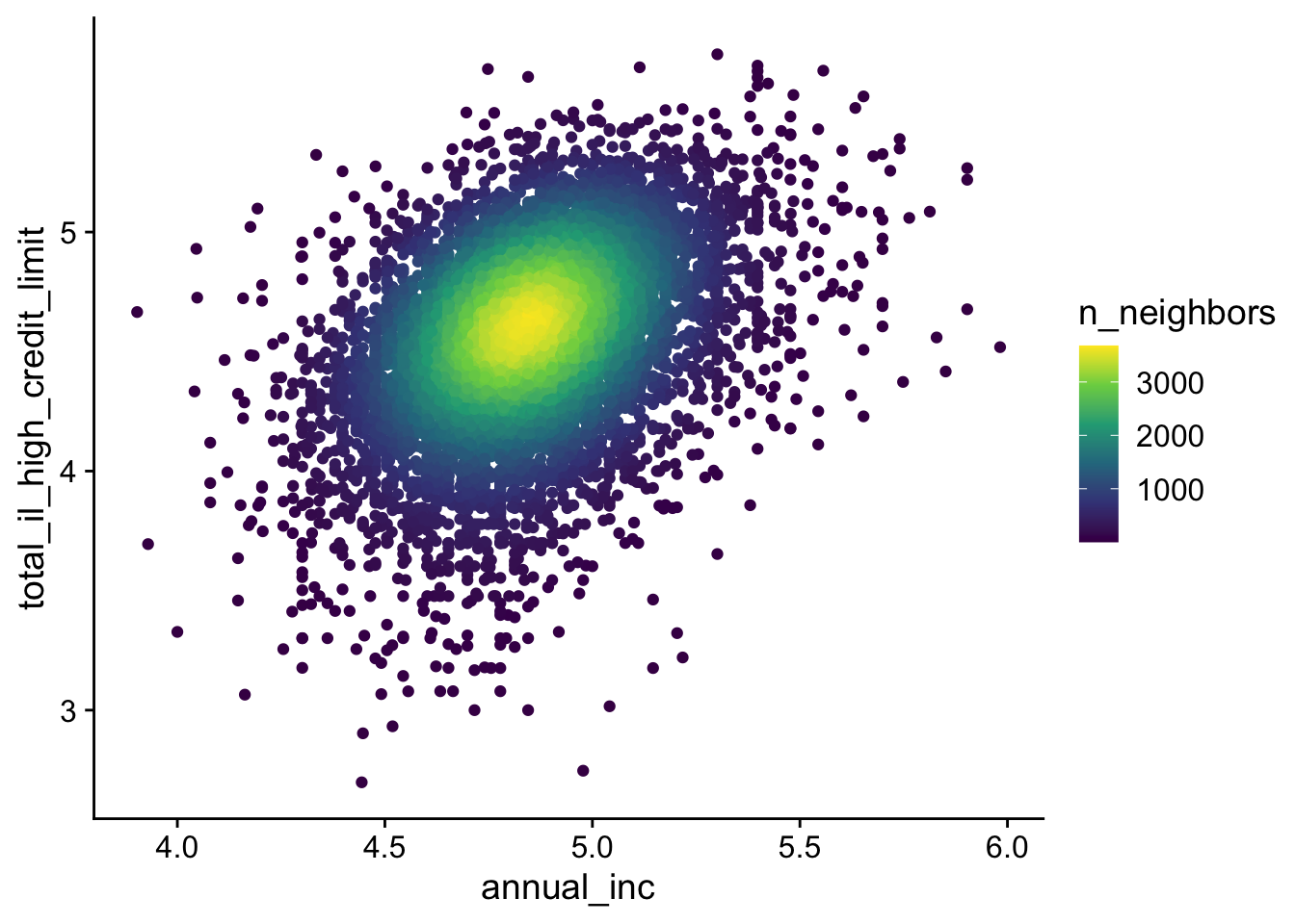
The ggpointdensity package colors points based on the local point density, highlighting areas of high concentration. It is a combination of two best worlds.
lending_club_log10 |>
ggplot(aes(x = annual_inc, y = total_il_high_credit_limit)) +
ggpointdensity::geom_pointdensity() +
scale_color_viridis_c()- 1
- Use viridis color palette (generally preferred over the default)
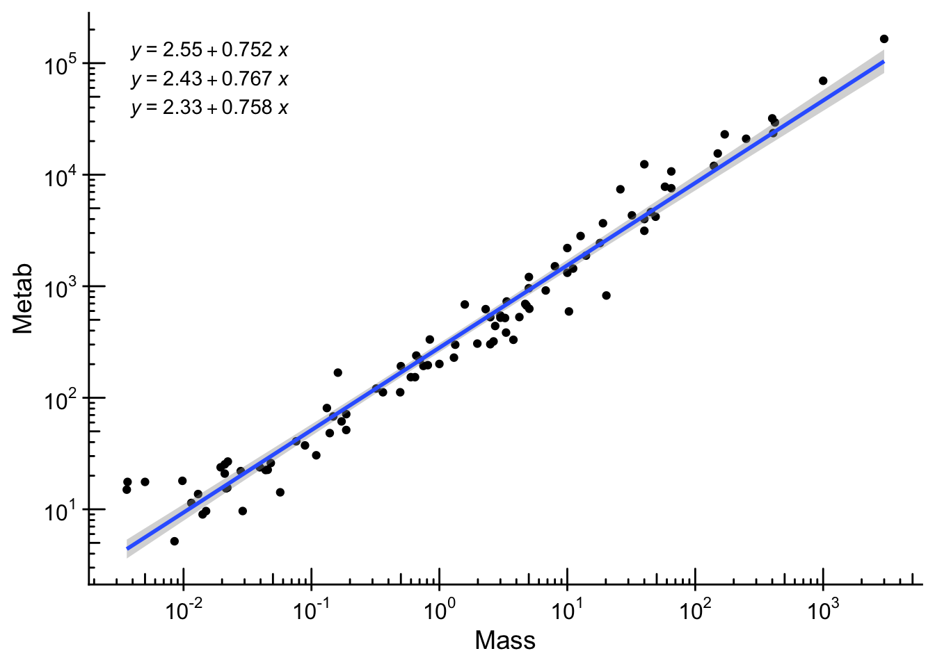
13.3 Axis Transformation
Because data can span several orders of magnitude, we often use log transformed axes. It is straightforward to do so in ggplot2. We will test the famous Kleiber’s law on how metabolic rate scales with body mass. We use the ex0826 dataset from the Sleuth3 package.
data(ex0826, package = "Sleuth3")

ex0826 |>
    ggplot(aes(x = Mass, y = Metab)) +
    geom_point() +
    scale_x_log10(
        breaks = scales::trans_breaks("log10", function(x) 10^x),
        labels = scales::trans_format("log10", scales::math_format(10^.x))
    ) +
    scale_y_log10(
        breaks = scales::trans_breaks("log10", function(x) 10^x),
        labels = scales::trans_format("log10", scales::math_format(10^.x))
    ) +
    annotation_logticks() +
    geom_smooth(method = "lm") +
    ggpmisc::stat_quant_eq()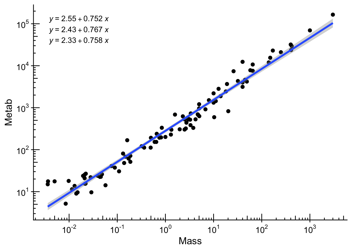
Log plots are super useful. However, it warrants caution as it may not be as intuitive as it seems (see a recent study).
Additionally, visual associations cannot replace rigorous statistical tests. As scientists, we should always put ourselves to a high standard to avoid artefacts (see two related scientific debates here and here).
13.4 High-Dimensional Data
When dealing with multiple variables, it is often insightful to explore relationships beyond simple 2D plots. We illustrate two common approaches with the penguins dataset.
penguins_small <- penguins |>
    select(species, bill_length_mm, bill_depth_mm, flipper_length_mm, body_mass_g) |>
    drop_na()
select: dropped 3 variables (island, sex, year)
drop_na: removed 2 rows (1%), 342 rows remaining13.4.1 Pairwise plots
Pairwise plots (or scatterplot matrices) allow you to visualize the relationships between all pairs of variables in a dataset. They are especially useful for exploratory data analysis. We will use the GGally package to create these plots.
penguins_small |>
    GGally::ggpairs()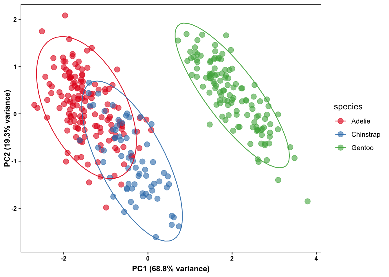
13.4.2 Dimension reduction
Dimension reduction techniques help summarize high-dimensional data into two or three dimensions, making it easier to visualize complex relationships. Although many packages exist, we will use the ggpca package as it offers several options (e.g., PCA, t-SNE, UMAP) through a consistent interface.
library(ggpca)
penguins_small |>
ggpca(
metadata_cols = "species",
mode = "pca",
color_var = "species",
ellipse = TRUE
)- 1
- Column to use for grouping/metadata
- 2
- Choose PCA; change to “tsne” or “umap” as desired
- 3
- Color points by species
- 4
- Add ellipses for group boundaries

While dimension reduction techniques are powerful, they can sometimes be misleading. They simplify complex relationships and might hide important nuances of the data. For more insights on potential pitfalls, see this article.