pak::pak(c("patchwork", "plotly", "ggiraph", "gganimate", "ggreveal"))24 Additional Topics in Data Visualization
Class Objectives
- Combine multiple plots using the awesome patchwork package.
- Make interactive plots to let your audience dive into your data.
- Create animated visualizations to clearly show patterns and changes over time.
Packages for this chapter
If you haven’t installed the following packages, run this code:
You’ve done great exploring data visualization so far. Now, let’s dive into some exciting extras that’ll really make your visualizations stand out—perfect for your papers, presentations, or blog posts!
24.1 Combining Plots with patchwork
Did you know that most academic journals limit you to about 6 figures per paper? To squeeze more information into fewer figures, you can combine multiple plots into one tidy visual (just a random exmaple I found online). The easiest and most intuitive way to do this is with the patchwork package—seriously, once you try it, you’ll never go back!
library(tidyverse)
library(patchwork)
library(palmerpenguins)
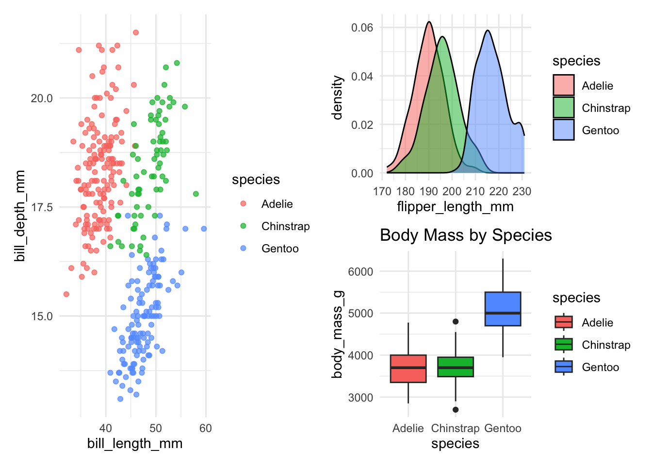
# First plot: Scatter plot
p1 <- ggplot(penguins, aes(x = bill_length_mm, y = bill_depth_mm, color = species)) +
geom_point(alpha = 0.7) +
theme_minimal()
# Second plot: Density plot
p2 <- ggplot(penguins, aes(x = flipper_length_mm, fill = species)) +
geom_density(alpha = 0.5) +
theme_minimal()Use the + operator to combine plots horizontally:
p1 + p2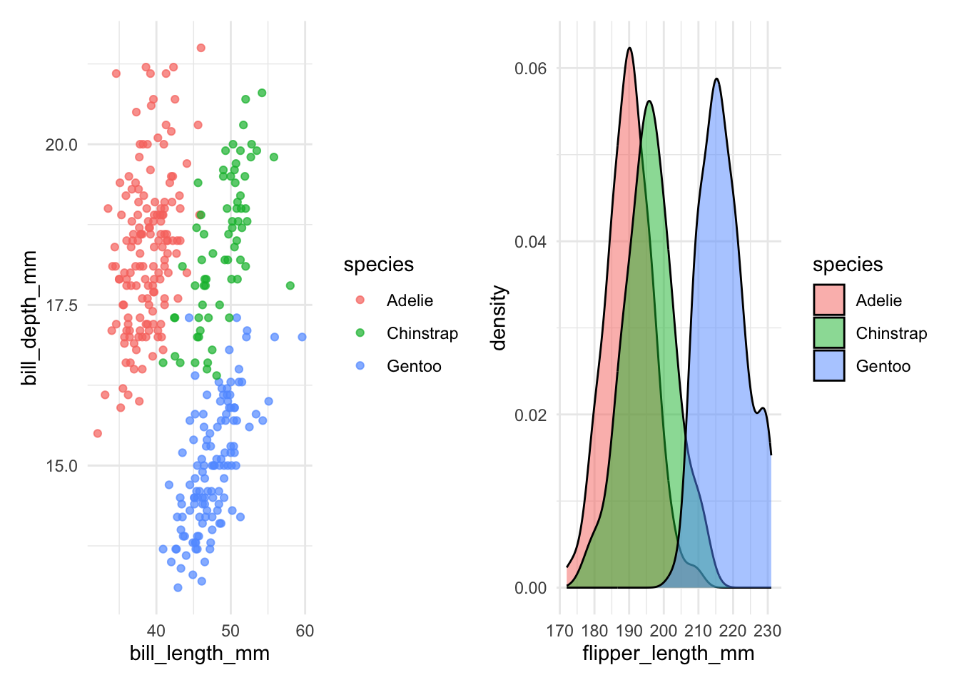
Use the / operator to combine plots vertically:
p1 / p2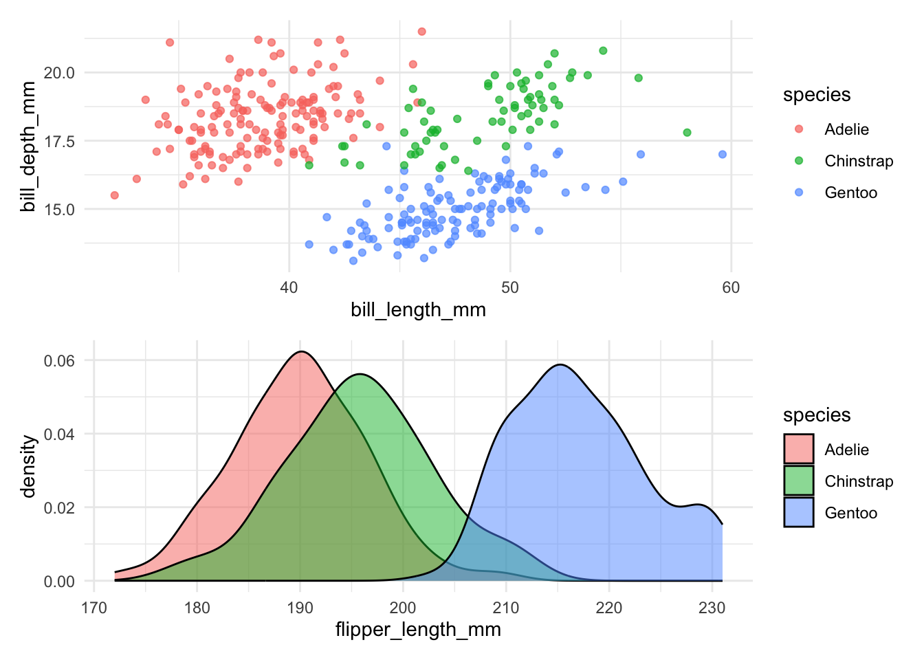
Combine multiple plots in a single line of code:
p3 <- ggplot(penguins, aes(x = species, y = body_mass_g)) +
geom_boxplot(aes(fill = species)) +
labs(title = "Body Mass by Species") +
theme_minimal()
(p1 | (p2 / p3))- 1
- Complex layout: p1 on top, p2 and p3 side-by-side below
Let’s explore the advanced features of patchwork with one practical example:
p1 +
(p2 + guides(fill = "none")) +
plot_layout(
widths = c(5, 2)
) +
plot_layout(guides = "collect") +
plot_annotation(
tag_levels = "A"
) &
hrbrthemes::theme_ipsum()- 1
- Remove the legend from the first plot
- 2
- Left plot takes up 1/3 of the width
- 3
- Add a title to the entire composition
- 4
- Use Roman numerals for panel labels
- 5
-
Using
&as this applies the theme to the entire composition
24.2 Creating Interactive Plots
Unfortunately, interactive plots can’t be included in traditional academic papers (bummer!), but they’re incredibly effective for presentations, blogs, or web-based content, letting viewers actively explore your data.
Plotly offers the easist way to turn a ggplot2 static figure to an interactive version. Just plot as alwas, then use ggplotly() to convert it to an interactive plot.
library(plotly)
# Create basic ggplot as usual
p_plotly <- penguins |>
ggplot(aes(x = bill_length_mm, y = bill_depth_mm, color = species)) +
geom_point(
aes(text = paste(
"Species:", species,
"<br>Island:", island,
"<br>Body mass:", body_mass_g, "g"
)),
alpha = 0.7
) +
theme_minimal()
# Convert to plotly
ggplotly(p_plotly, tooltip = "text")- 1
-
is used to create a line break in the tooltip
The ggiraph package converts ggplot2 graphics to interactive SVG elements. You need to specify clearly what geom you want to be interactive, but is generally more flexible than plotly.
library(ggiraph)
# Create interactive scatter plot with tooltips
p_ggiraph <- penguins |>
ggplot(aes(x = bill_length_mm, y = bill_depth_mm, color = species)) +
geom_point_interactive(
aes(
tooltip = paste(
"Species:", species,
"<br>Bill length:", bill_length_mm, "mm",
"<br>Bill depth:", bill_depth_mm, "mm"
),
data_id = sex
),
size = 3, alpha = 0.7
) +
theme_minimal()
girafe(ggobj = p_ggiraph) |>
girafe_options(opts_zoom(max = 5))- 1
- Specify the tooltip content
- 2
- Specify the data_id to be used as a unique identifier
- 3
- Render the interactive plot
- 4
- Add zooming functionality
dygraphs for time series
A great tool for interactive time series plots is the dygraphs package. It allows you to zoom in and out of the time series, highlight specific time periods, and display additional information on hover. It has a different syntax than ggplot2, but it’s worth learning if you work with time series data.
24.3 Animated Visualizations
Animations are awesome for illustrating changes over time or differences between groups. They’re engaging and clearly communicate your story, especially during presentations.
Smoothly animate plots over continuous changes (like time). The key new function is transition_reveal() which reveals data points, lines (or other geom) over time.
library(gganimate)
economics |>
ggplot(aes(x = date, y = unemploy)) +
geom_line(linewidth = 1, color = "#0072B2") +
geom_point(color = "white", fill = "#0072B2", shape = 21, size = 4) +
transition_reveal(date) +
labs(title = "Unemployment Rate Over Time") +
theme_minimal()- 1
- Transition the plot by revealing data points over time
To save the animation as a GIF, use the anim_save() function.
For discrete groups, sometimes it is easier to just use ggreveal. It creates a series of plots, showing how this plot is being built
library(ggreveal)

p <- penguins  |>
    filter(!is.na(sex))  |>
    ggplot(aes(body_mass_g, bill_length_mm,
               group=sex, color=sex)) +
    geom_point() +
    geom_smooth(method="lm", formula = 'y ~ x', linewidth=1) +
    facet_wrap(~species) +
    theme_minimal()

reveal_groups(p)