pak::pak(c("ggforce", "ggiraph", "ggtext", "jtools", "MetBrewer", "datasauRus"))6 First Publication-Ready Figure
Class Objectives
- Understand the design principles of a good figure
- How to customize a ggplot2 figure
- How to export a figure for publication
Packages for this chapter
If you haven’t installed the following packages, run this code:
While many ggplot2 tutorials dive headfirst into creating various plot types (e.g., bar plots, line plots – the usual suspects). We’ll get to those, but first, let’s talk about what truly sets ggplot2 apart: its powerful customization. Although other plotting libraries might offer seemingly magical one-line solutions, these rarely survive contact with the harsh realities of academic publication and presentation. Effective visualizations require careful customization to address specific research questions. This guide covers key steps to create self-contained, informative, and aesthetically pleasing graphics—graphics that will make your readers (and reviewers) happy.
First, let’s rewind to where we left off in the previous chapter:
library(ggplot2)
library(palmerpenguins)
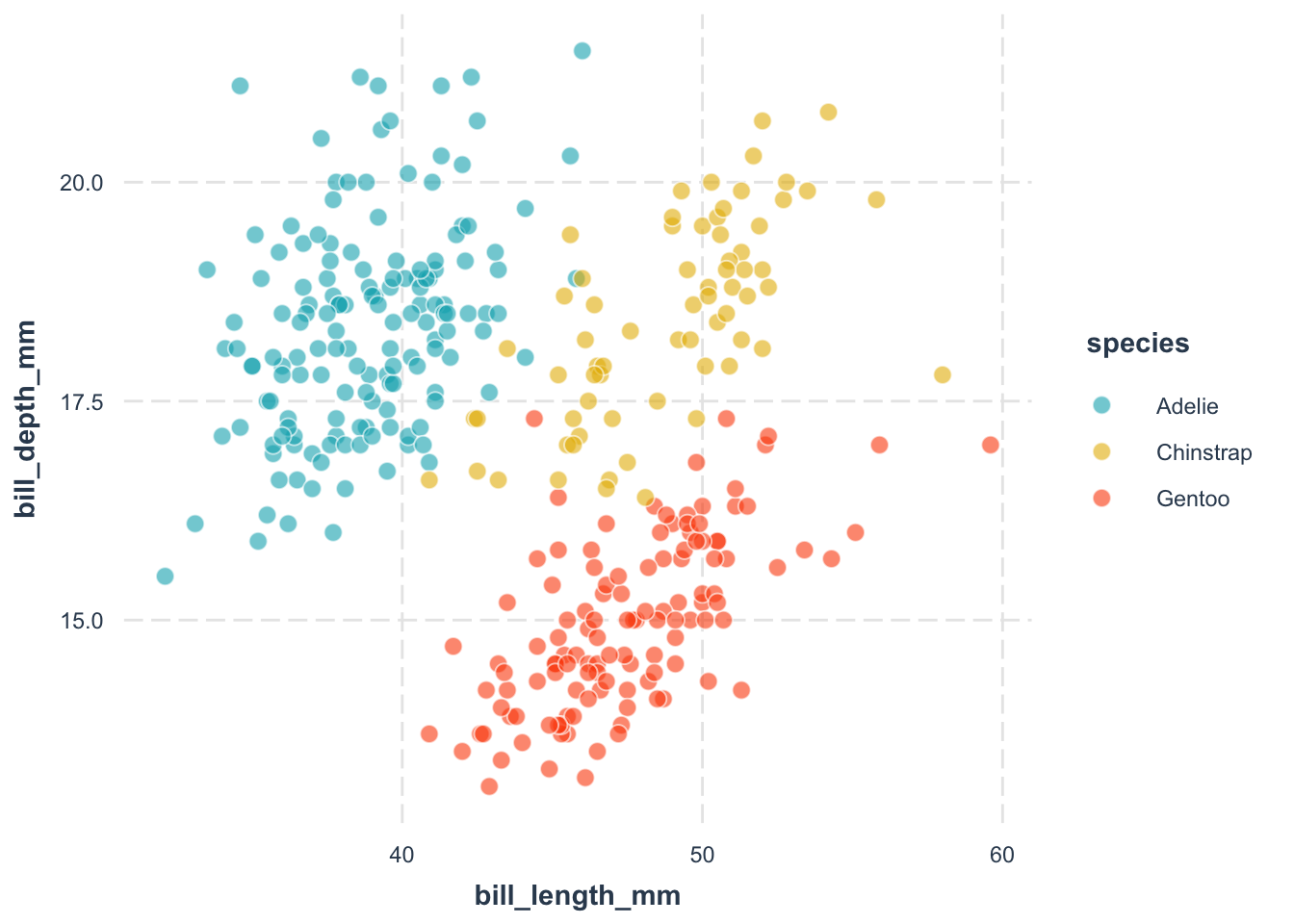
ggplot(
data = penguins,
aes(
x = bill_length_mm,
y = bill_depth_mm
)
) +
geom_point(aes(color = species)) +
theme_minimal()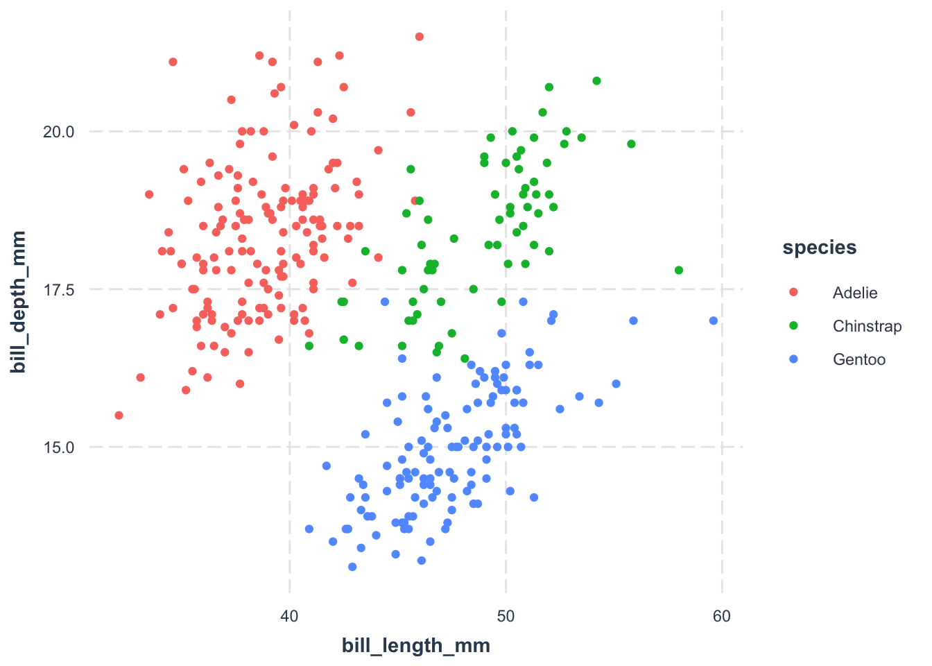
6.1 Choose a Good Theme
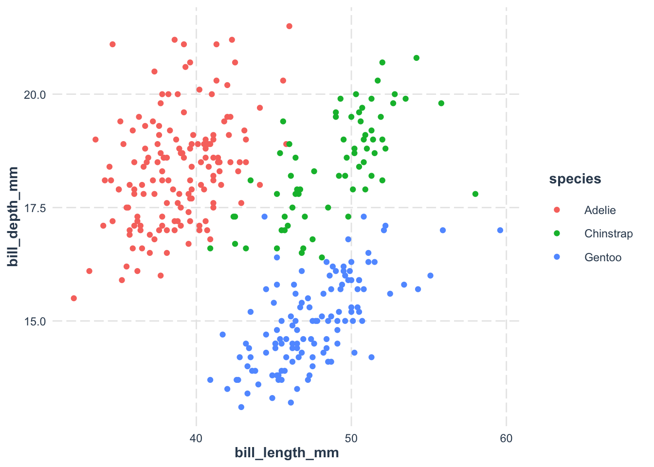
Remember, themes control the non-data elements of your plot. In the ggplot2 universe, the theme_*() functions offer opinionated customization options to tweak your plot’s appearance. Picking a theme you like can save you a boatload of time. Here are some choices I like:
I have a soft spot for theme_nice() from the jtools package. It’s clean, minimalistic, and easy on the eyes.
library(ggplot2)
library(palmerpenguins)
ggplot(
data = penguins,
aes(
x = bill_length_mm,
y = bill_depth_mm
)
) +
geom_point(aes(color = species)) +
jtools::theme_nice()- 1
-
We use the
theme_nice()function from thejtoolspackage to apply thenicetheme to the plot. If you have not installedjtoolspackage yet, just runinstall.packages("jtools").
ggthemr offers a delightful collection of themes for ggplot2. It’s not on CRAN, so you’ll need to install it from GitHub.
library(devtools)
install_github('Mikata-Project/ggthemr')
Here’s how to use the fresh theme in it, one of my favorites.
library(ggplot2)
library(palmerpenguins)

ggplot(
    data = penguins,
    aes(
        x = bill_length_mm,
        y = bill_depth_mm
    )
) +
  geom_point(aes(color = species)) +
  ggthemr::ggthemr('fresh', set_theme = FALSE)$theme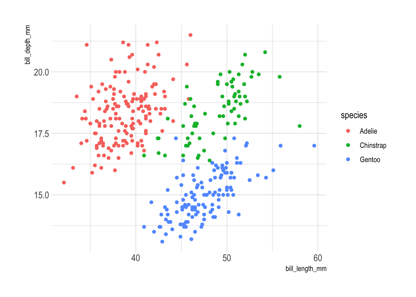
For more options, check out its GitHub page
Another contender is hrbrthemes, which also offers a suite of ggplot2 themes. I’m not its biggest fan, but it is quite popular.
library(ggplot2)
library(palmerpenguins)

ggplot(
    data = penguins,
    aes(
        x = bill_length_mm,
        y = bill_depth_mm
    )
) +
  geom_point(aes(color = species)) +
  hrbrthemes::theme_ipsum()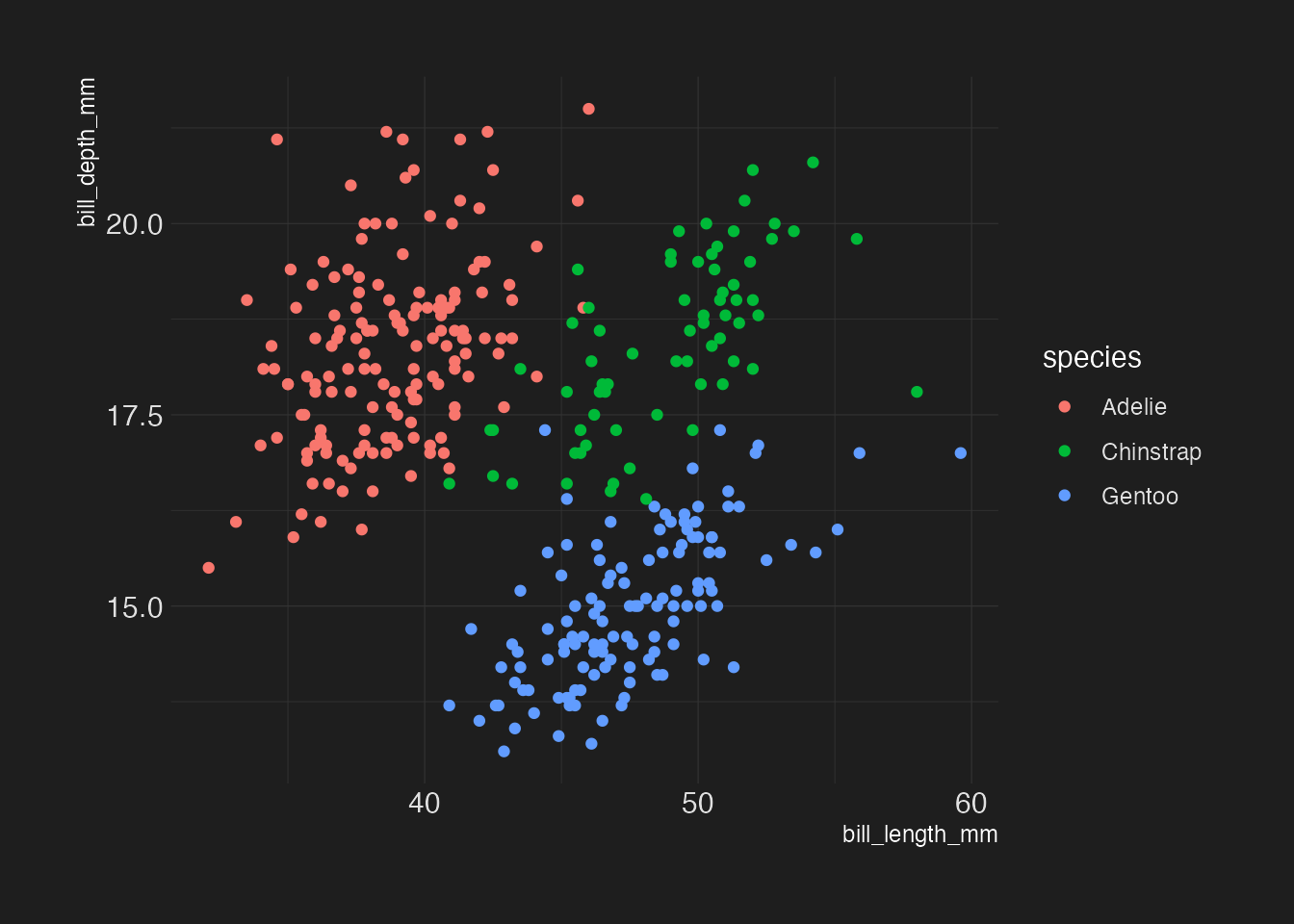
For those who prefer dark background, hrbrthemes has you covered:
library(ggplot2)
library(palmerpenguins)
ggplot(
    data = penguins,
    aes(
        x = bill_length_mm,
        y = bill_depth_mm
    )
) +
  geom_point(aes(color = species)) +
  hrbrthemes::theme_modern_rc()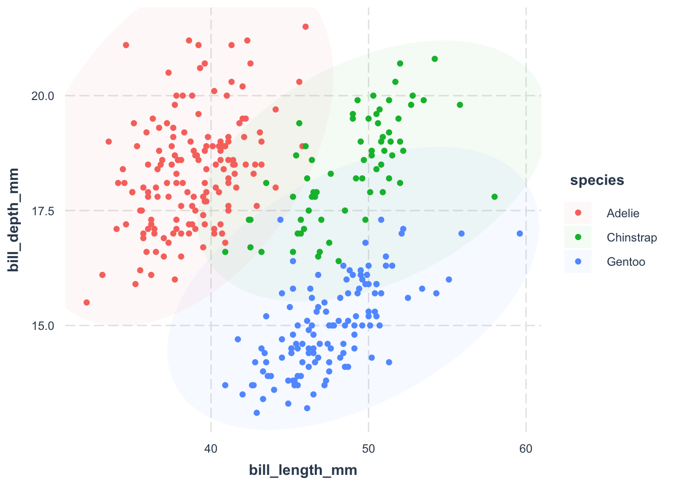
There are many other themes out there, so feel free to explore and find one that suits your style.
Exercise
iris is a widely known dataset introduced by Ronald Fisher. It contains three plant species and four features measured for each sample. We will use this dataset to explore the association between Sepal.Width and Petal.Width as exercise throughout this Chapter. Try three different themes on the iris dataset:
As one example, you can use jtools::theme_nice() as the theme.
6.2 Customizing the Geometry
A common issue with scatter plots is that the boundary of points are unclear among different groups. We will use a new geometric object to lay the boundary of the points clear. We will use the package ggforce to add an ellipse around the points. As usually, if you have not installed the package yet, just run install.packages("ggforce").
library(ggplot2)
library(palmerpenguins)
ggplot(
data = penguins,
aes(
x = bill_length_mm,
y = bill_depth_mm
)
) +
ggforce::geom_mark_ellipse(
aes(fill = species),
alpha = 0.05,
color = 'transparent'
) +
geom_point(aes(color = species)) +
jtools::theme_nice()- 1
-
We use the
geom_mark_ellipse()function from theggforcepackage to add an ellipse around the points. - 2
-
We fill the ellipse differently by species using the
fill = speciesargument. - 3
- We make the ellipse more transparent as we don’t want it to be too distracting.
- 4
-
We make the border of the ellipse transparent using the
color = 'transparent'argument.
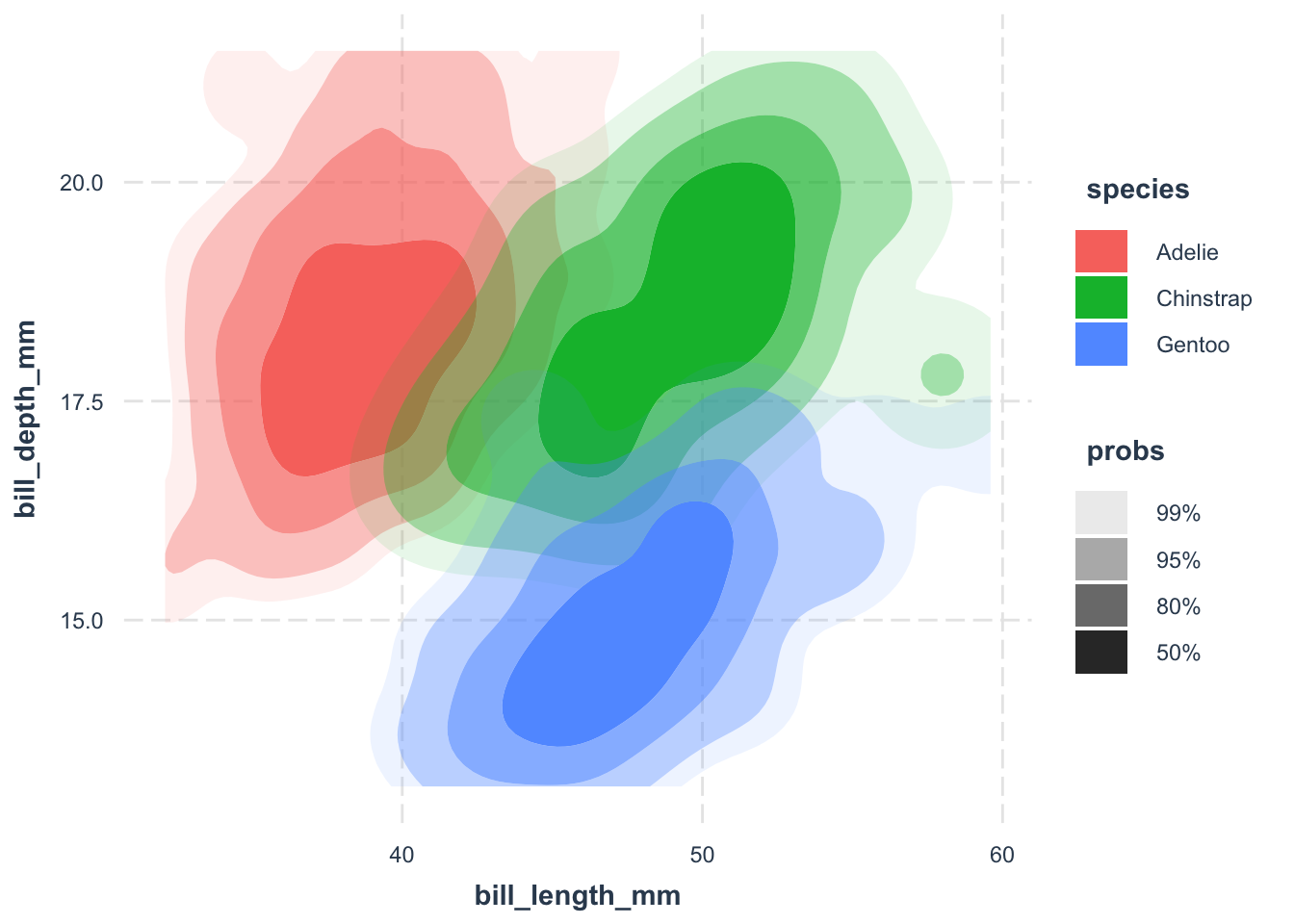
Using a Density Geometry
ggforce::geom_mark_ellipse() is a great way to show the distribution of points. However, it may not be the best choice for large datasets, especially when we want to show the density of points.
library(ggplot2)
library(palmerpenguins)
ggplot(
data = penguins,
aes(
x = bill_length_mm,
y = bill_depth_mm
)
) +
ggdensity::geom_hdr(aes(fill = species)) +
# geom_point(shape = 21) +
jtools::theme_nice()- 1
-
We use the
geom_hdr()function from theggdensitypackage to create a density plot. Thefill = speciesargument specifies that we want to fill the density plot with the color of the species. - 2
-
We use the
geom_point()function to add points to the density plot. Theshape = 21argument specifies that we want to use point shape 21, which is a circle with a border.

The default points are aesthetically not pleasing, at least to me. Customizing them can make your plot visually appealing. A common trick is to use point shape 21—a circle with a border. Fill the circle with the species color, add some transparency, and give it a white border. This way, overlapping points don’t turn into an unrecognizable blob.
library(ggplot2)
library(palmerpenguins)
ggplot(
data = penguins,
aes(
x = bill_length_mm,
y = bill_depth_mm
)
) +
ggforce::geom_mark_ellipse(
aes(fill = species),
alpha = 0.05,
color = 'transparent'
) +
geom_point(
aes(fill = species),
color = "white",
shape = 21,
alpha = .6,
size = 3
) +
jtools::theme_nice()- 1
-
We fill the points with the color of the species using the
fill = speciesargument. - 2
-
We make the border of the points white using the
color = "white"argument. - 3
-
We use point shape 21, which is a circle with a border, using the
shape = 21argument. - 4
-
We make the points slightly transparent using the
alpha = .6argument. - 5
-
We increase the size of the points using the
size = 3argument.
A Fancy Trick (Just in Case)
library(ggplot2)
library(palmerpenguins)
ggplot(
    data = penguins,
    aes(
        x = bill_length_mm,
        y = bill_depth_mm
    )
) +
  geom_point(
    aes(
      fill = species,
      size = body_mass_g
    ),
    shape = 21,
    color = "transparent",
    alpha = .3
  ) +
  geom_point(
    aes(
      size = body_mass_g
    ),
    shape = 21,
    color = "white",
    fill = "transparent"
  ) +
  jtools::theme_nice()
We’ve got points colored by species. However, when people print it out in black and white, they may not be able to distinguish the points. Let’s assign different shapes to each species for better clarity. To be concistent, we use other hollow shapes for points.
library(ggplot2)
library(palmerpenguins)
ggplot(
data = penguins,
aes(
x = bill_length_mm,
y = bill_depth_mm
)
) +
ggforce::geom_mark_ellipse(
aes(fill = species),
alpha = 0.05,
color = 'transparent'
) +
geom_point(
aes(
shape = species,
fill = species
),
color = "white",
size = 3,
alpha = .6
) +
scale_shape_manual(values = c(21, 22, 23)) +
jtools::theme_nice()- 1
-
We fill the points with the color of the species using the
fill = speciesargument. - 2
-
We use different shapes for each species using the
scale_shape_manual(values = c(21, 22, 23))argument. Nobody can remeber the meanings of these numbers, so just google when you need to.
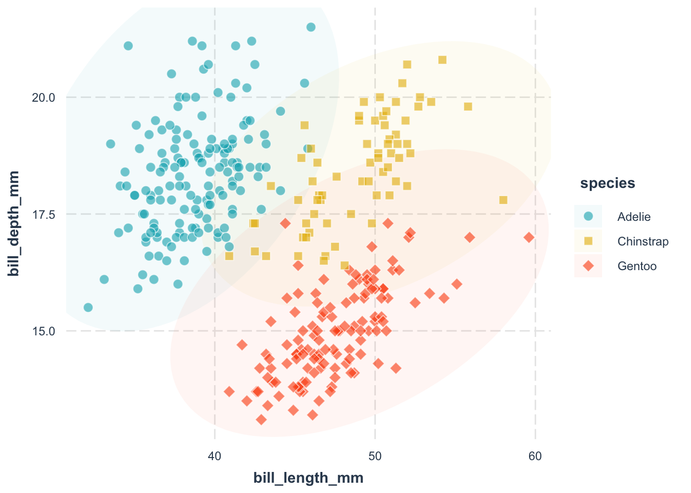
Now, points are distinguishable by both color and shape. Voilà!
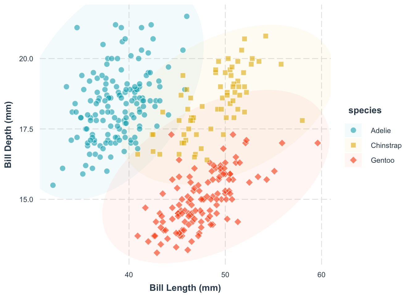
If you are unhappy with the default color palette, you can change it. Here, we use the scale_fill_manual() function to specify the fill color of each species:
library(ggplot2)
library(palmerpenguins)
p <- ggplot(
data = penguins,
aes(
x = bill_length_mm,
y = bill_depth_mm
)
) +
ggforce::geom_mark_ellipse(
aes(fill = species),
alpha = 0.05,
color = 'transparent'
) +
geom_point(
aes(
shape = species,
fill = species
),
color = "white",
size = 3,
alpha = .6
) +
scale_shape_manual(values = c(21, 22, 23)) +
scale_fill_manual(
values = c(
"Adelie" = "#00AFBB",
"Chinstrap" = "#E7B800",
"Gentoo" = "#FC4E07"
)
) +
jtools::theme_nice()
p- 1
-
We change the fill of the points using the
scale_fill_manual()function. - 2
-
We specify the fill of the Adelie species using the
Adelie = "#00AFBB"argument. - 3
-
We specify the fill of the Chinstrap species using the
Chinstrap = "#E7B800"argument. - 4
-
We specify the fill of the Gentoo species using the
Gentoo = "#FC4E07"argument.
A Short Cut (Not Recommended)
library(ggplot2)
library(palmerpenguins)

ggplot(
    data = penguins,
    aes(
        x = bill_length_mm,
        y = bill_depth_mm
    )
) +
  geom_point(
    aes(fill = species),
    color = "white",
    shape = 21,
    alpha = .6,
    size = 3
  ) +
  scale_fill_manual(
    values = c("#00AFBB", "#E7B800", "#FC4E07")
  ) +
  jtools::theme_nice()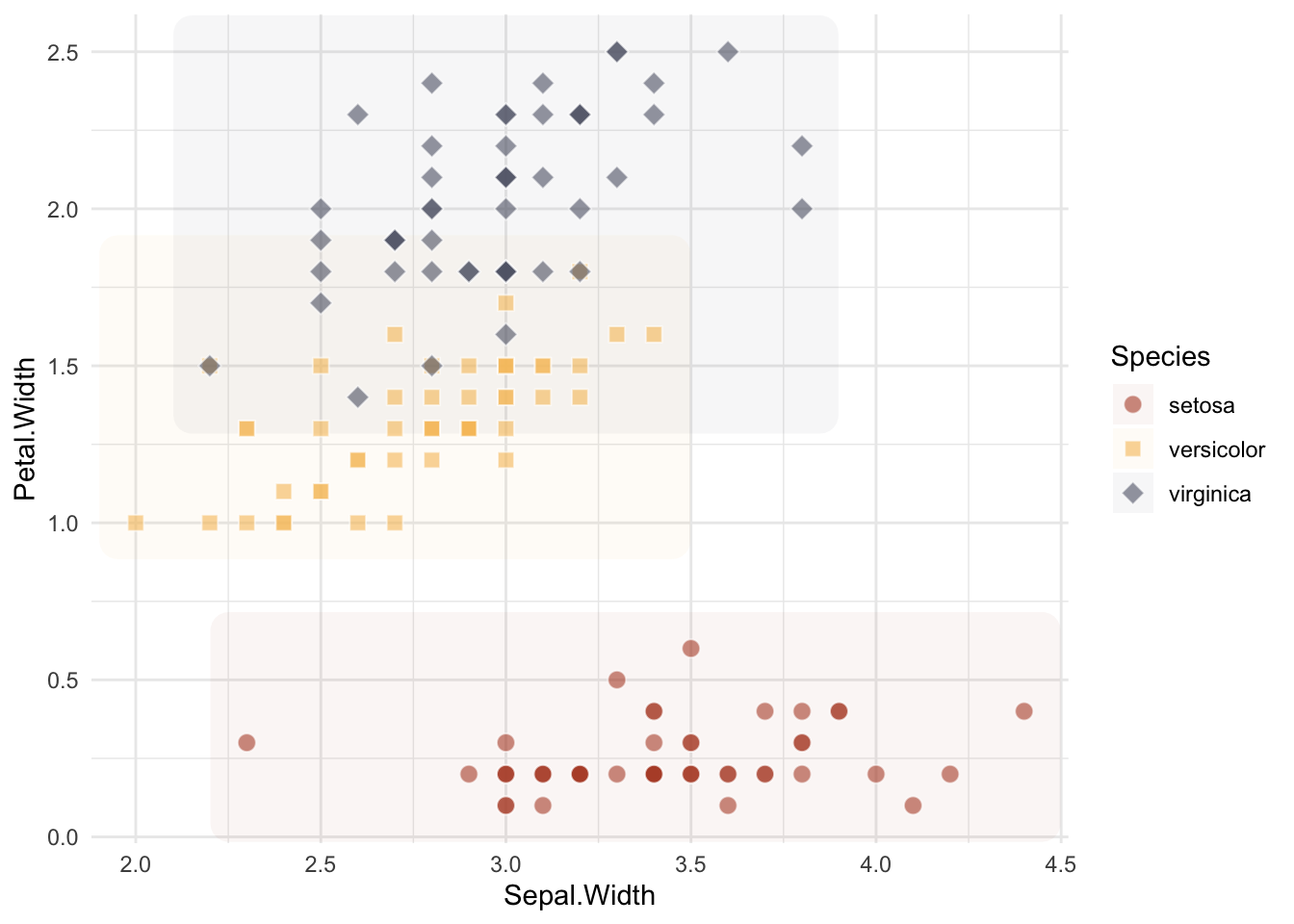
While we have saved a few lines of code, it is not recommended. It is better to use the specific names as keys, so that you can be absolutely sure what color is assigned to which species.
Choose colors wisely. Everyone has their own preferences, but there are some guidelines for best practice. We will get back to this topic later. But for now, I recommend some fun and artsy palettes:
For instance, to use a palette from the MoMAColors package, you can either explicitly give the palette using scale_fill_manual or directly use the package’s convenience function scale_fill_moma_d():
library(ggplot2)
library(palmerpenguins)
ggplot(
data = penguins,
aes(
x = bill_length_mm,
y = bill_depth_mm
)
) +
geom_point(
aes(fill = species),
color = "white",
shape = 21,
alpha = .6,
size = 3
) +
MoMAColors::scale_fill_moma_d("Klein") +
jtools::theme_nice()- 1
-
We use
scale_fill_moma_d("Klein")to directly apply the ‘Klein’ discrete palette from theMoMAColorspackage.
my_colors <- MoMAColors::moma.colors("Lupi", n=5, type="discrete")
ggplot(
data = penguins,
aes(
x = bill_length_mm,
y = bill_depth_mm
)
) +
geom_point(
aes(fill = species),
color = "white",
shape = 21,
alpha = .6,
size = 3
) +
scale_fill_manual(
values = c(
"Adelie" = my_colors[1],
"Chinstrap" = my_colors[3],
"Gentoo" = my_colors[5]
)
) +
jtools::theme_nice()- 1
- Extract a larger palette to pick specific colors. It is a vector of colors.
- 2
- We generate a 5-color palette, but selectively assign specific colors (by their index) from it to our species. This gives us precise control over which exact shade from the palette represents each group.
And if you are adventurous, almost all palettes are accessible from the paletteer package (link).
Exercise
Let us apply what we have learnt so far. Below is a simple scatter plot of the iris dataset. Your task is to customize the plot with:
- customized point shape for each species
- use a non-default color.
- add point cloud boundary for each species (try
ggforce::geom_mark_ellipse(),ggforce::geom_mark_hull()andggforce::geom_mark_rect())
library(ggplot2)

ggplot(
    data = iris,
    aes(
        x = Sepal.Width,
        y = Petal.Width
    )
) +
  ggforce::geom_mark_rect(
    aes(fill = Species),
    alpha = 0.05,
    color = 'transparent'
  ) +
  geom_point(
      aes(
          shape = Species,
          fill = Species
      ),
      color = "white",
      size = 3,
      alpha = .6
  ) +
  scale_shape_manual(values = c(21, 22, 23)) +
  scale_fill_manual(
    values = MetBrewer::met.brewer("Demuth", n=3, type="discrete")
  ) +
  theme_minimal()
Registered S3 method overwritten by 'MetBrewer':
method from
print.palette MoMAColors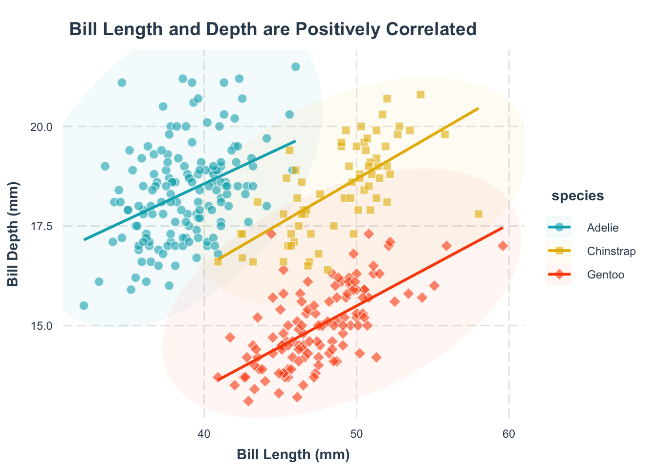
6.3 Make the Plot More Self-Contained
The rule of thumb is to make your plot as self-contained as possible. Ideally, the reader should be able to understand the plot without referring to the text. There are many steps to achieve this, but we will focus on the most important ones for now.
Clarity starts with clear labels. Use the labs() function to name your axes.
p +
labs(
x = "Bill Length (mm)",
y = "Bill Depth (mm)"
)- 1
-
We add a label to the x-axis using the
x = "label text"argument. - 2
-
We add a label to the y-axis using the
y = "label text"argument.
We will get back to labelling later (with the library ggtext and ggrepel), but for now, let’s keep it simple.
Notice how we add the layer directly to the plot p from the previous figure. This is a common (and very powerful) trick in ggplot2.
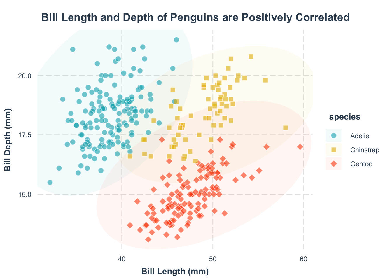
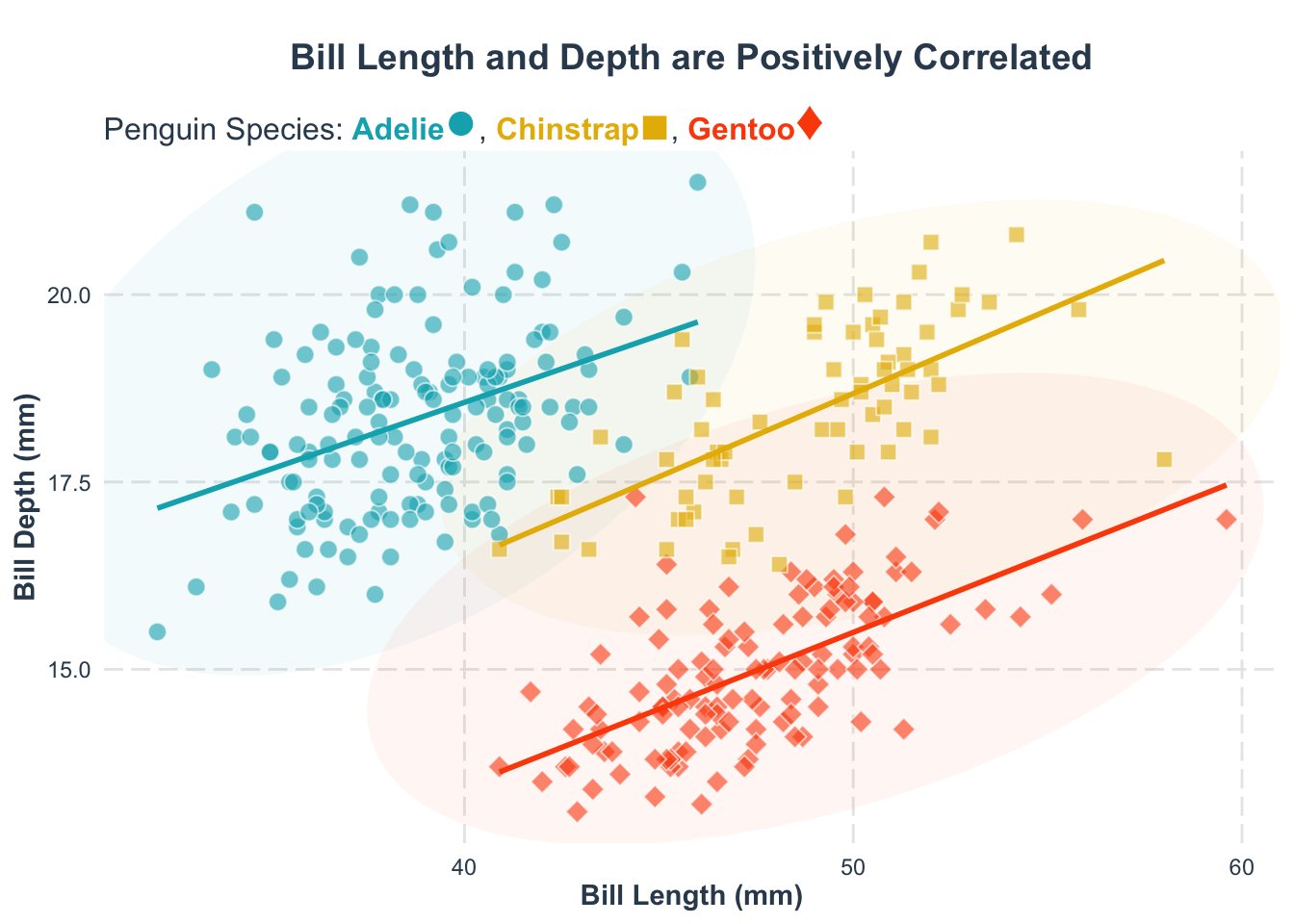
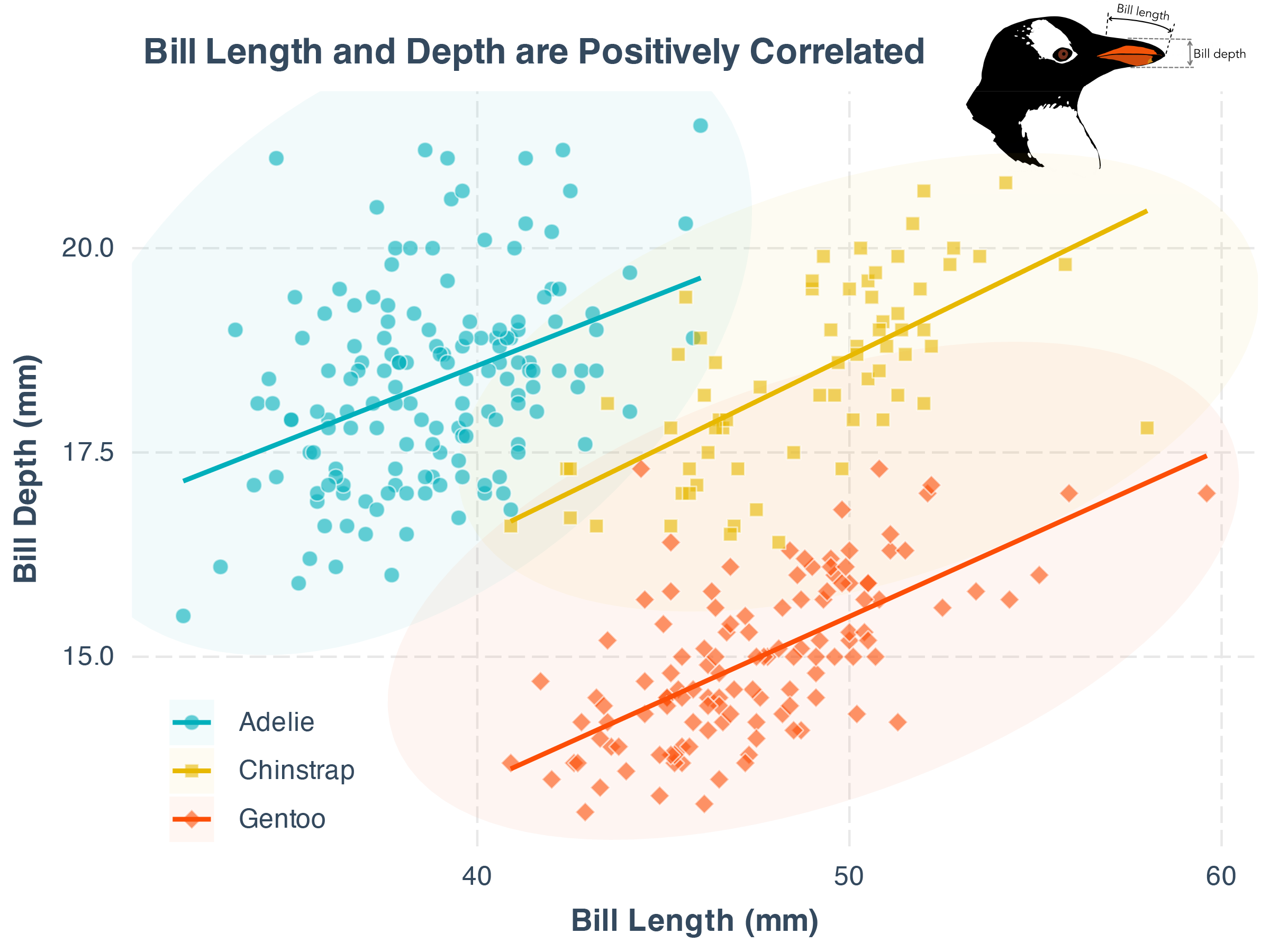
Second, what’s this plot telling us? A title can make that clear, also using labs():
p +
labs(
x = "Bill Length (mm)",
y = "Bill Depth (mm)",
title = "Bill Length and Depth of Penguins are Positively Correlated"
)- 1
-
We add a title to the plot using the
title = "title text"argument.
Now, your plot clearly communicates its main message.
Help your readers spot trends by adding a trend line. Remember, the goal is to make the plot as easy to understand as possible.
p1 <- p +
labs(
x = "Bill Length (mm)",
y = "Bill Depth (mm)",
title = "Bill Length and Depth are Positively Correlated"
) +
geom_smooth(
aes(group = species, color = species),
method = "lm", se = FALSE
) +
scale_color_manual(
values = c(
"Adelie" = "#00AFBB",
"Chinstrap" = "#E7B800",
"Gentoo" = "#FC4E07"
)
)
p1- 1
-
We add a linear trend line to the plot using the
geom_smooth()function. Thegroup = speciesargument specifies that we want to fit a separate trend line for each species. - 2
-
We add a linear trend line to the plot using the
geom_smooth()function. Themethod = "lm"argument specifies that we want to fit a linear model to the data. These = FALSEargument specifies that we do not want to display the standard error around the trend line. - 3
-
We need to change the color of the trend line using the
scale_color_manual()function.
Note: color and fill are different aesthetics in ggplot2, so you need to set them separately. The grammar for setting them is the same.
Exercise
Let us apply what we have learnt so far. Below is a simple scatter plot of the iris dataset. Your task is to customize the plot with customized point shape for each species and use a non-default color.
library(ggplot2)
library(MetBrewer)

p_exe <- ggplot(
    data = iris,
    aes(
        x = Sepal.Width,
        y = Petal.Width
    )
) +
  geom_point(
      aes(
          shape = Species,
          fill = Species
      ),
      color = "white",
      size = 3,
      alpha = .6
  ) +
  scale_shape_manual(values = c(21, 22, 23)) +
  scale_fill_manual(
    values = MetBrewer::met.brewer("Demuth", n=3, type="discrete")
  ) +
  theme_minimal()

p_exe +
  labs(
      x = "Petal width (cm)",
      y = "Sepal width (cm)",
      title = "Association between Sepal and Petal Width"
  ) +
  geom_smooth(
      aes(group = Species, color = Species),
      method = "lm", se = FALSE
  ) +
  scale_color_manual(
    values = MetBrewer::met.brewer("Demuth", n=3, type="discrete")
  )
`geom_smooth()` using formula = 'y ~ x'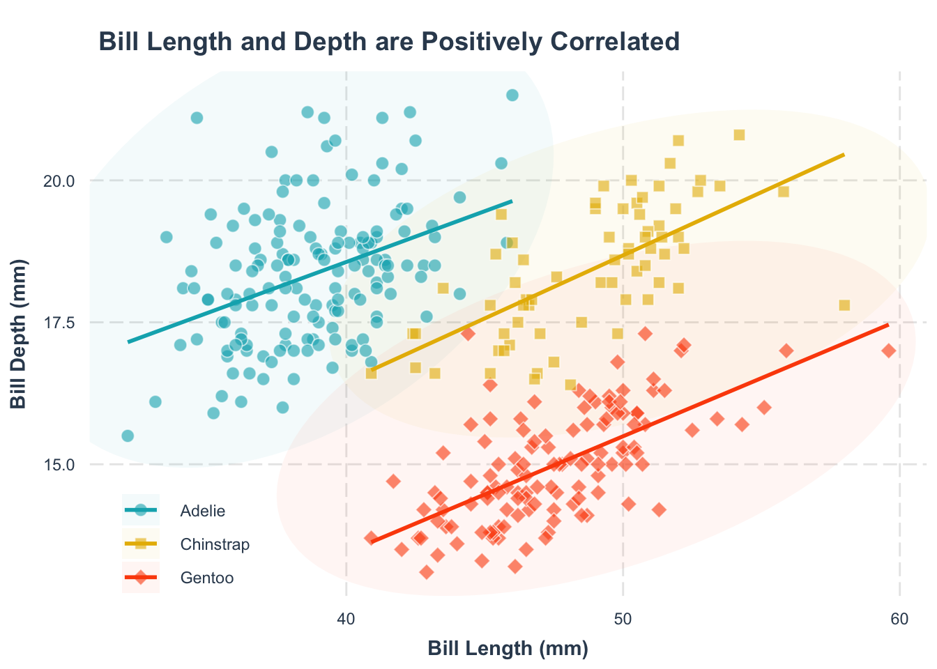
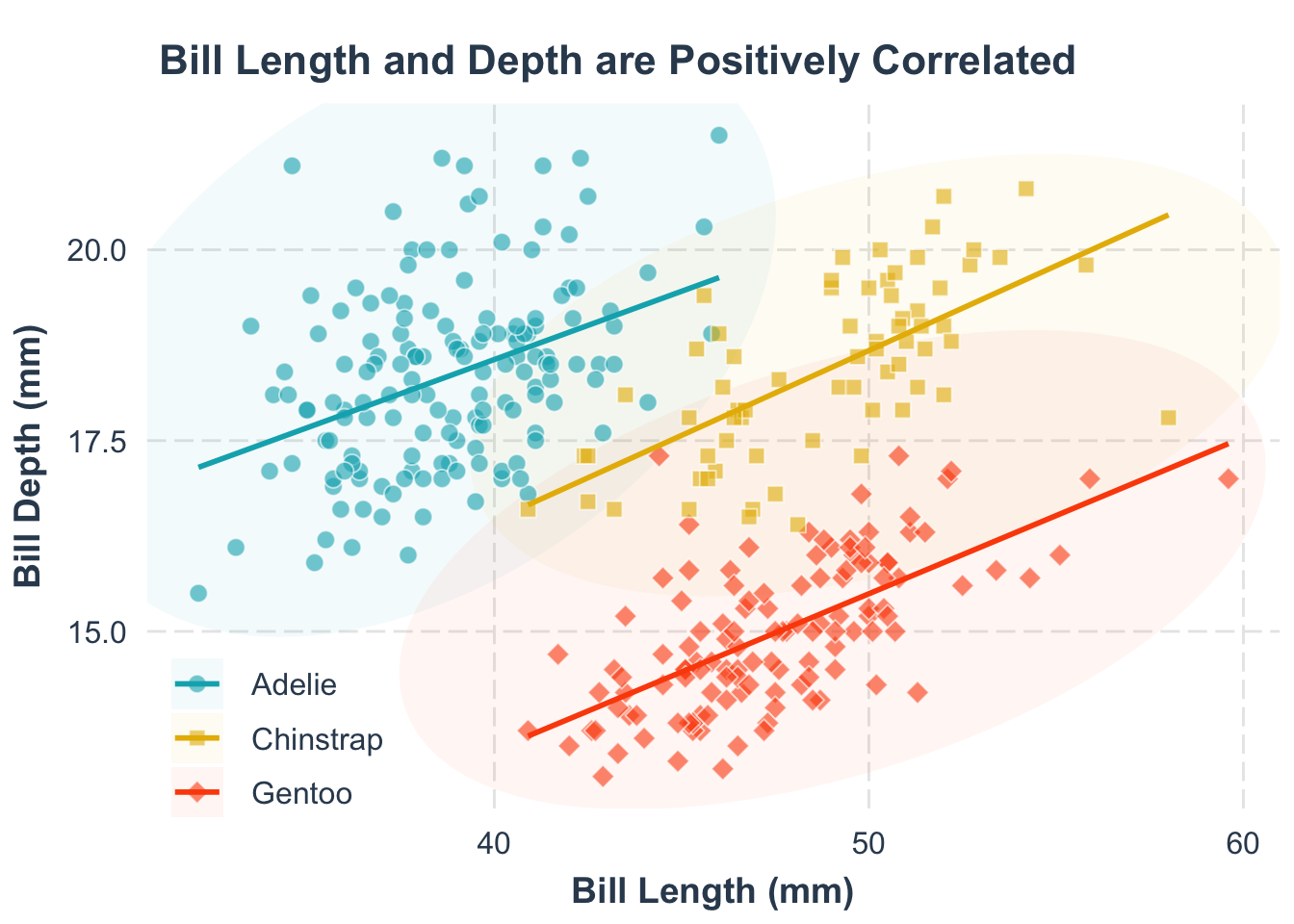
6.4 Dealing with legend
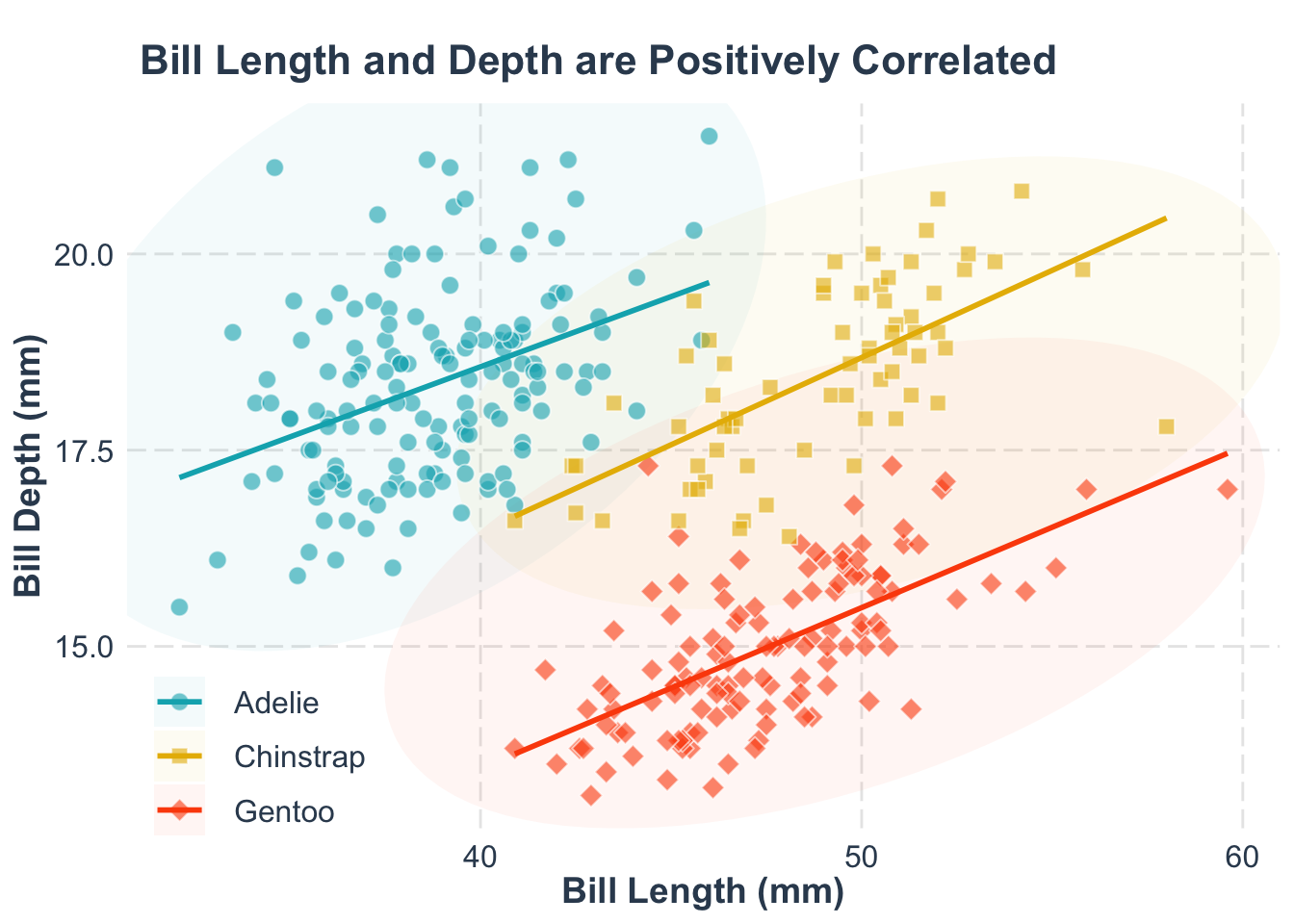
By default, the legend hangs out on the right. Often, placing it on top (or bottom) or inside the figure makes for a cleaner look. Let’s see how.
p1 +
theme(
legend.position = c(0.12, 0.1)
)- 1
-
We place the legend inside the plot using the
legend.position = c(*, *)argument.
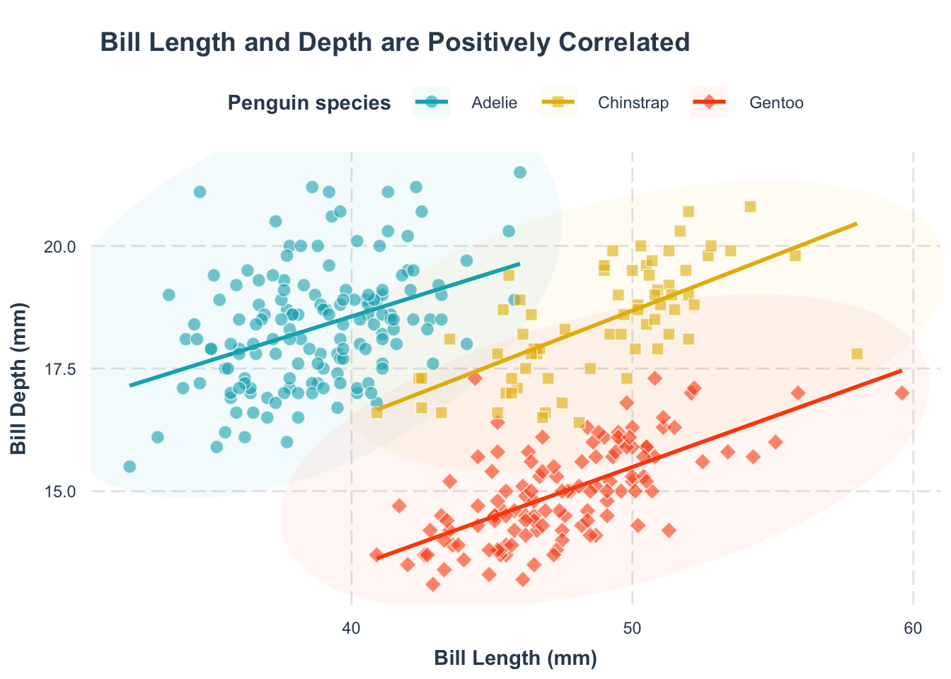
The first number is the x-coordinate, and the second is the y-coordinate, both ranging from 0 (left/bottom) to 1 (right/top).
p1 +
theme(
legend.position = "top"
# legend.position = "bottom"
)- 1
-
We place the legend on the top using the
legend.position = "top"argument. - 2
-
We can place the legend on the bottom using the
legend.position = "bottom"argument.
Another common blunder: not paying attention to the legend title.
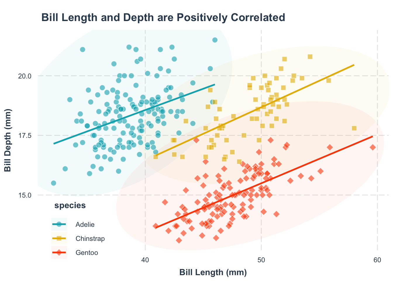
Sometimes, for example with expert audiences, the legend title is redundant. Remove it with theme()
p2 <- p1 +
theme(
legend.position = c(0.12, 0.1),
legend.title = element_blank()
)
p2- 1
-
We remove the legend title using the
legend.title = element_blank()argument.
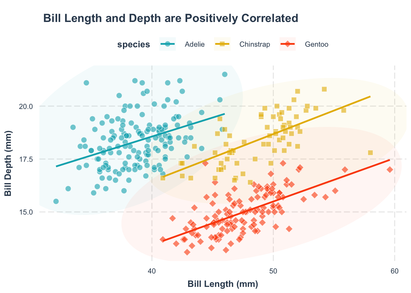
For a more informative, self-contained figure, you might need to rewrite the legend title. Since ggplot2 can merge multiple legends (color, shape, linetype), ensure consistency by renaming all relevant legends.
p1 +
theme(
legend.position = "top"
) +
labs(
color = "Penguin species",
shape = "Penguin species",
fill = "Penguin species", # <3>,
linetype = "Penguin species"
)- 1
-
We rewrite the title of the color legend using the
labs(color = "label text")argument.
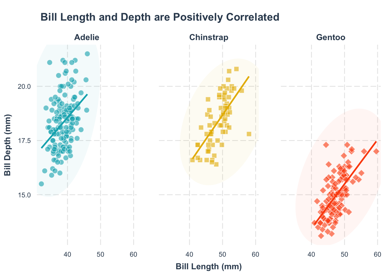
Another approach is to design the figure so that the legend is not necessary. They are usually more complicated and labor-heavy, but definitely worth it. Below we show two approaches:
p1 +
  facet_wrap(~species) +
  theme(
    legend.position = "none"
  )
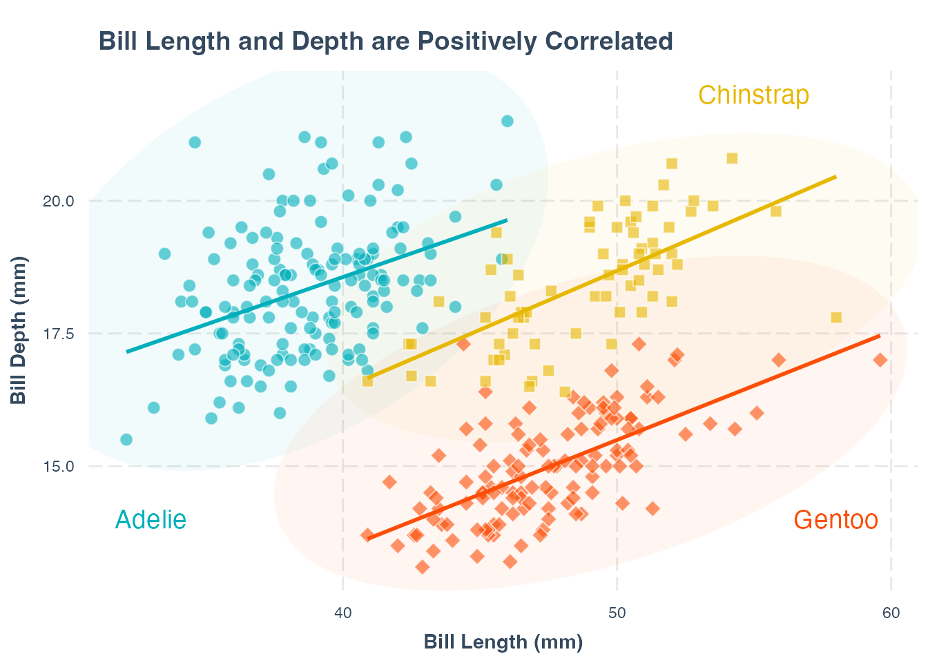
p1 +
theme(legend.position = "none") +
annotate("text",
x = 33, y = 14,
label = "Adelie",
color = "#00AFBB", size = 5
) +
annotate("text",
x = 55, y = 22,
label = "Chinstrap", color = "#E7B800", size = 5
) +
annotate("text",
x = 58, y = 14,
label = "Gentoo", color = "#FC4E07", size = 5
)- 1
-
We add text annotations to the plot using the
annotate()function. - 2
-
We specify the x and y coordinates of the text annotations using the
x = , y =arguments. - 3
-
We specify the label of the text annotations using the
label = "label text"argument. - 4
-
We specify the color of the text annotations using the
color =argument. We increase the size of the text annotations using thesize =argument.
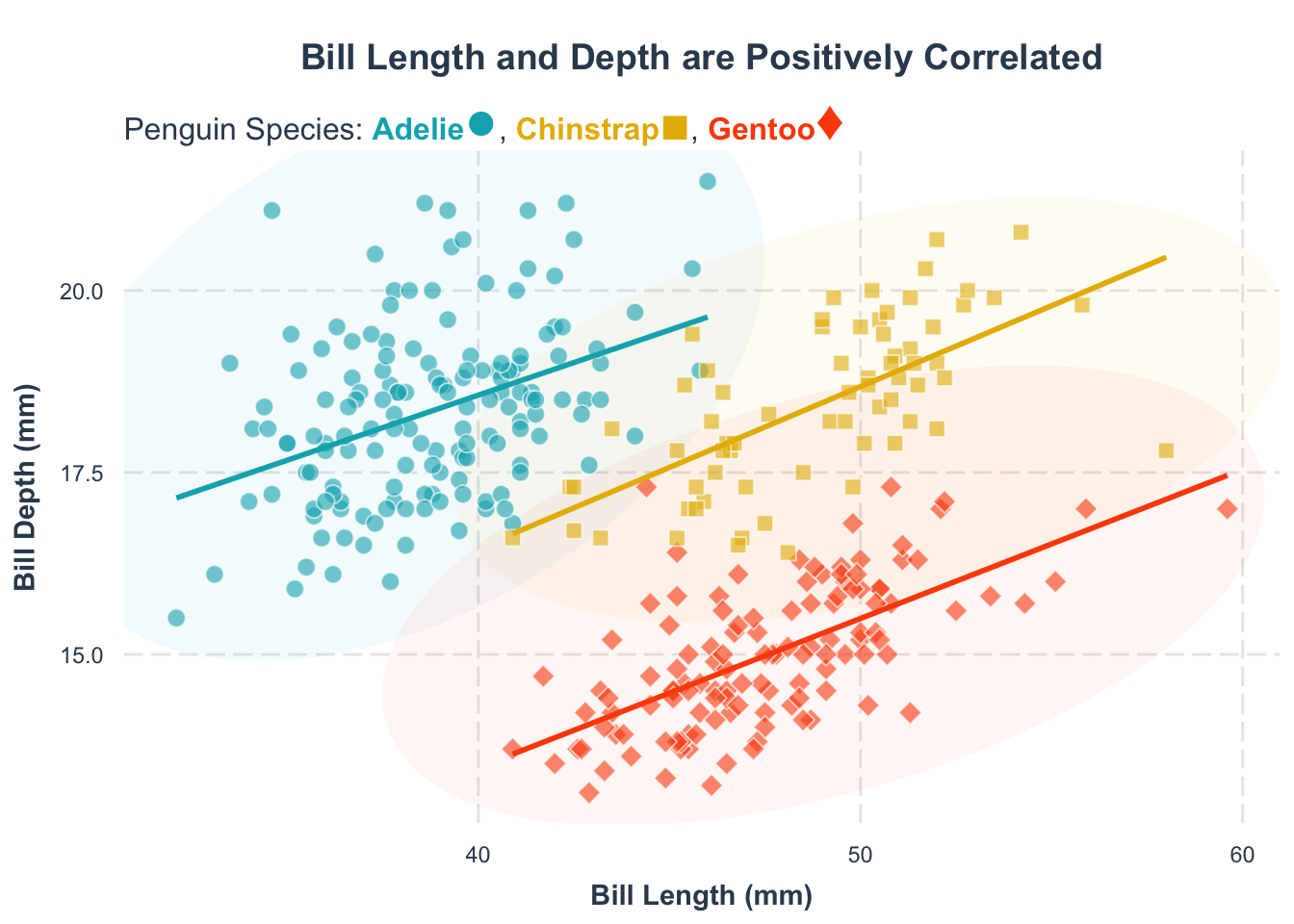
We can use subtitle as an effective way to label the groups. We can use the ggtext package to add the subtitle. If you have not installed the package yet, just run install.packages("ggtext").
library(ggtext)
p1 +
  theme(
    legend.position = "none"
  ) +
  labs(
    subtitle = "Penguin Species:
    <span style = 'color:#00AFBB;'>**Adelie**</span><span style = 'color:#00AFBB;font-size:22pt'>\u25CF</span>,
    <span style = 'color:#E7B800;'>**Chinstrap**</span><span style = 'color:#E7B800;font-size:20pt'>\u25A0</span>,
    <span style = 'color:#FC4E07;'>**Gentoo**</span><span style = 'color:#FC4E07;font-size:22pt'>\u2666</span>"
  ) +
  theme(
    plot.title = element_text(hjust = 0.5),
    plot.subtitle = element_textbox_simple(halign = 0, size = 12)
  )
There is also another package marquee that makes this process easier. But it is still under active development. Check the documentation if you are intrested.
6.5 Use larger annotations
Whenever I read papers or listen to talks, I often see that the font size is too small. The following is a quote from the book Fundamentals of Data Visualization by Claus Wilke:
If you take away only one single lesson from this book, make it this one: Pay attention to your axis labels, axis tick labels, and other assorted plot annotations. Chances are they are too small. In my experience, nearly all plot libraries and graphing softwares have poor defaults. If you use the default values, you’re almost certainly making a poor choice.
We can increase the font size of the axis labels using the theme() function.
p3 <- p2 +
theme(
axis.text = element_text(size = 12),
axis.title = element_text(size = 14),
plot.title = element_text(size = 16),
legend.text = element_text(size = 12)
)
p3- 1
-
We increase the font size of the axis labels using the
theme()function. - 2
-
We increase the font size of the axis labels using the
axis.text = element_text(size = )argument. - 3
-
We increase the font size of the axis labels using the
axis.title = element_text(size = )argument. - 4
-
We increase the font size of the title using the
title = element_text(size = )argument. - 5
-
We increase the font size of the legend text using the
legend.text = element_text(size = )argument.

Selecting the appropriate font size in ggplot2 is somewhat of an art. A common mistake is using a font size that looks great in the RStudio preview but doesn’t scale appropriately when exporting the plot to different sizes. While the plot elements typically adjust to the export dimensions, fixed font sizes do not, leading to readability issues and challenges with reproducibility. To address this,
- You can finalize all other aspects of the plot first and then adjust the font sizes to ensure they are readable and harmonize with the overall visualization.
- Alternaticely, you can use a fixed canvas size for the plot, which can help you better control the font sizes:
p2 +
  patchwork::plot_layout(widths = 50, heights = 50) +
  theme(...)
6.6 The full code
Alright, brace yourself. The full code for our pièce de résistance—our final figure—is right below. Run it with a single click and marvel as the figure above magically appears:
Yes, the code might look like it’s speaking in tongues, but fear not! It’s all about the logic. Let’s break down the wizardry step by step:
- We always start with
ggplot()function. This is your canvas. Specify your data and map out the x and y axes. - The first couple of layers are adding the geometries (
geom_*). What to add are motivated by what we want to show. Since we’re exploring the relationship between bill length and bill depth, we need:- Points (
geom_point): Each penguin observation. - Trend Lines (
geom_smooth): To highlight that positive relationship. - Ellipses (
ggforce::geom_mark_ellipse): To neatly separate different species. - Pro Tip: The order matters! The first layer (ellipses) sits at the bottom, with points and trend lines layering on top. Carefully think about the order of layers.
- Points (
- We then customize so that the aesmatics match your vision. This is controlled by the
scale_*function. In this plot, the customizedaesincludesshape,color, andfill. - Labeling with
labs(): Clear labels make your plot understandable at a glance. - We then customize the theme, the non-data elements of the plot:
- We first use a good theme. This saves us a lot of time in custimization.
- We then do our own custimization. This is controlled by the
theme()function. We can change the font size, the position of the legend, etc.
The logic behind every ggplot2 figure follows these structured steps. It may seem intimidating at first, but I promise you will get used to it and even fall in love with it:
- Encourages Thoughtful Design: ggplot2 challenges you to think deeply about what you want to visualize. This thoughtful approach not only creates stunning visuals but also helps you understand your data on a deeper level. I have benefitted many times from this.
- A Playground for Creativity: The beauty of ggplot2 lies in its flexibility. As I said multiple times, you are in full control of your plot. Add or remove layers effortlessly and experiment with countless extensions to find what best communicates your data. Who says you cannot do experiments on computer!
6.7 Exporting Your Plot with Precision
Finally, we need to export the plot such as pdf or png, so we can use it elsewhere (like submit to a journal). However, a minimalist approach like ggsave("plot_name.pdf") lacks the precision needed for publication-quality figures. Below, we show the best practices for exporting your plot:
PDFs are the gold standard for vector graphics in academic publications due to their scalability and clarity. To save your plot as a PDF, consider the following comprehensive method:
ggsave(
filename = "plot.pdf",
plot = p3,
width = 8,
height = 6,
units = "in",
device = cairo_pdf
)- 1
- Filename Specification: Clearly define the output file name and its format using the filename argument. This ensures your plot is saved with the desired name and extension.
- 2
- Plot Selection: The plot argument allows you to specify which ggplot object you intend to save. This is particularly useful when working with multiple plots.
- 3
- Dimensional Control: By setting the width and height, you control the physical size of the plot, ensuring it fits seamlessly within your manuscript’s layout.
- 4
- Unit Definition: Specifying units (inches, centimeters, etc.) provides consistency, especially when adhering to journal-specific formatting guidelines.
- 5
- Device Choice: The cairo_pdf device offers superior rendering quality, handling fonts and graphical elements with precision.
Why do we bother to specify plot dimensions? For one thing, RStudio window sizes can vary from one computer to another, which may cause your figures to appear distorted or improperly sized if dimensions aren’t fixed. Additionally, font sizes in plots are fixed and do not automatically scale with plot dimensions, leading to text that may be too large or too small relative to the plot size. I’ve had nightmares to reproduce well-formatted figures because I forgot to set these dimensions. To avoid such headaches, it’s best practice to always specify the width and height when exporting your plots.
While PDFs are ideal for vector graphics, many journals only accept non-vector format like PNGs. To achieve optimal quality and avoid common pitfalls related to fonts and rendering, the ragg package is highly recommended. If you haven’t installed it yet, simply execute install.packages(“ragg”).
ggsave(
filename = "plot.png",
plot = p3,
width = 8,
height = 6,
units = "in",
device = ragg::agg_png
)- 1
- Filename Specification: Clearly define the output file name and its format using the filename argument.
- 2
- Device Choice: Utilizing ragg::agg_png ensures that the PNG is rendered with high fidelity, handling intricate details and text smoothly.
6.8 Refining Your Plot Beyond R
While ggplot2 is powerful, it is not a design software and it can be paiful to do everything in R. To add extra touch, you can save it as a vector graphic (e.g., pdf) and edit it in a design software like Adobe Illustrator or Inkscape.
However, learning a new software can be time-consuming. Luckily, you get to do many of these tasks in PowerPoint. The trick is to save the plot as svg format. This is a vector graphic format that can be easily imported into editable format in PowerPoint. Another practicle trick is to remove the white background of the plot. Below is the code to do this:
p_svg <- p3 +
theme(
panel.background = element_rect(fill = "transparent", colour = NA_character_),
plot.background = element_rect(fill = "transparent", colour = NA_character_),
legend.background = element_rect(fill = "transparent"),
legend.box.background = element_rect(fill = "transparent"),
legend.key = element_rect(fill = "transparent")
)
ggsave(
filename = "plot.svg",
plot = p_svg,
width = 8,
height = 6,
units = "in"
)- 1
- We make the panel background transparent.
- 2
- We make the plot background transparent.
- 3
- We make the legend background transparent.
- 4
- We make the legend box background transparent.
- 5
- We make the legend key transparent.
With the exported svg in Keynote, you can easily add annotations, arrows, and other design elements to make your plot more informative and appealing. As an example, below adds the artistic plot of penguins to better illustate the two axis:
Where to find artistic illustrations
A well-drawn illustration can make your plot more engaging. It is not easy, as this is not a standardized process. That said, here are some solid options for finding awesome illustrations:
- Hire an artist. Honestly, this is your best bet for top-notch quality and tons of customization. Plus, you’re supporting creative folks! Here are a few options to check out (not sponsored—just examples):
- Use online resources. If hiring someone isn’t in the cards, these online platforms can help:
- BioRender. Super popular with molecular biologists, packed with templates and illustrations. Downsides? It’s super pricey.
- NIH BioArt Source. Free and provided by NIH.
- Bio Icons. Free as well.
- Adobe Stock. High-quality stuff from Adobe, but yeah, like other Adobe products, it’s expensive.
- Use AI. AI tools are getting pretty good at making custom illustrations. Just tread carefully—AI-generated stuff isn’t always perfect, and you don’t want to end up with something embarrassing (Here’s a cringe-worthy example).
Another great side benefit of editing this in Powerpoint is that that you can esaily animate your figures when you present in conferences or group meetings. We will demonstratre in class how to do this.